TFC Online
TFC (The Filipino Channel) is the flagship digital product of ABS-CBN International. TFC is known to about 14 million Filipinos worldwide.
This is an omnichannel release being: responsive web, native mobile & tablet, OTT and Smart TV.
Role:
UX Design Head, UX/UI Designer (Web &Mobile)
Product Manager:
Tools:
Sketch, Flinto for Mac, Design Sprint, Invision
Background
Prior to my team working on this project, the entire platform was designed and developed by a 3rd party digital agency based in Oakland back in 2014. It was then maintained by an engineering team in Manila and a Web Master in Daly City.
In mid 2018, my team was asked to be involved and was given the task to improve, enhance and optimize the user experience for the entire product.
BUSINESS GOALS:
Improve adoption and retention rates for FREE (we call them Basic) subscribers to increase advertising revenue.
USER GOALS:
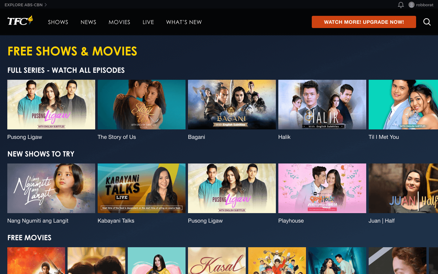
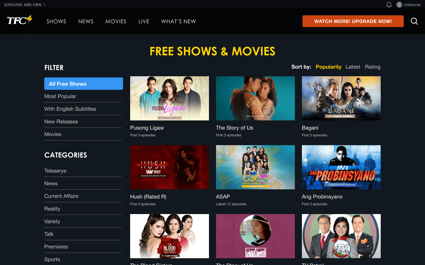
As a free subscriber, I want to be able to easily find the shows and movies I can watch.
CONSTRAINTS:
Engineering is split between Philippines and a US 3rd party agency.
Native mobile and tablet will be developed using React Native.
OTT will be a Roku release only and Smart TV will be a Samsung Tizen release only for Phase 1.
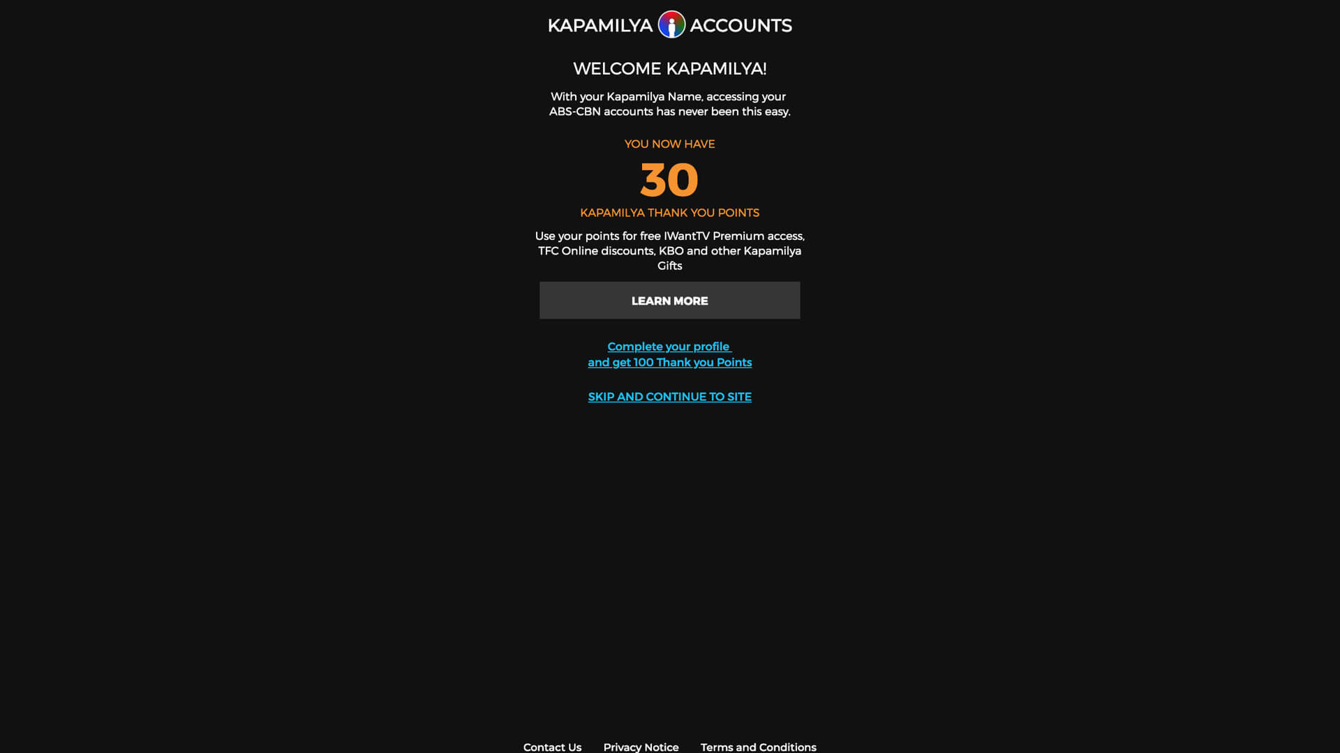
Users can only sign up using the web at this point.

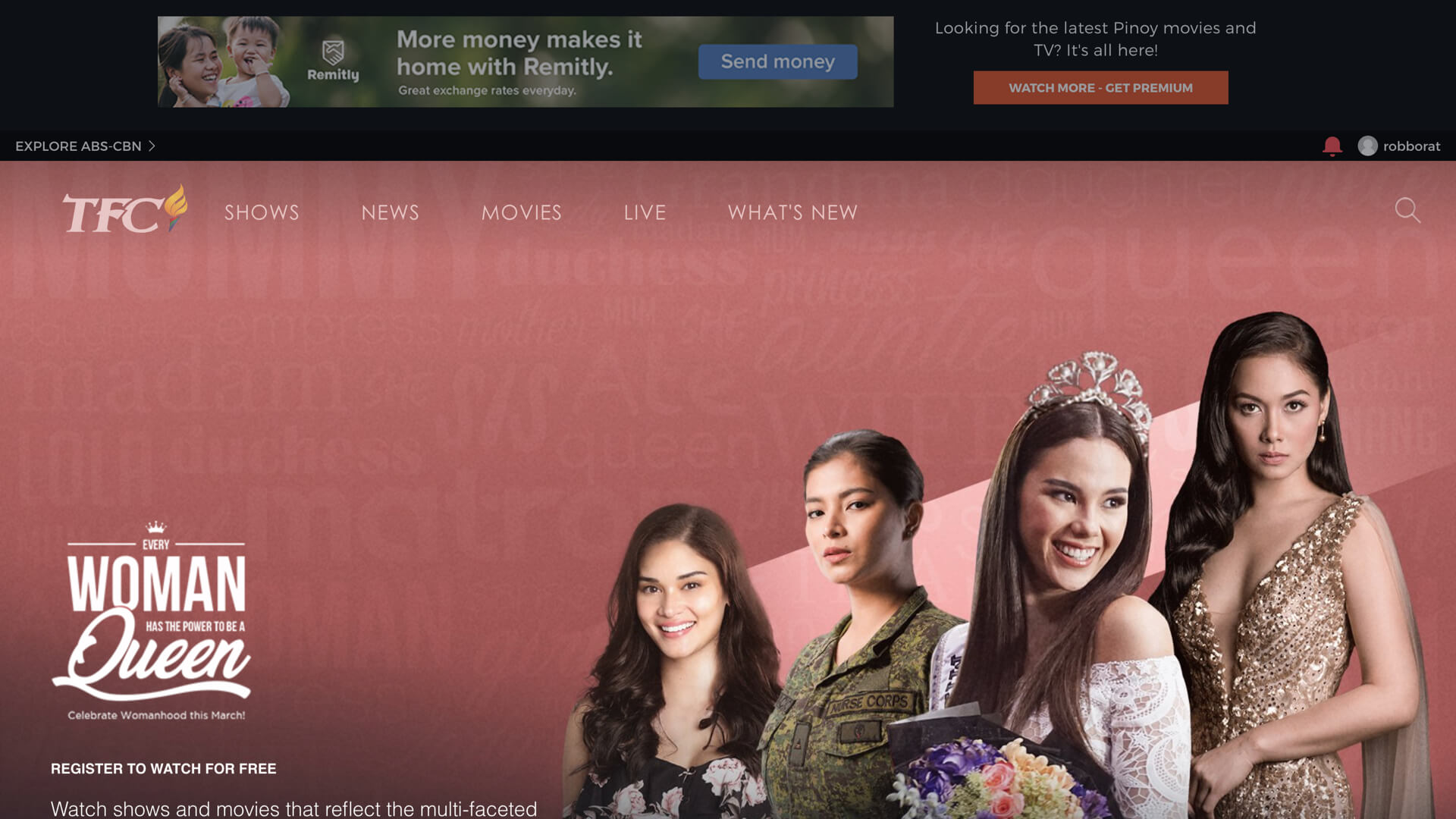
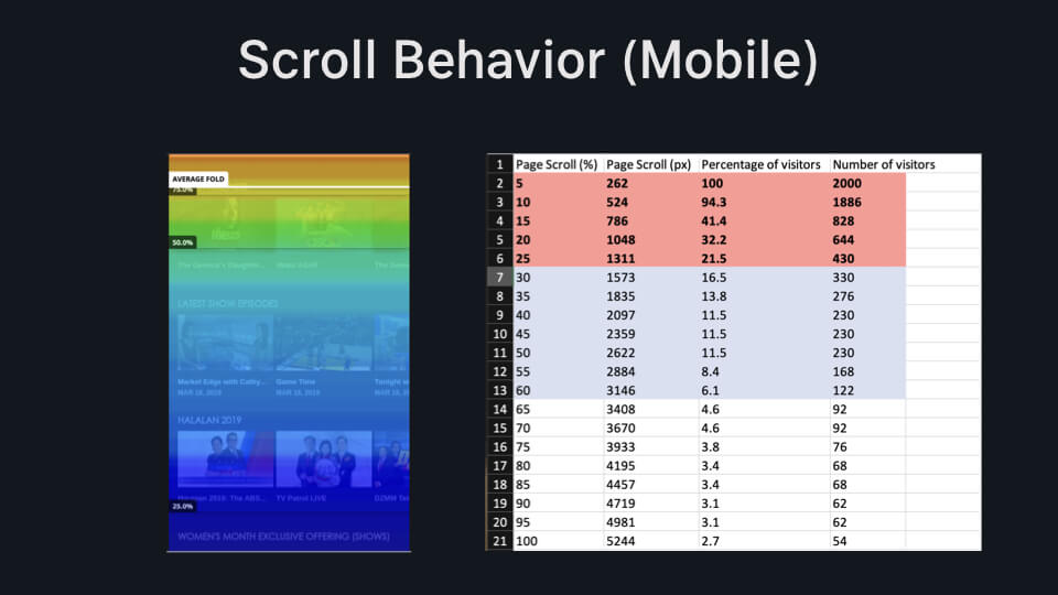
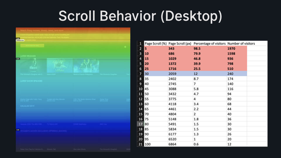
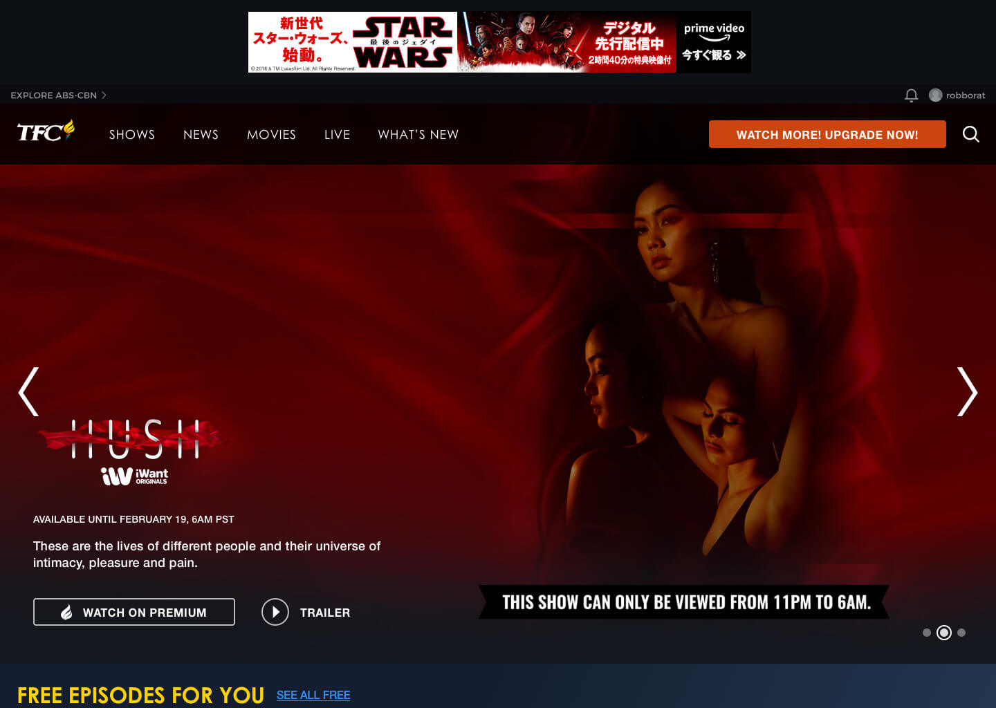
The home page had a big problem: it was smashed with all the content available in 1 extremely long page all before a user gets to register or authenticate their account.
The Problem
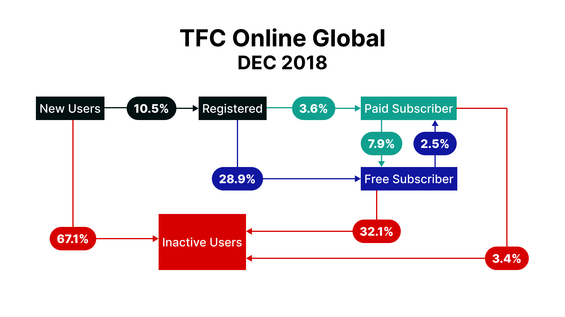
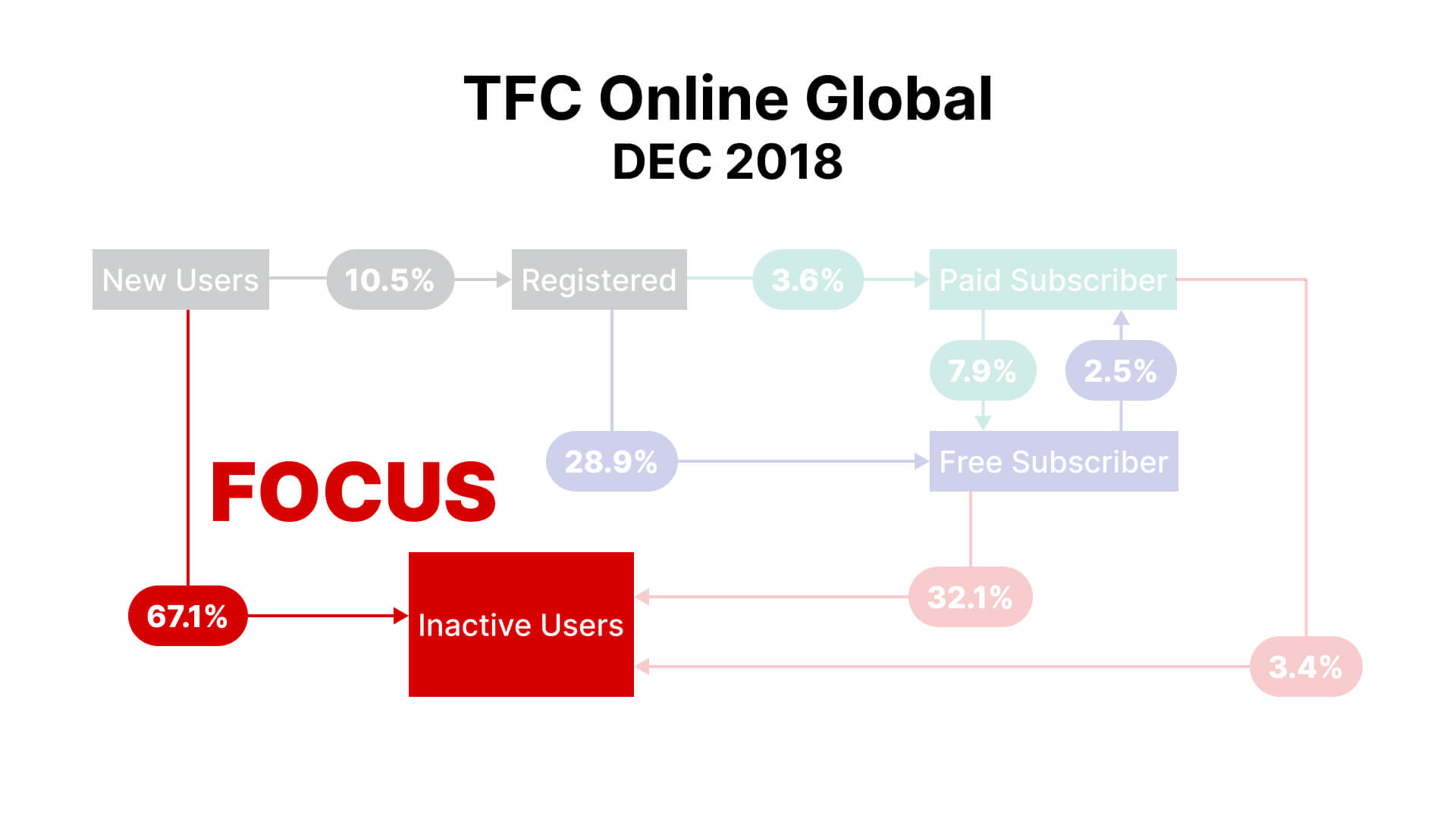
Only 10% of unique page visitors successfully register to the website. Once they register for a Basic plan (the free plan), almost half of them become inactive after their first month. At an average ad revenue of $102 per user, we were losing millions of dollars per month.
Discovery
Our team was allowed to take a step back and spend some time re-assessing the product experience through research.
Personas
In September 2018, our team was tasked to conduct some qualitative user research.
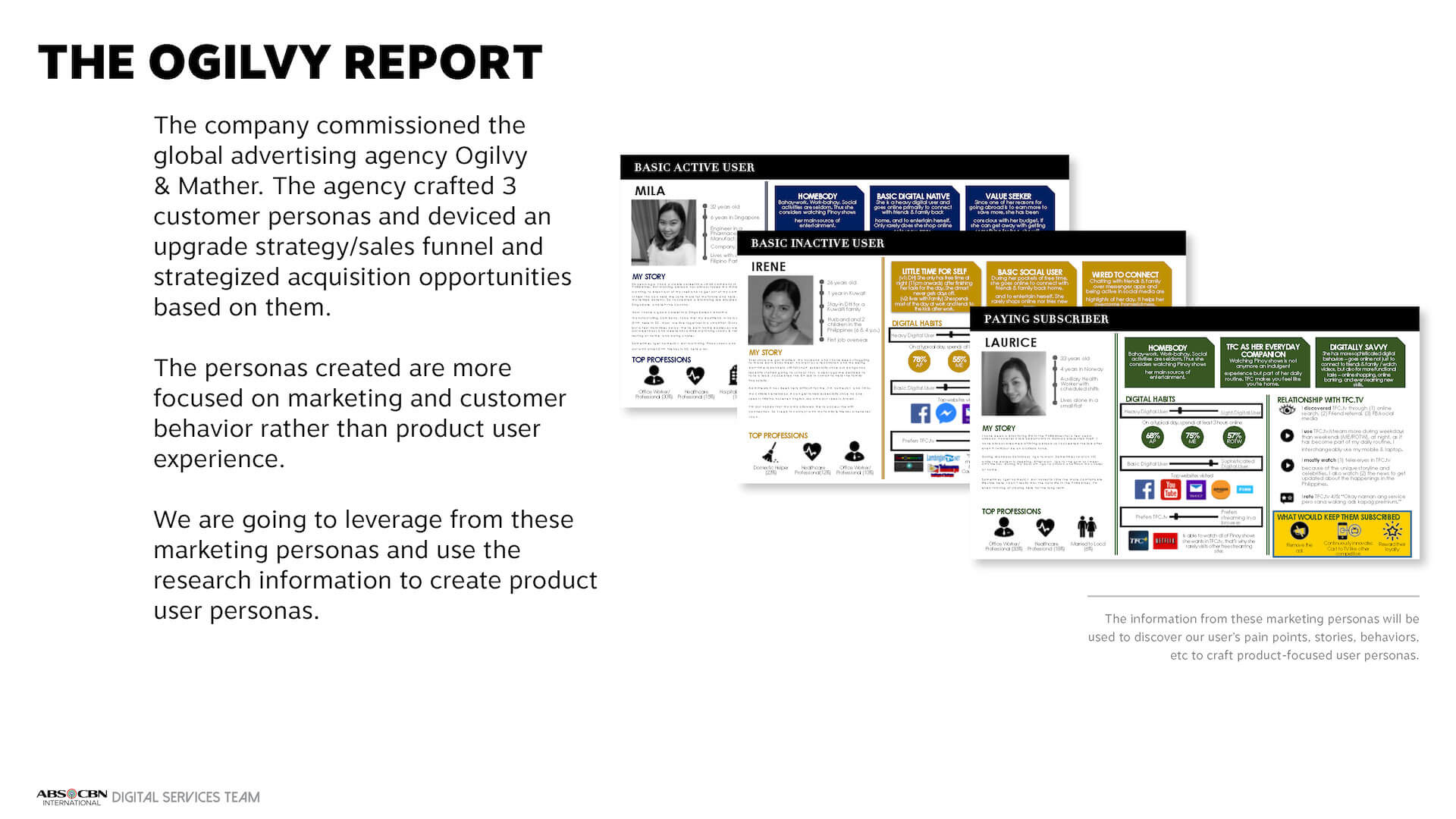
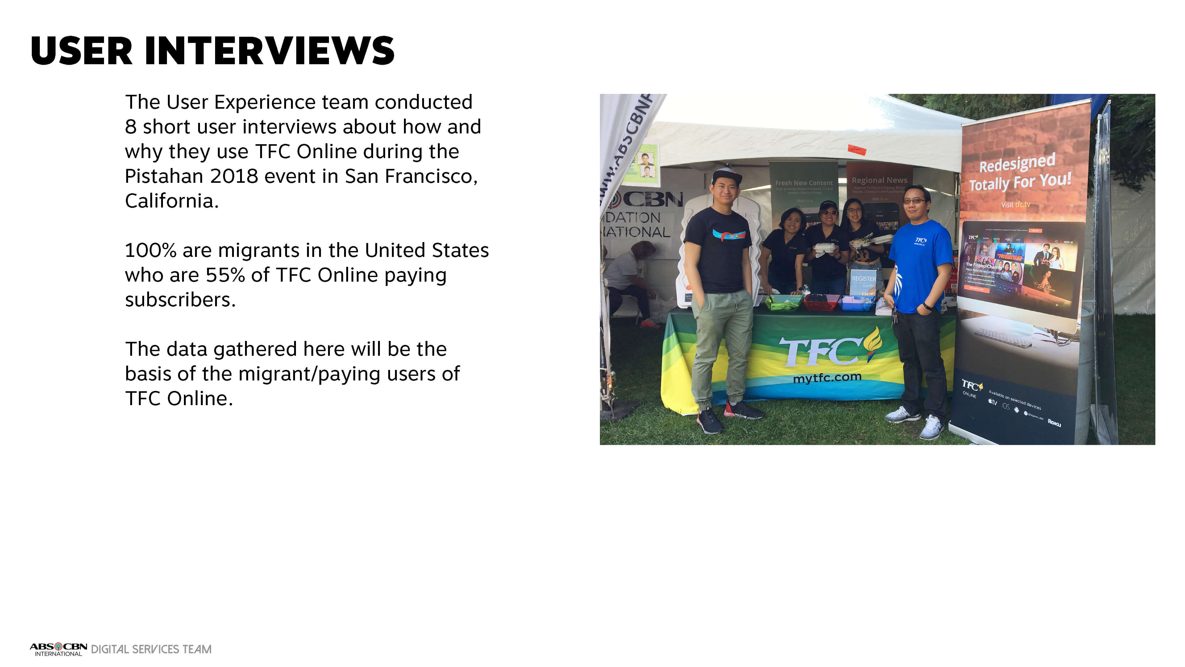
We comissioned a 3rd party research agency to conduct contextual interviews with Overseas Filipino Workers all over the world.
We conducted contextual interviews with users during a Filipino event over at Yerba Buena in San Francisco.
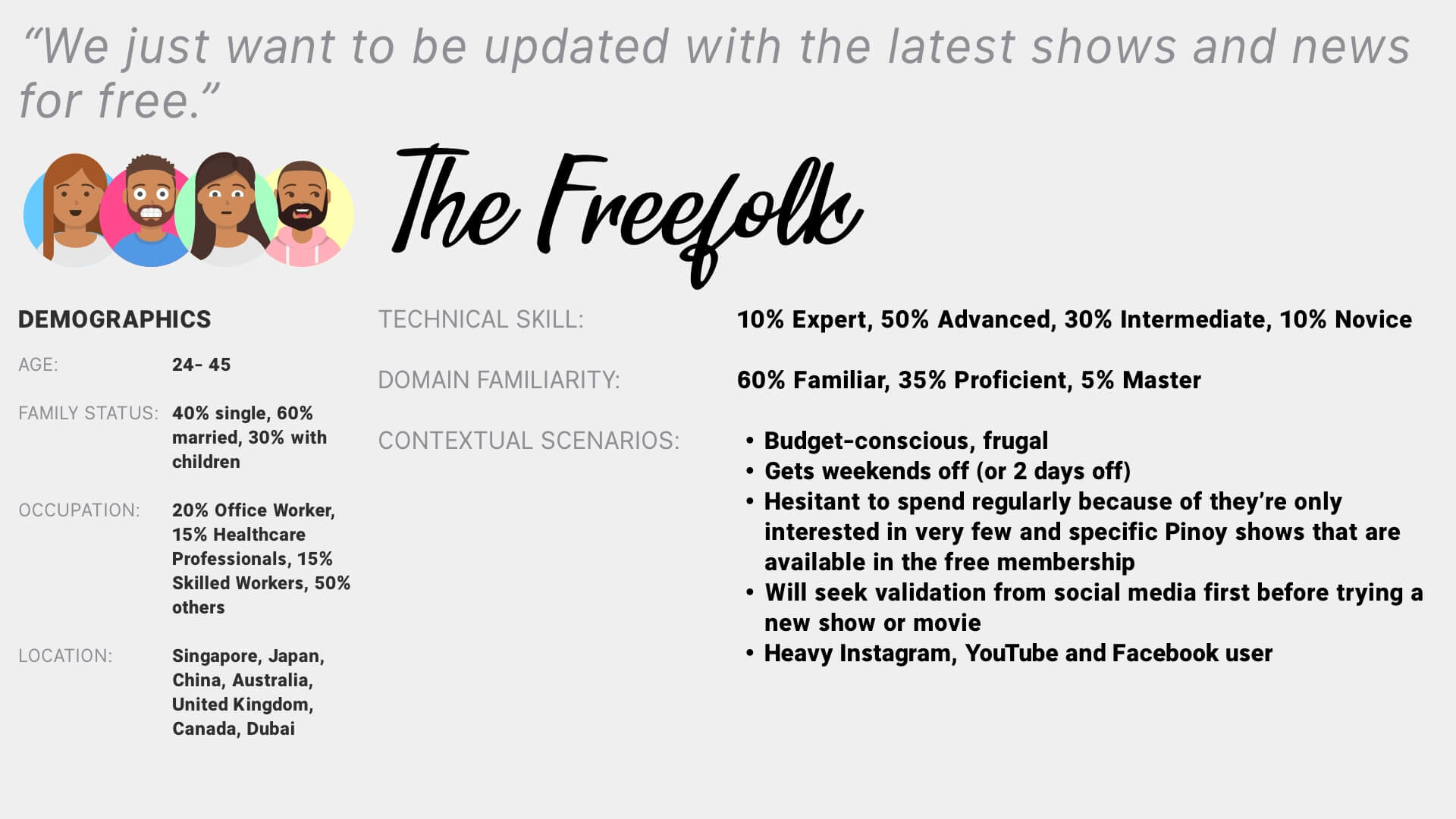
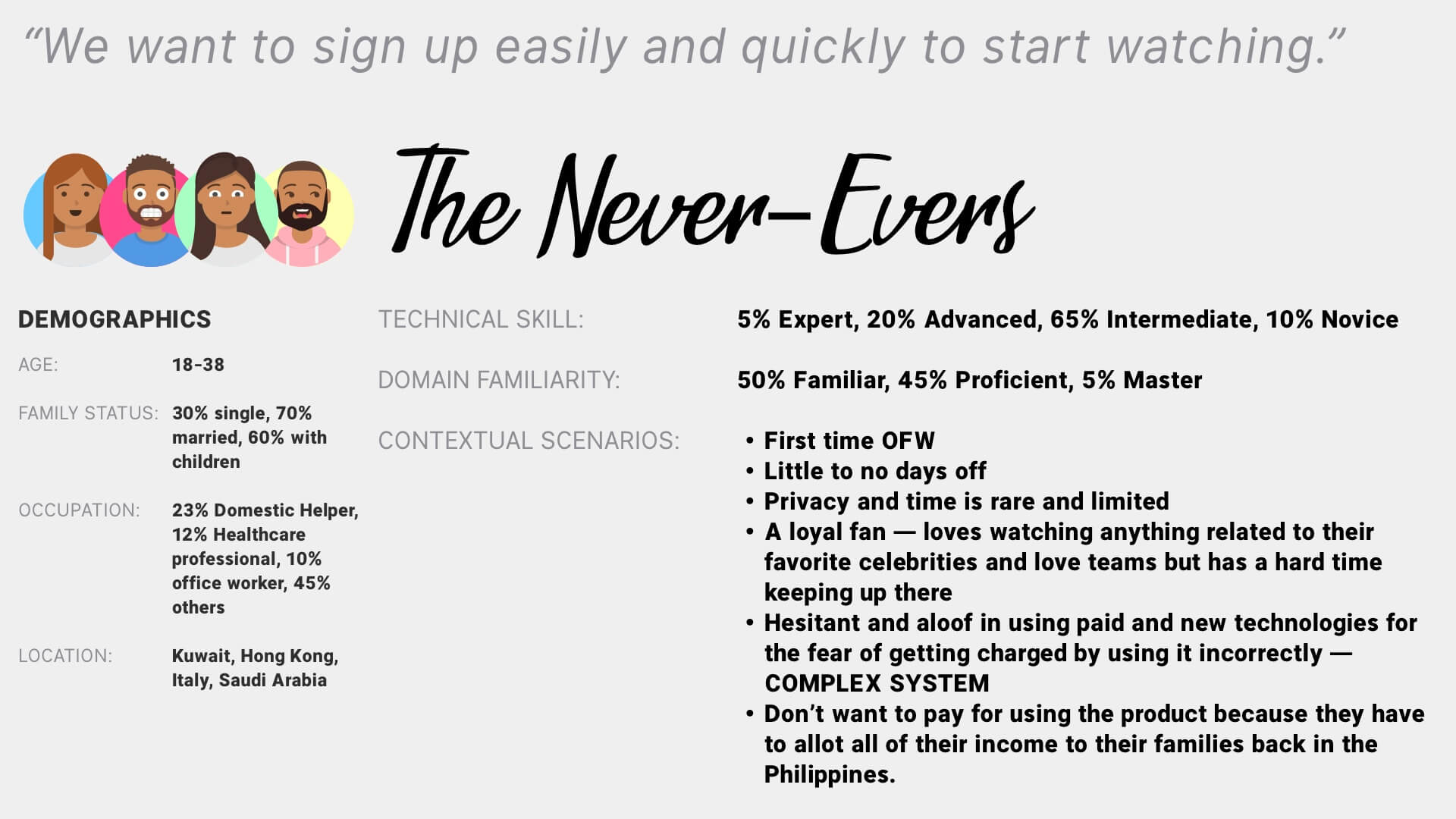
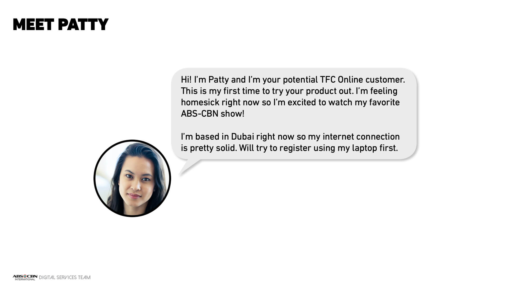
Based on the data we gathered, we created a new set of personas to account for the major use cases we wanted lift from.
Data & Insights
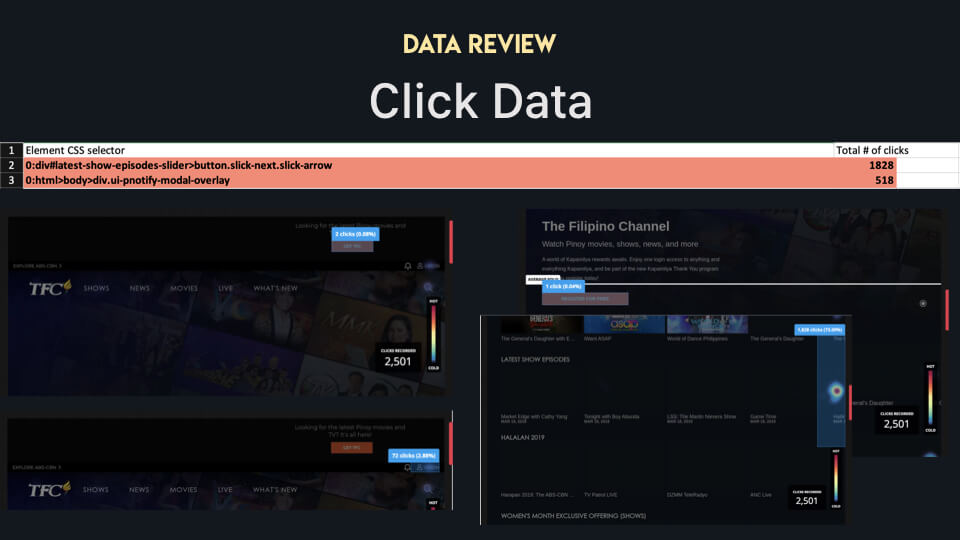
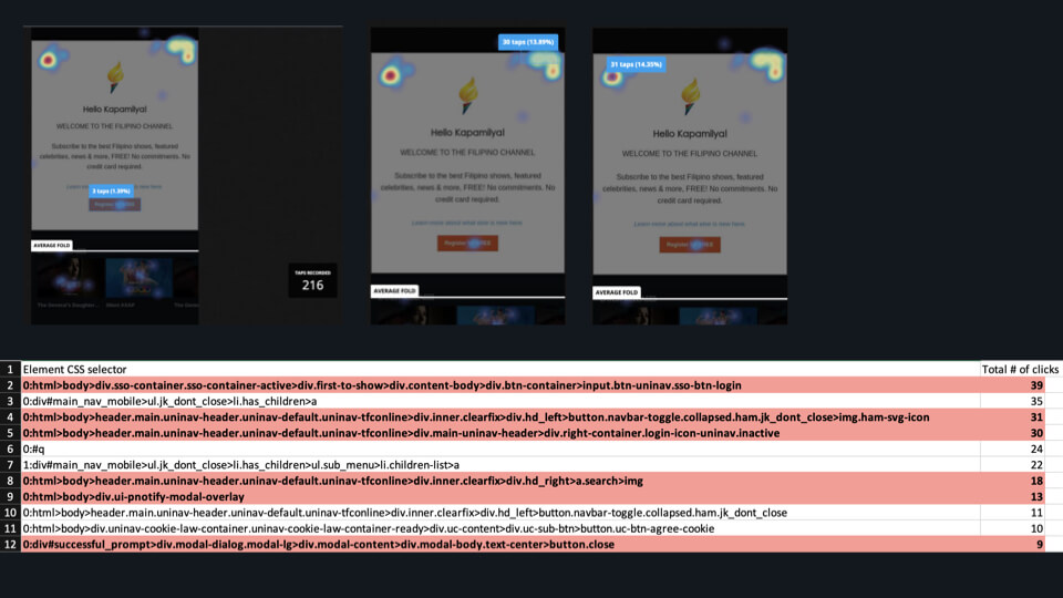
To solve our problem, we also gathered several quantitative data and insights on the existing platform.
Assessment
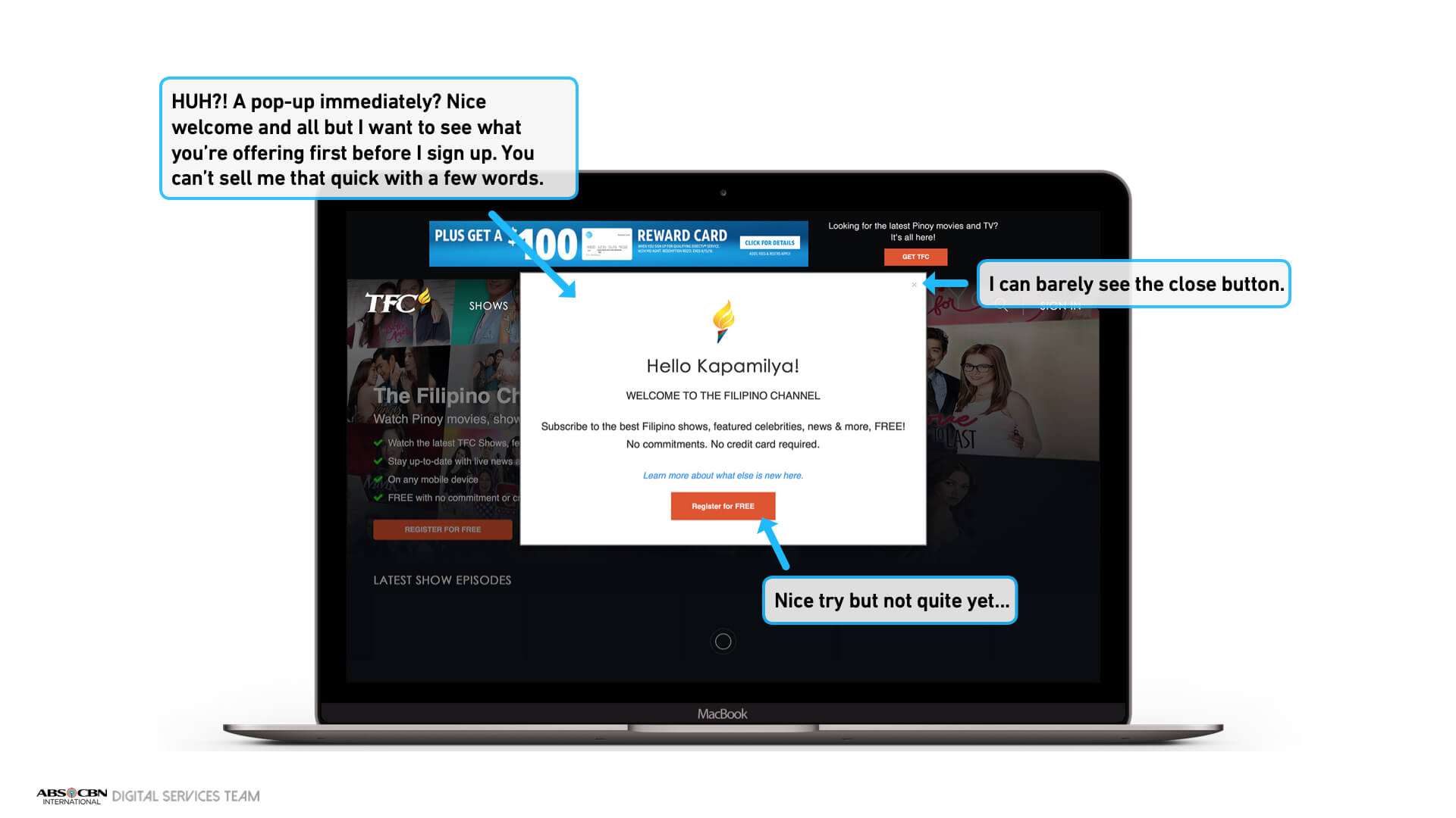
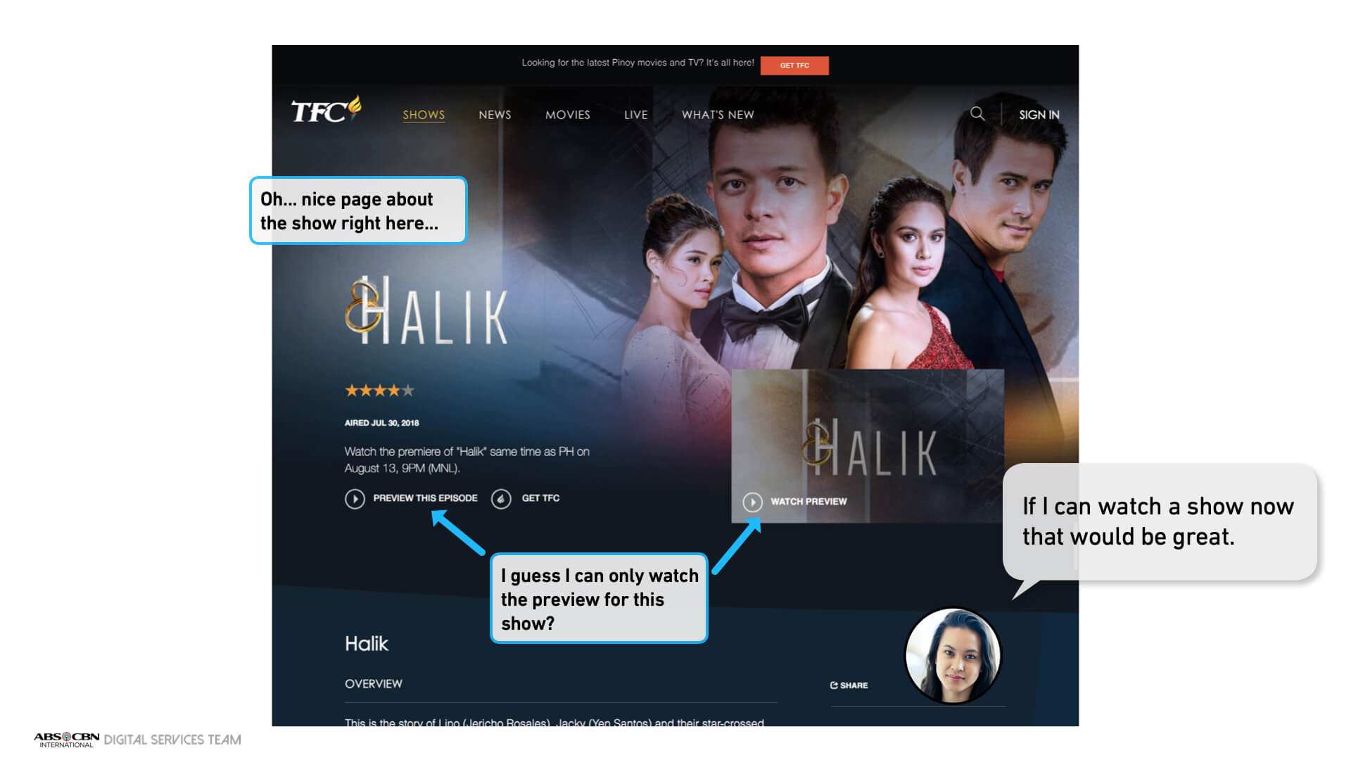
We created a user teardown to develop more empathy with a user and shared it with key stakeholders.
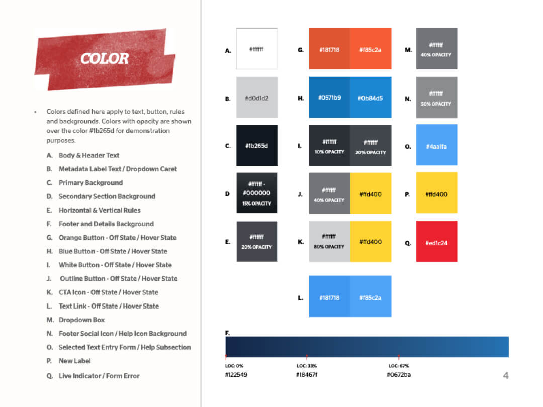
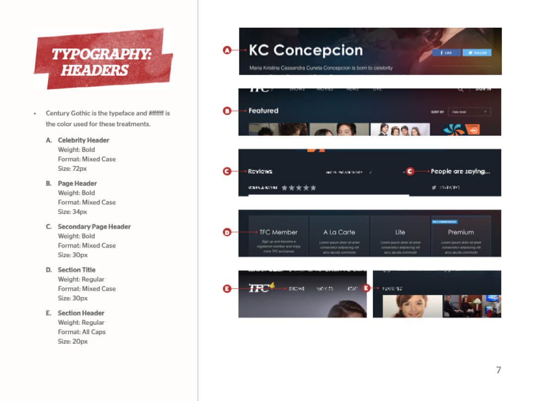
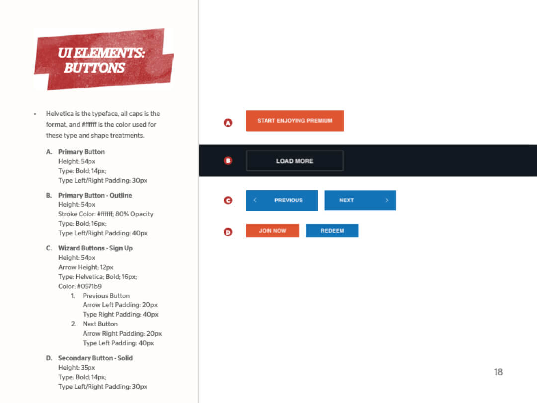
We repurposed most of the existing styles from the style guide developed by the previous designers.
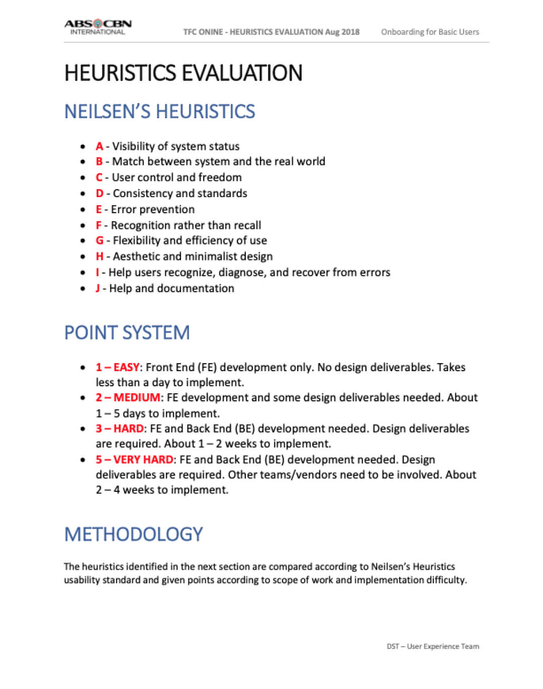
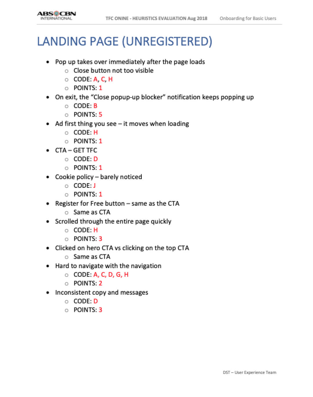
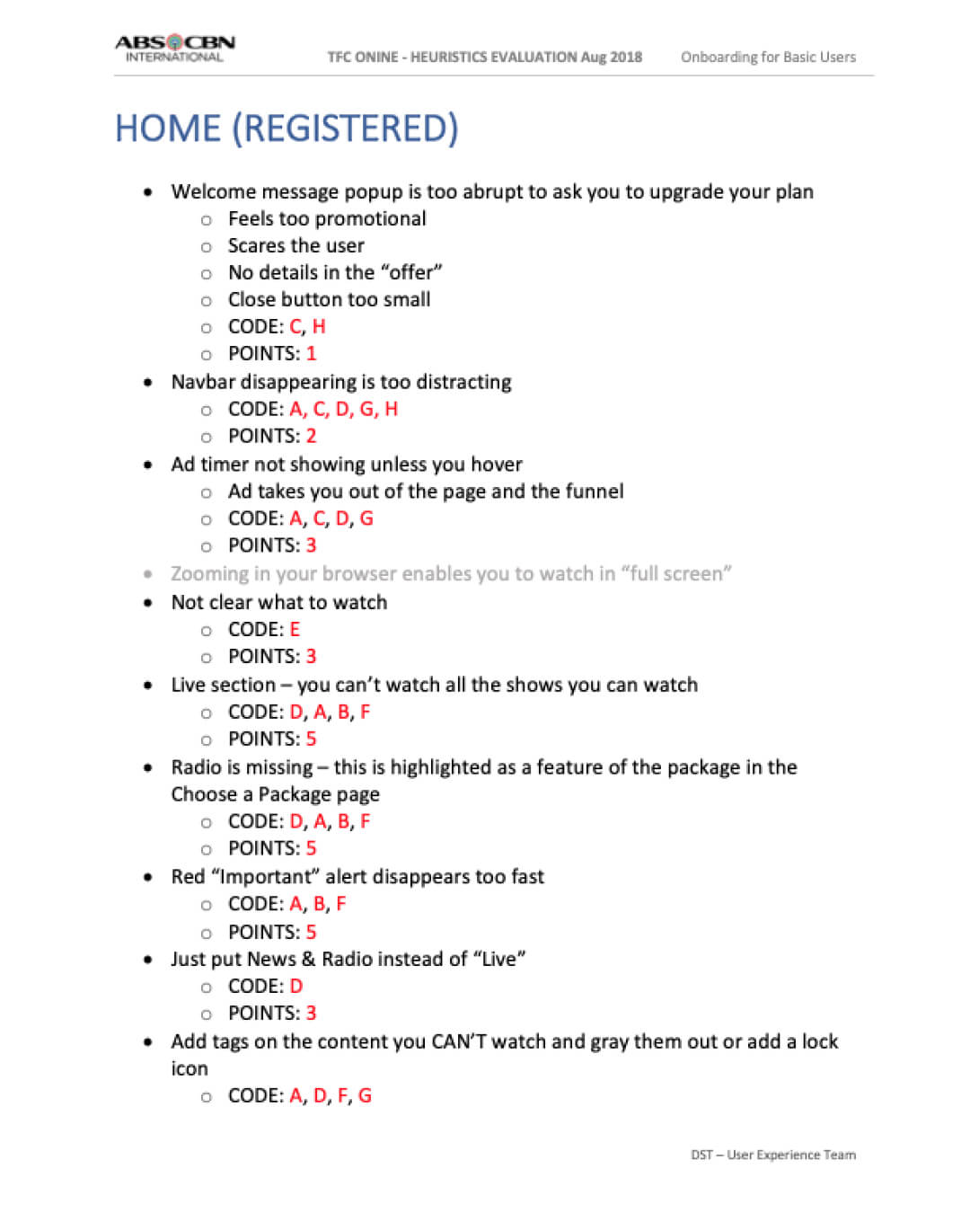
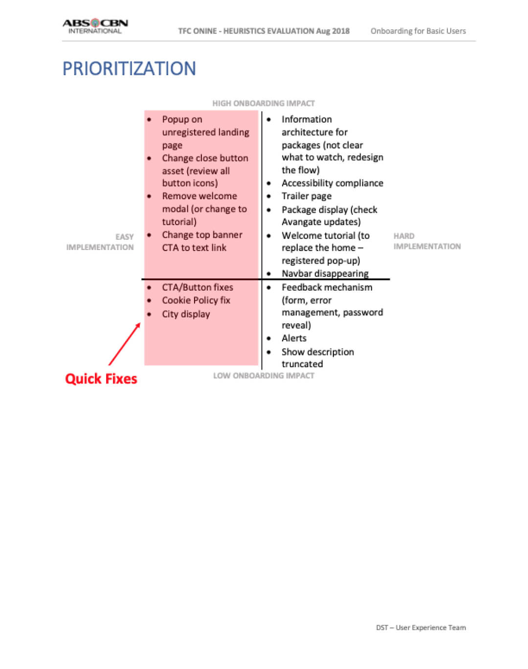
We conducted a heuristics evaluation using Nielsen's Heuristics to identify some quick fixes while we worked on the bigger solution.
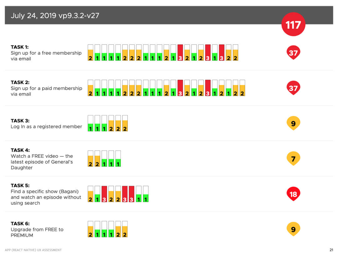
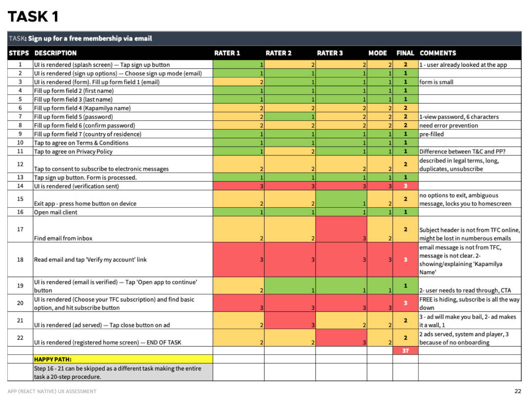
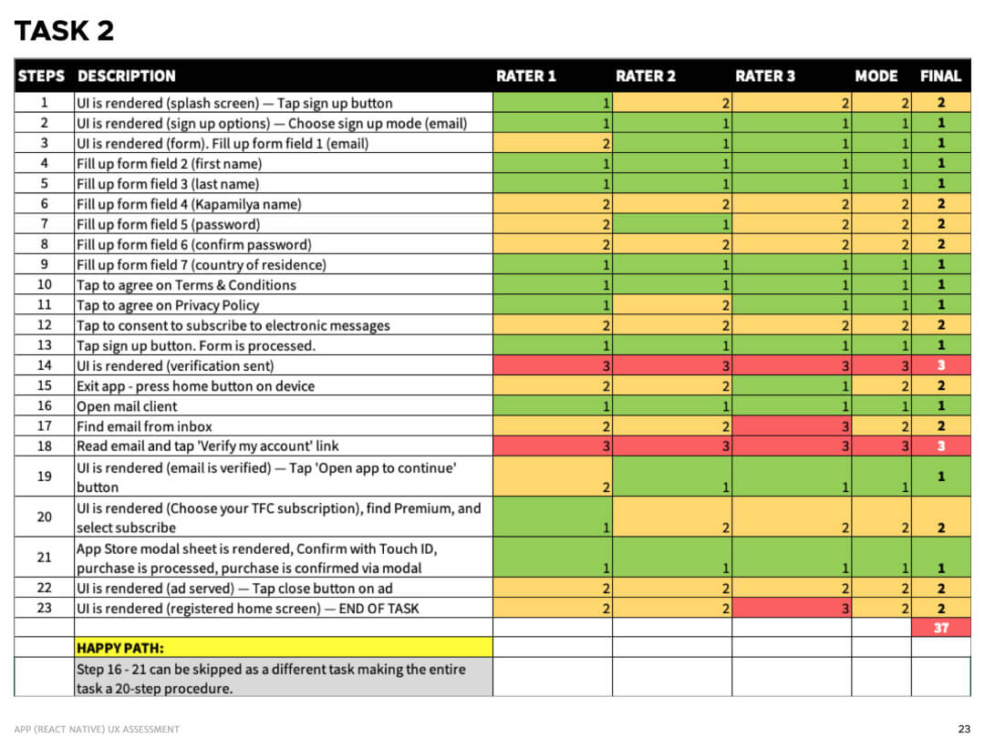
We also assessed some key tasks using the PURE method.
Ideation
We ran several brainstorming workshops with Product Management and Engineering to come up with a good experiment to improve the experience.
Hypothesis
The unregistered homepage was designed to showcase the vast library of content available for the user. We have observed that this leads to user confusion (and frustration) in achieving their primary task of watching a full video.
We believe that changing the unregistered homepage, an anonymous user will see a focus in TFC Online's value proposition, making the start of the conversion process more clear.
Objectives & Key Results
- O: Improve the unregistered homepage to be more focused to the value proposition without frustrating the anonymous users.
KR: This can be measured through an increase registration rate above 10.5% from January's data.
KR: There will be an increase in clicks/taps on the CTA buttons to signal interest in registration - O: Reduce churning after registration by the end of each period.
KR: This can be measured by decreasing the total registrations of a period from become a NEW Basic Inactive user. - O: Improve engagement and retention on Basic (free) members by keeping them active.
KR: Reduce rate from Basic Active to Basic Inactive from previous period.
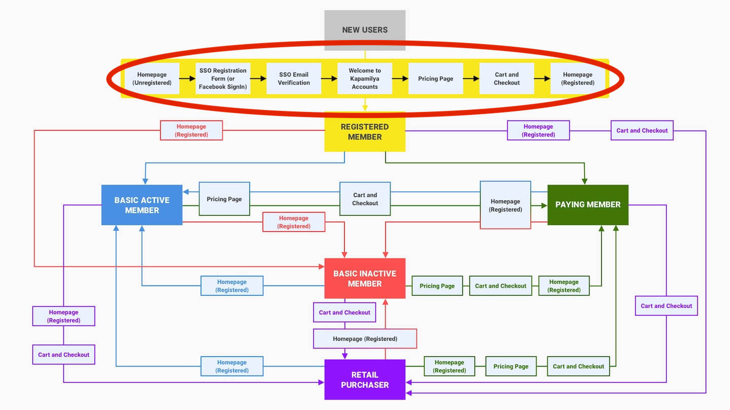
User Flows
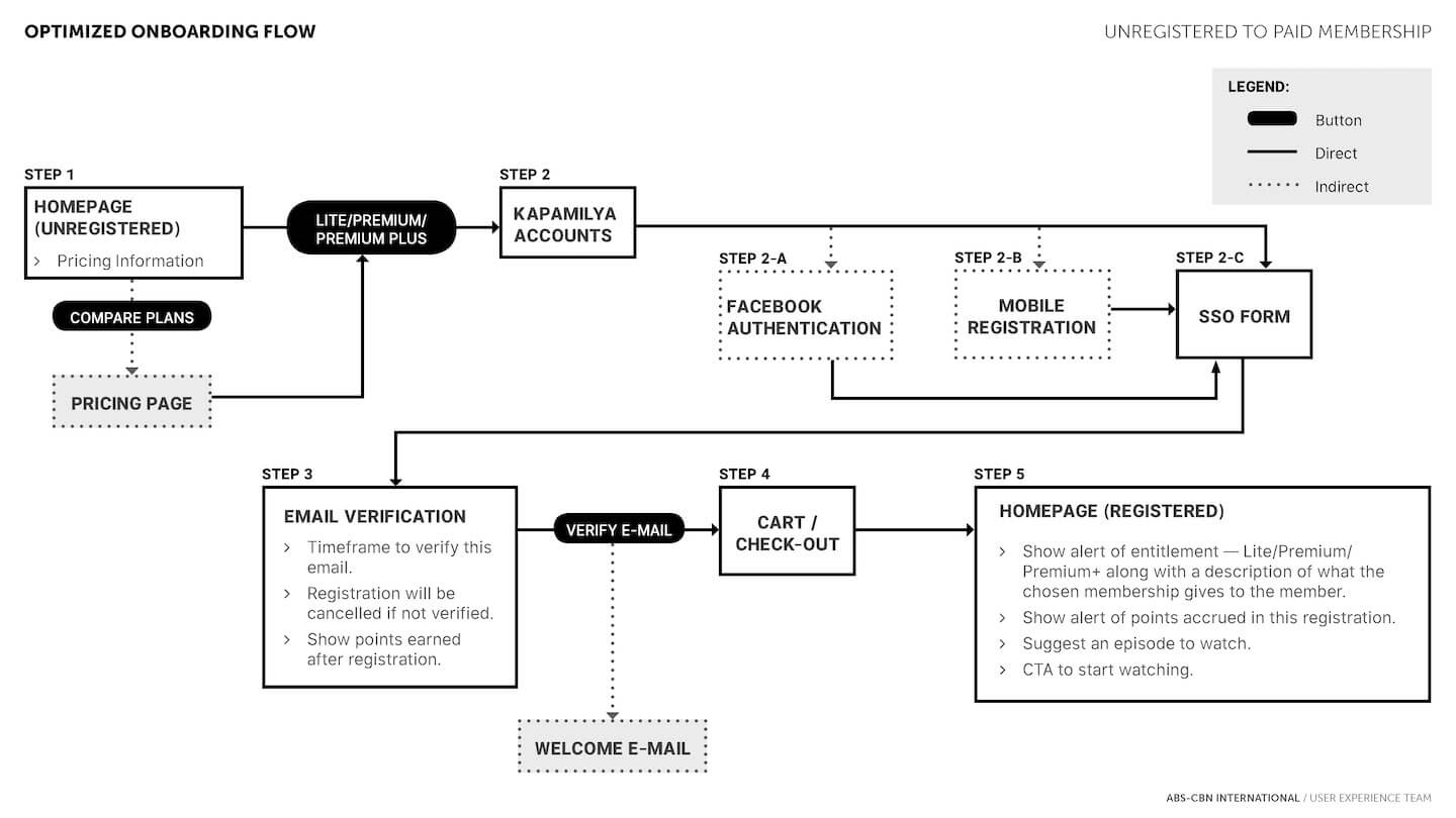
Anonymous Homepage Redesign
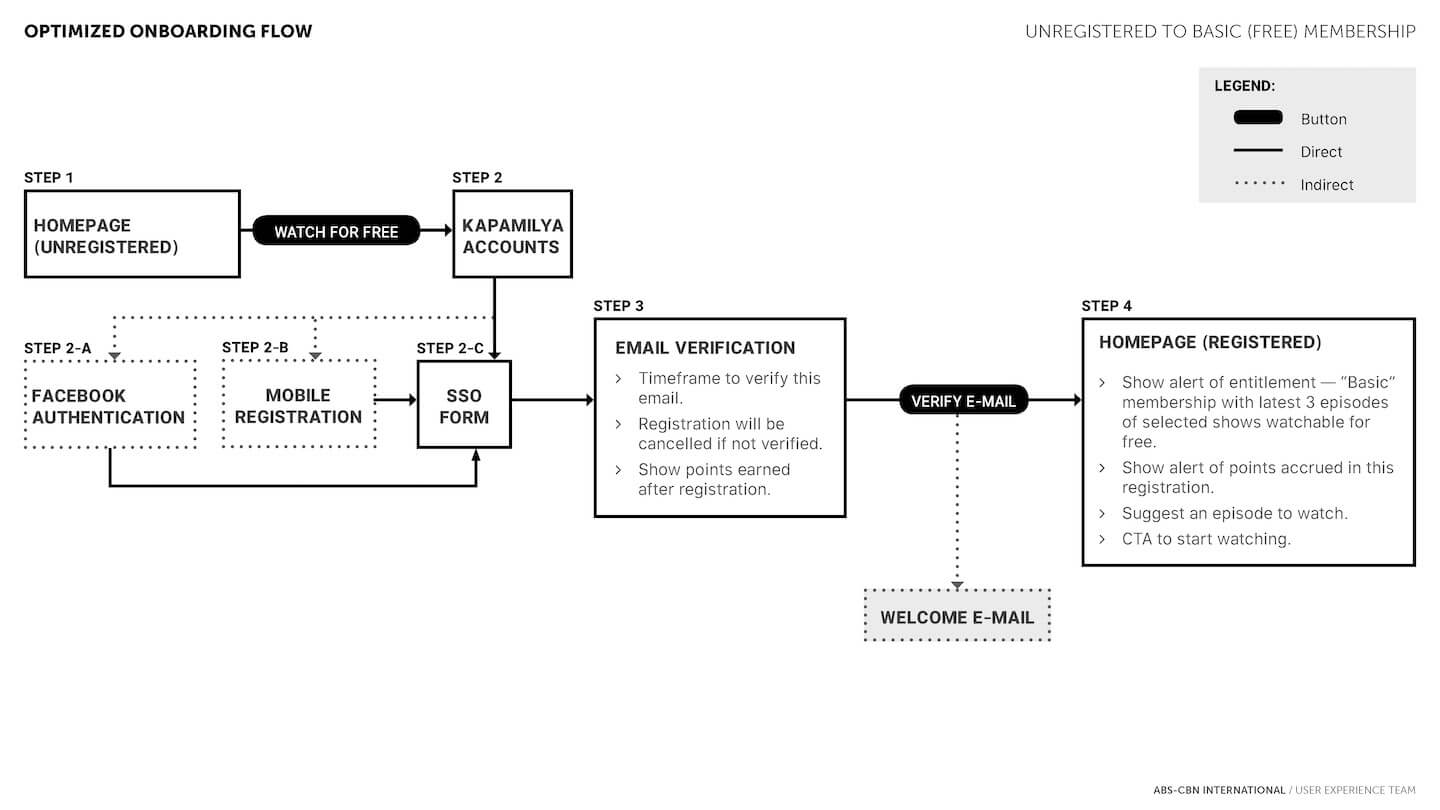
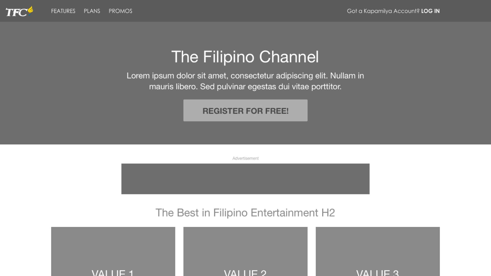
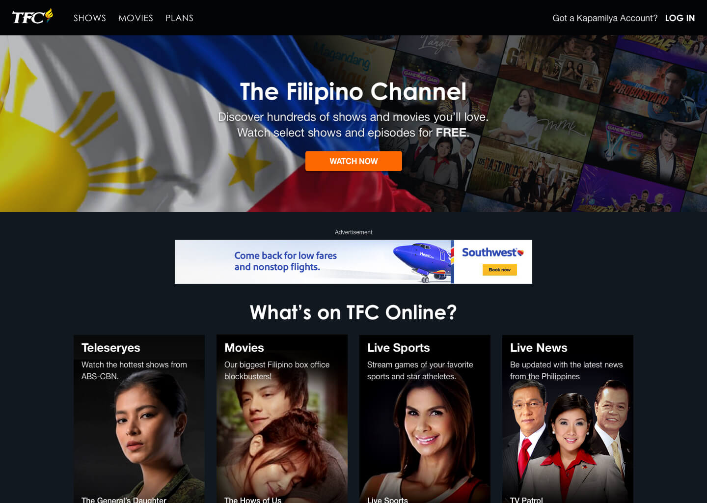
One big change we decided to do is to redesign the anonymous homepage. We chose to shift it towards getting conversions through registrations rather than showcasing all the content available.
We also proceeded to give some attention to a new homepage for anonymous users.
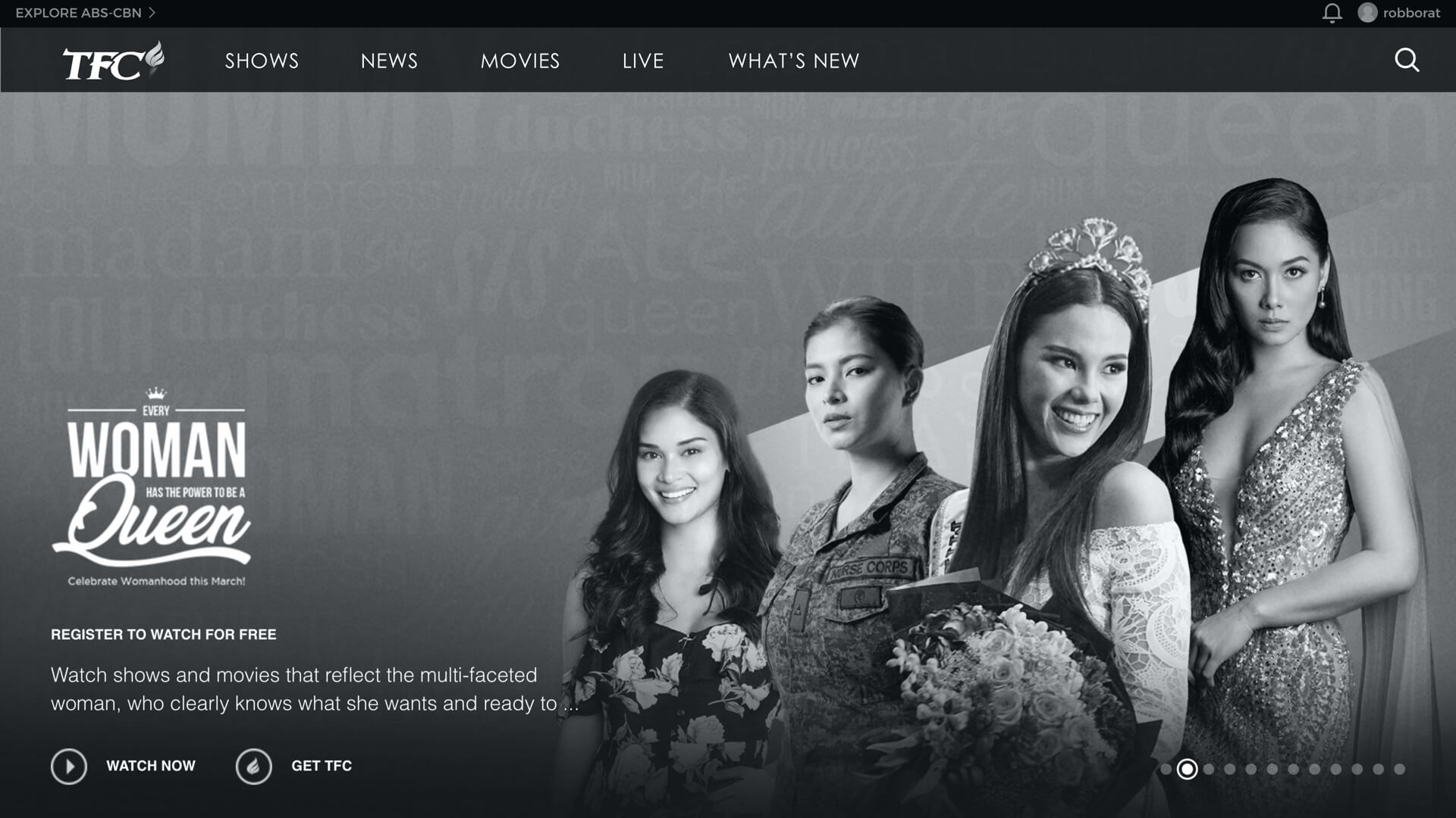
Prototype (Desktop Web)
One version is to get users to watch without signing up. We believe that adding this necessary friction will help users to find free content that's available.
App Screens
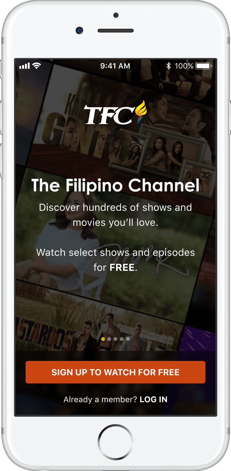
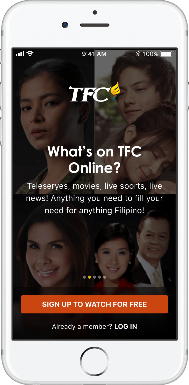
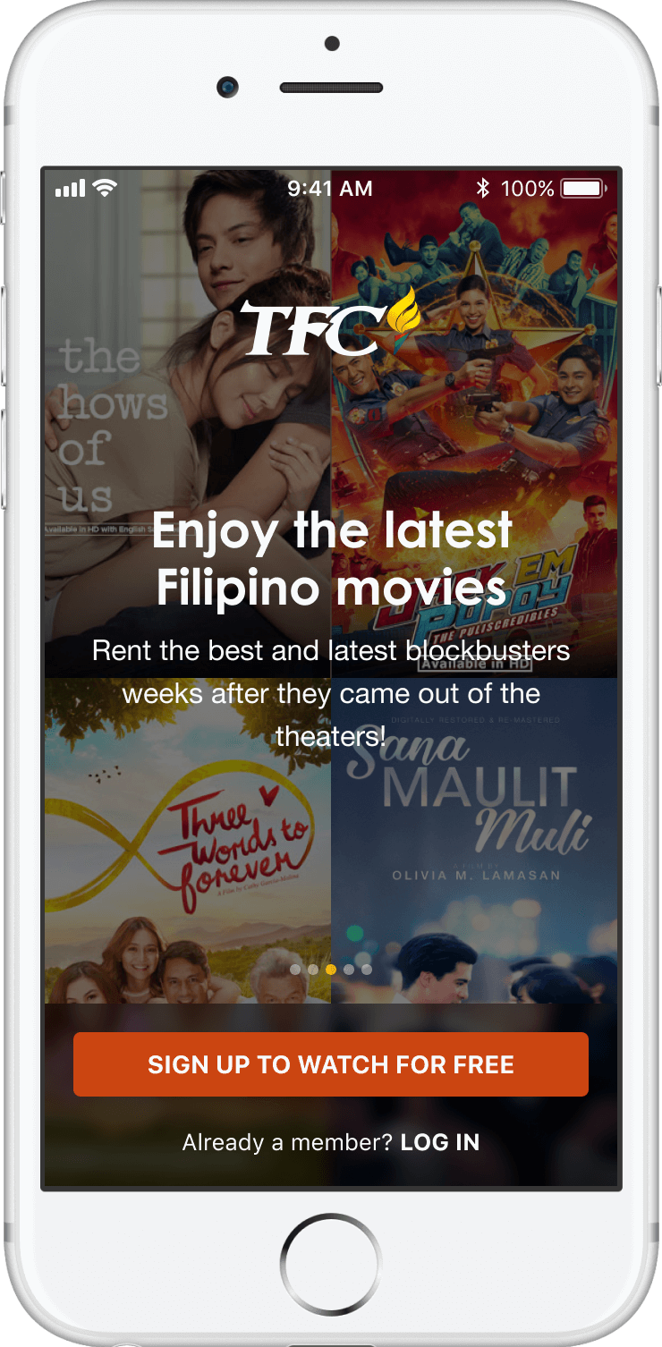
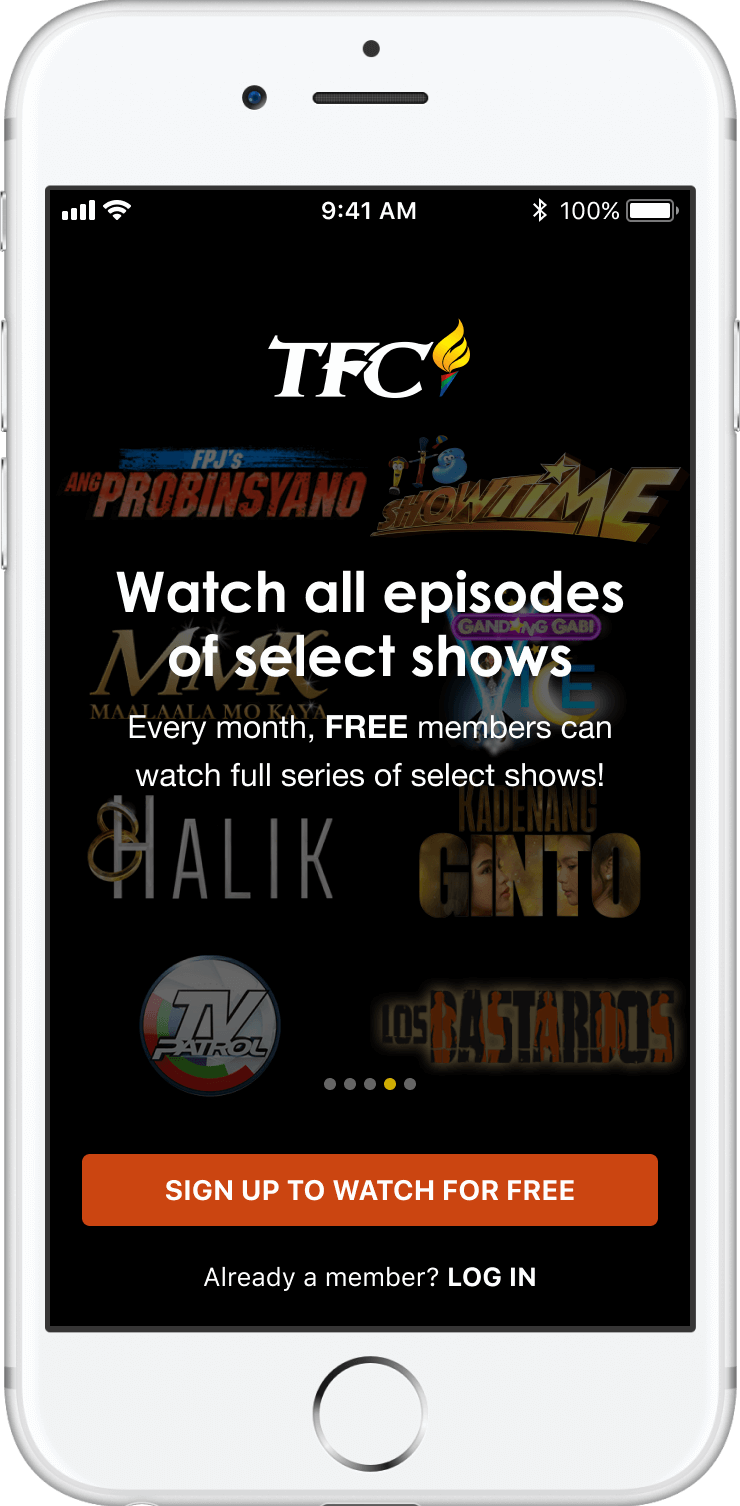
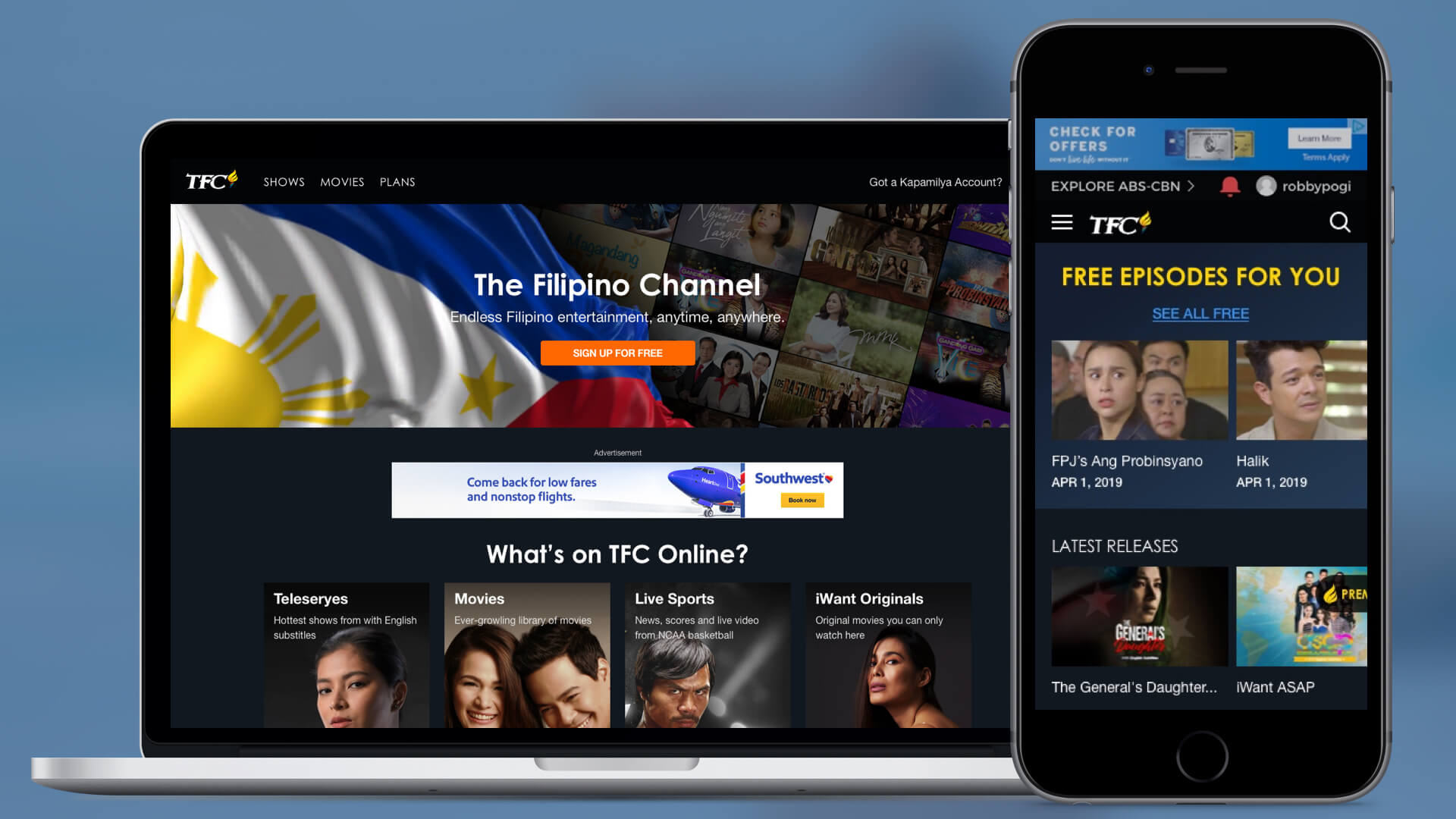
For the native apps, we showcased the different value propositions as a sliding carousel and dynmically highlight the latest and promoted content in the background.
Adoption, Engagement and Retention of a Free Subscriber
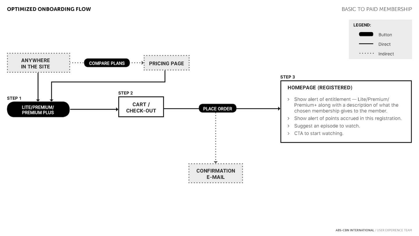
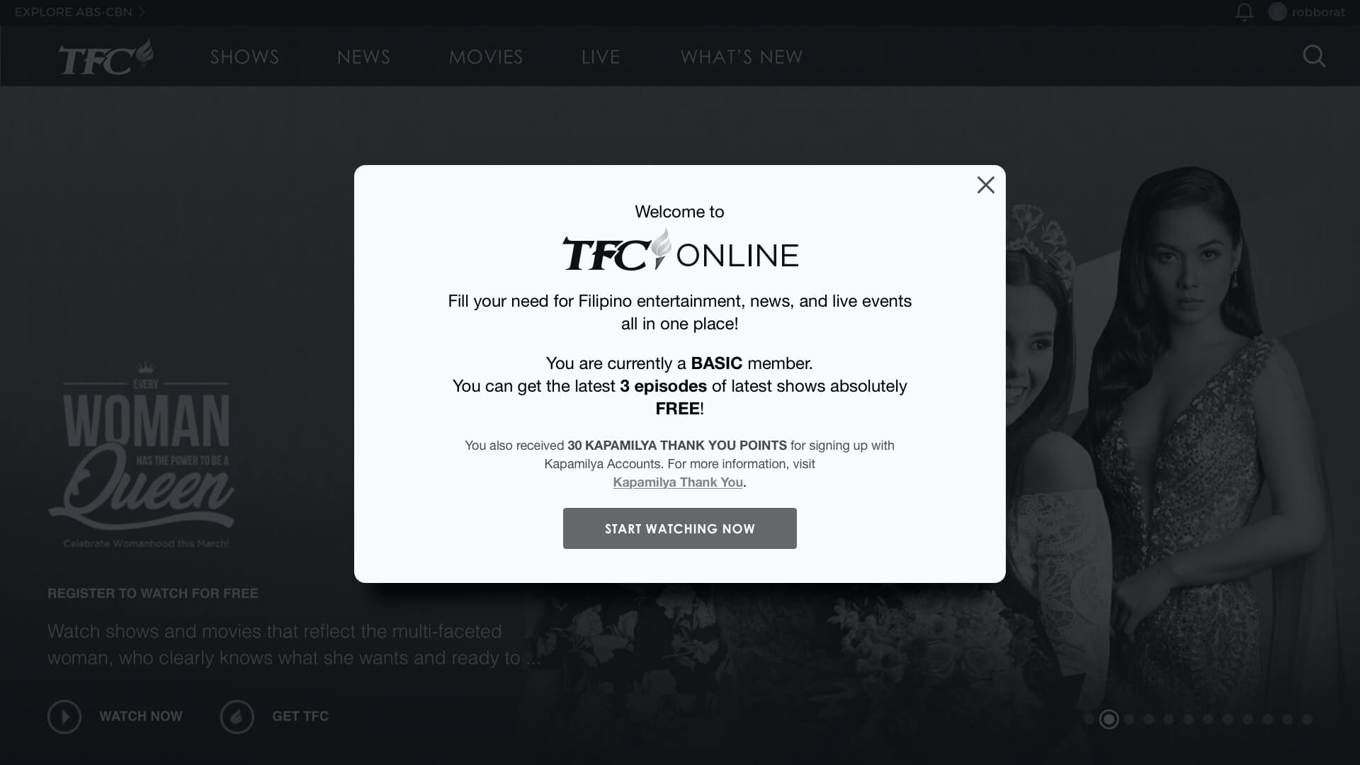
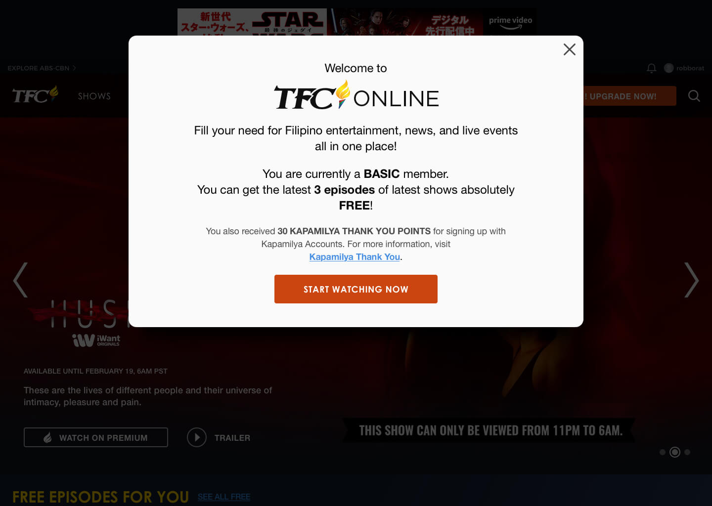
After a new user successfully registers for a Basic/Free subscription, our task was now to help them successfully adopt to the system, engage in the allowed content and make them come back to watch more.
Prototype (Native App)
The native app is re-built entirely using React Native. We intentionally opted to have an "OS agnostic" approach with the design elements such as typeface (not using Roboto or SF Pro fonts), OS-specific app bars, floating action buttons, nav bars, etc.
The trade-off is that our animations and transitions are not as smooth as they would be if developed using Swift (for iOS) and Java (for Android) and we were collectively ok with that.
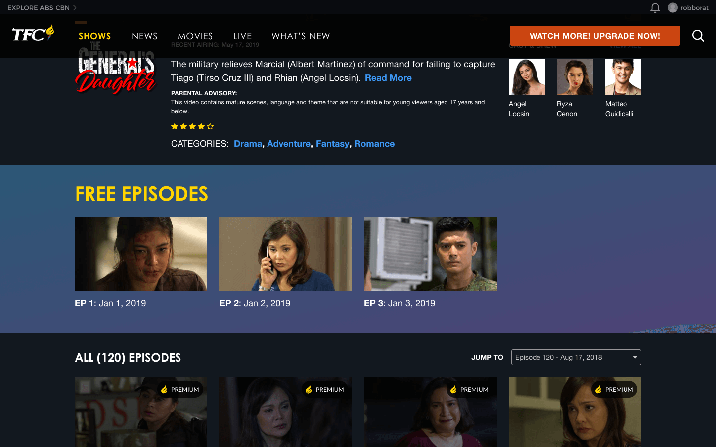
For this prototype, try to sign up for free, find the show called "The General's Daughter" and watch Episode 3.
Results
This project was launched on May 21, 2019 after 6 sprints.
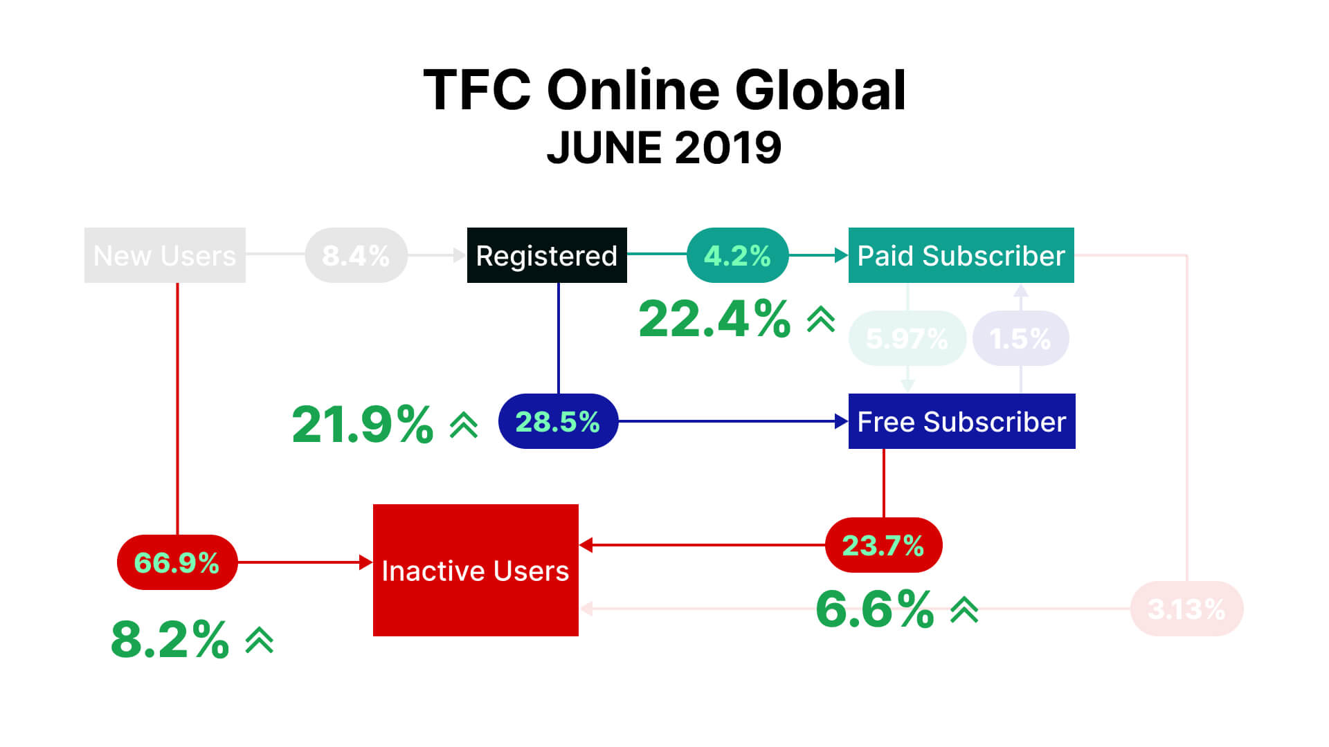
On June 30th, data was gathered to compare from previous period (May 30th). The following insights were gathered:
Registrations are still low. In fact it was worse by 1.4%.
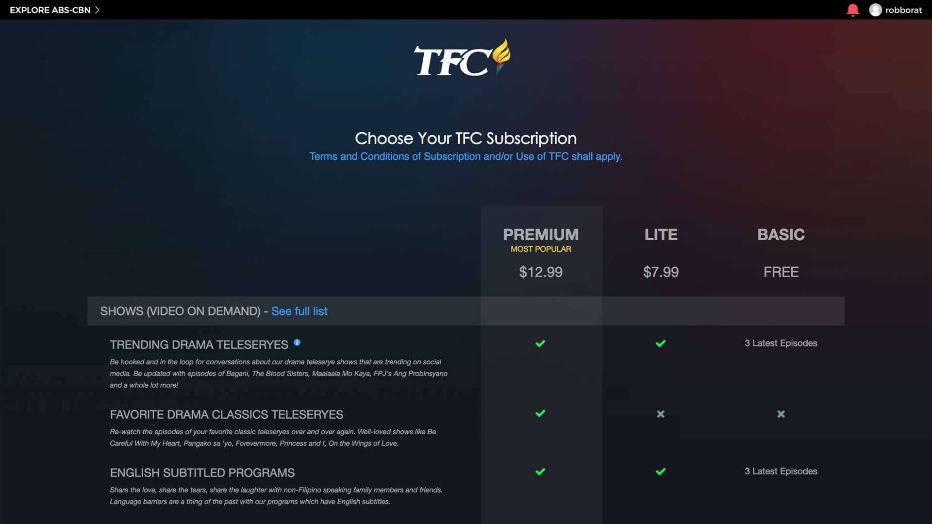
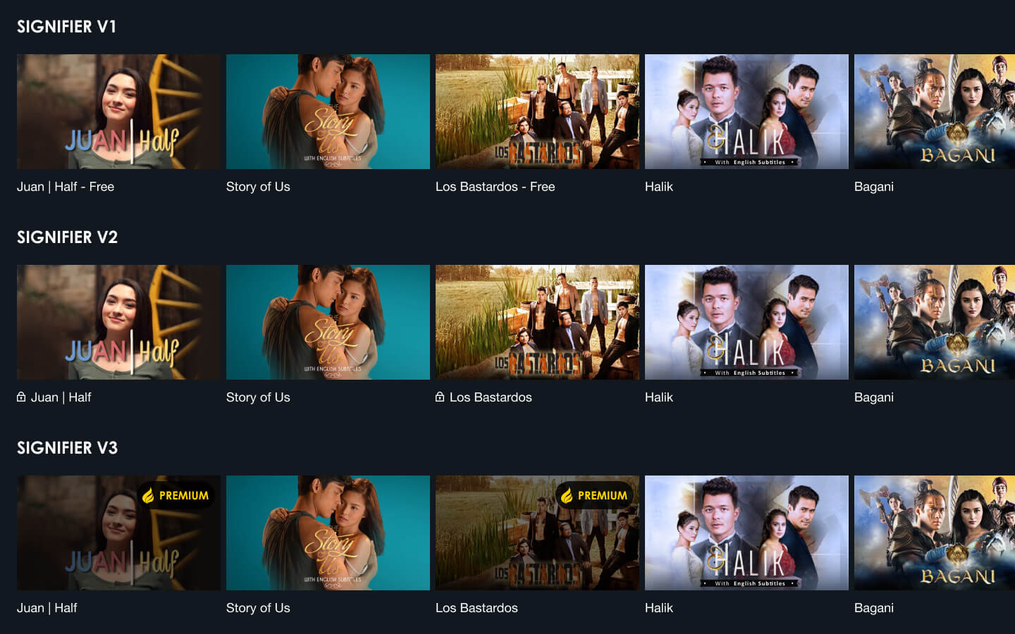
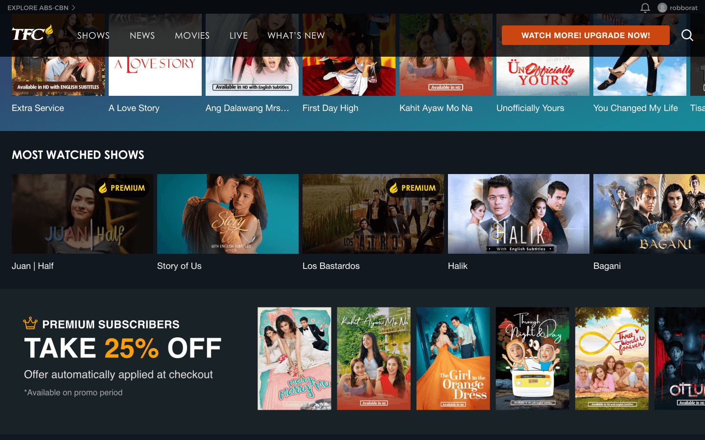
Signifiers to show what FREE content is available to Basic/Free members improved retention by 6.6%.
The new unregistered homepage design improved the adoption rate at the end of the period by 21.9% for Basic/Free and 22.4% for paid members for a total of 5.9%.
The churn rate for June improved by 8.2% by decreasing the total number of registrations to becoming inactive.
With 1 month activity after release to production: 21.9% improvement in retention (new FREE subscriber to active FREE subscriber) = $2.2M/month in ad revenue.
 Robby Torres / Product Designer