Case Study · 02
Opening a new revenue segment
through self-service enrollment design
Sr. Product Designer · Freedom Debt Relief · Low Debt Enrollment · Mobile Web
Freedom Debt Relief had a segment problem: customers with $1,500–$7,500 in unsecured debt were consistently routed out to third-party providers. The business was leaving a reachable audience unserved — and the design question was whether a fully self-service digital flow could replace the agent-led process that made the traditional program work.
As lead IC on this initiative, I owned the end-to-end design — from problem framing and flow architecture through three rounds of ideation, prototype testing, and handoff. The work introduced a "tiny rewards" interaction model: a progressive value reveal pattern designed to maintain motivation and trust through one of the most cognitively demanding enrollment flows I've designed.
The product shipped after I left the company. First-release data confirmed the flow's most important hypothesis while exposing a structural assumption that required re-architecture in the next iteration.
Note: The work shown reflects my design direction and closely matches the released version.

The Opportunity
Every prospective customer entered through Freedom Debt Relief's lead flow — a qualification sequence that assessed debt profile and routed users into the appropriate program. Customers with debt below $7,500 were outside the threshold for the core service and had historically been referred out to third-party providers.
That referral wasn't neutral. It meant the company absorbed acquisition costs for a lead it couldn't monetize, and it meant customers in genuine financial distress walked away without help. The product hypothesis was straightforward: a leaner, self-service enrollment flow could serve this segment profitably — if we could get users through it without an agent.
Why self-service was the right bet
The traditional FDR enrollment relied heavily on live consultants. That model worked for high-value customers — the economics justified the cost. For lower-debt customers, the margin was too thin for agent involvement at scale. Self-service wasn't just a product preference; it was the only viable path to making this segment work as a business.
Hard constraints from day one
The initiative came with meaningful non-negotiables that shaped the design from the start:
- No account creation in V1. Progress would be preserved through cookies and a return link sent via email and text — a decision that turned out to be load-bearing for the outcome.
- Visual continuity with the existing lead flow. We weren't building a standalone product; this was a new branch of an existing funnel, and the UI had to feel seamless from qualification to enrollment.
- Strict compliance requirements. Legal and Underwriting defined the minimum required disclosures and data collection. Design had to make those moments feel like part of the journey, not interruptions.
The User Problem
Lower debt balance doesn't mean lower financial stress. The users we were designing for had $1,500–$7,500 in unsecured debt — an amount that sounds manageable but often represents months of minimum payments with no visible end. Many had already tried budgeting, balance transfers, or payment plans. They were motivated, but cautious.
The trust gap was the primary design problem
Enrolling in a debt relief program without speaking to anyone requires a specific kind of trust — in the company, in the process, and in the outcome. Agent-led enrollment addresses that trust gap through conversation: a consultant can read hesitation, answer questions in real time, and adjust tone to match the customer's emotional state. A digital flow can't do any of those things. It has to earn trust through structure, transparency, and pacing.
What research told us about this user
- They wanted control, not convenience. Survey and feedback data showed that a meaningful segment of lower-debt customers actively preferred not to speak with an agent. The phone call itself was a friction point — not a reassurance.
- The cognitive load was genuinely high. This wasn't a form. Users had to understand the program model, evaluate tradeoffs against alternatives, enter sensitive financial data across multiple steps, and review legally required contract terms — all in a single mobile session.
- Being turned away was a pain point, not a neutral outcome. Customers who reached the end of the lead flow and got referred out felt rejected. Many didn't return. Designing a path that acknowledged their situation and gave them a clear way forward was itself a product improvement.
The design challenge wasn't digitizing an agent conversation. It was building enough structure, guidance, and earned trust to carry a financially stressed user through a complex task — on their own, on a phone, in one session.
Framing the Problem
Defining the primary user
The target customer had $1,500–$7,500 in unsecured debt, a steady income, and was falling behind on minimum payments. They understood their situation was serious but hadn't yet taken formal action. This wasn't a naive user who didn't know what debt relief meant — it was a cautious, moderately informed user who needed the process to feel credible enough to trust with their SSN, bank account information, and financial history.
Success metrics — and what they were actually measuring
We set explicit targets before design work began. These weren't just launch criteria; they were hypotheses about how the interaction model would perform.
Four design principles to guide every tradeoff
- Make progress visible at all times. Users in a long, unfamiliar flow need a persistent sense of location and completion. Every screen needed to answer: where am I, how far have I come, and what's left?
- Reward effort before asking for more. The pattern of ask → deliver value → ask again — rather than front-loading all data collection — was the core interaction bet of this project.
- Explain before you collect. Sensitive fields (SSN, bank account, income) required contextual framing before the input appeared. The goal was informed entry, not reluctant compliance.
- Use wait states productively. Contract generation created unavoidable latency. That dead time was an opportunity to build trust, not burn it with a spinner.
Ideation
We explored three distinct flow architectures before converging. Each iteration tested a different theory about where in the experience trust was built — and where it was most likely to break.
Version 1 — Eliminate Alternatives First
This approach led with a qualification sequence that systematically ruled out competing debt solutions before recommending the program. The theory: if a user has already considered and dismissed other options, the recommendation carries more weight. In practice, the disqualification framing felt interrogative and increased perceived risk before the user had seen any value. It created commitment pressure before establishing trust.
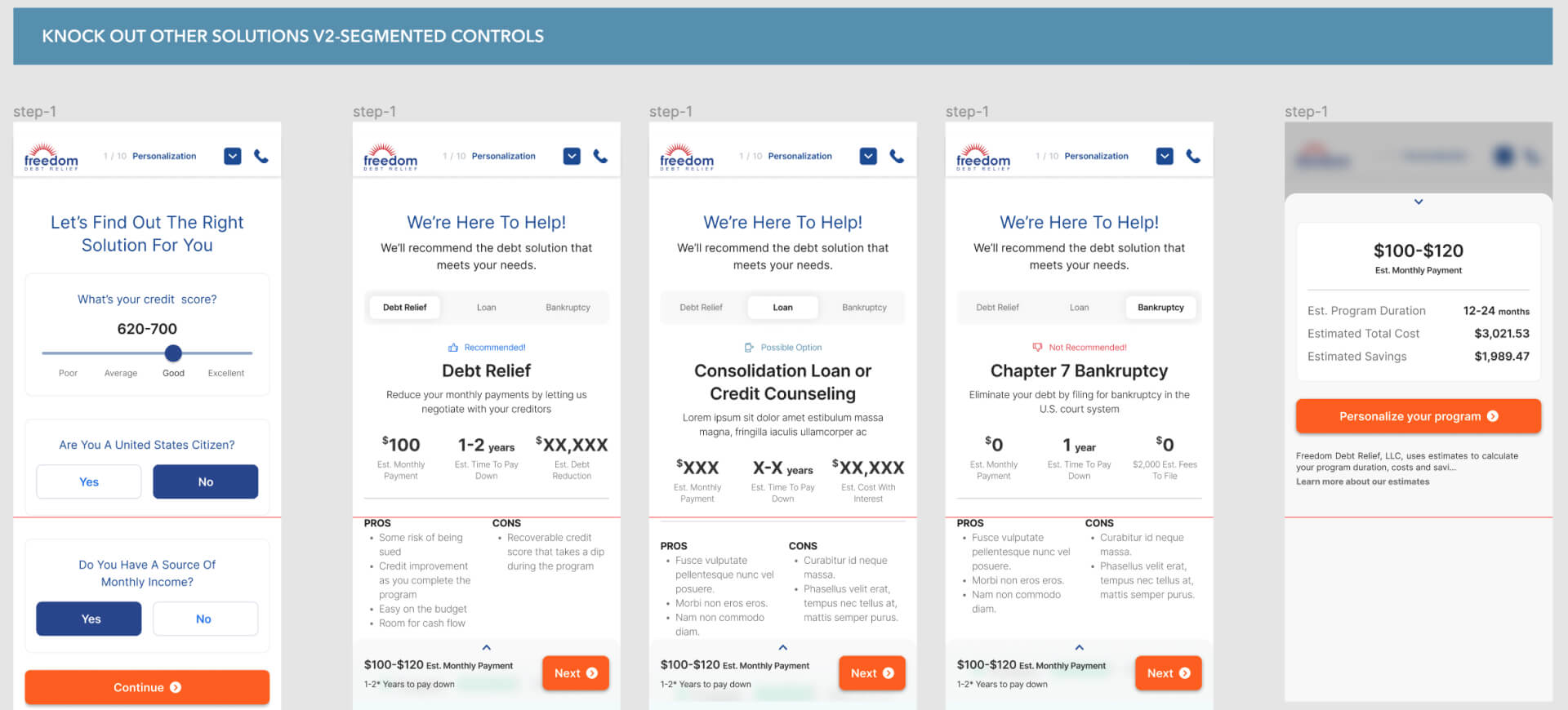
Version 2 — Show the Solution First, Then Personalize
This direction reversed the sequence: show the full program upfront, then guide the user through customization. The theory was that transparency early in the flow would front-load the trust-building work. What we found was the opposite — when users saw the full scope of the enrollment process before they'd invested any effort, perceived complexity increased and motivation dropped. Knowing everything you have to do is not the same as feeling capable of doing it.
Version 3 — Tiny Rewards
The strongest direction emerged from a simple reframe: instead of asking users to trust the program before they'd experienced it, design the enrollment itself as a sequence of trust-building moments. The model: ask for meaningful input → immediately return a more personalized, improved outcome → repeat. Each reward was directly tied to the effort that preceded it, creating a clear value exchange at every major step.
This wasn't gamification. It was an honesty mechanism — a way to show users that the information they were sharing was making the program more real and more useful in real time, not disappearing into a form.
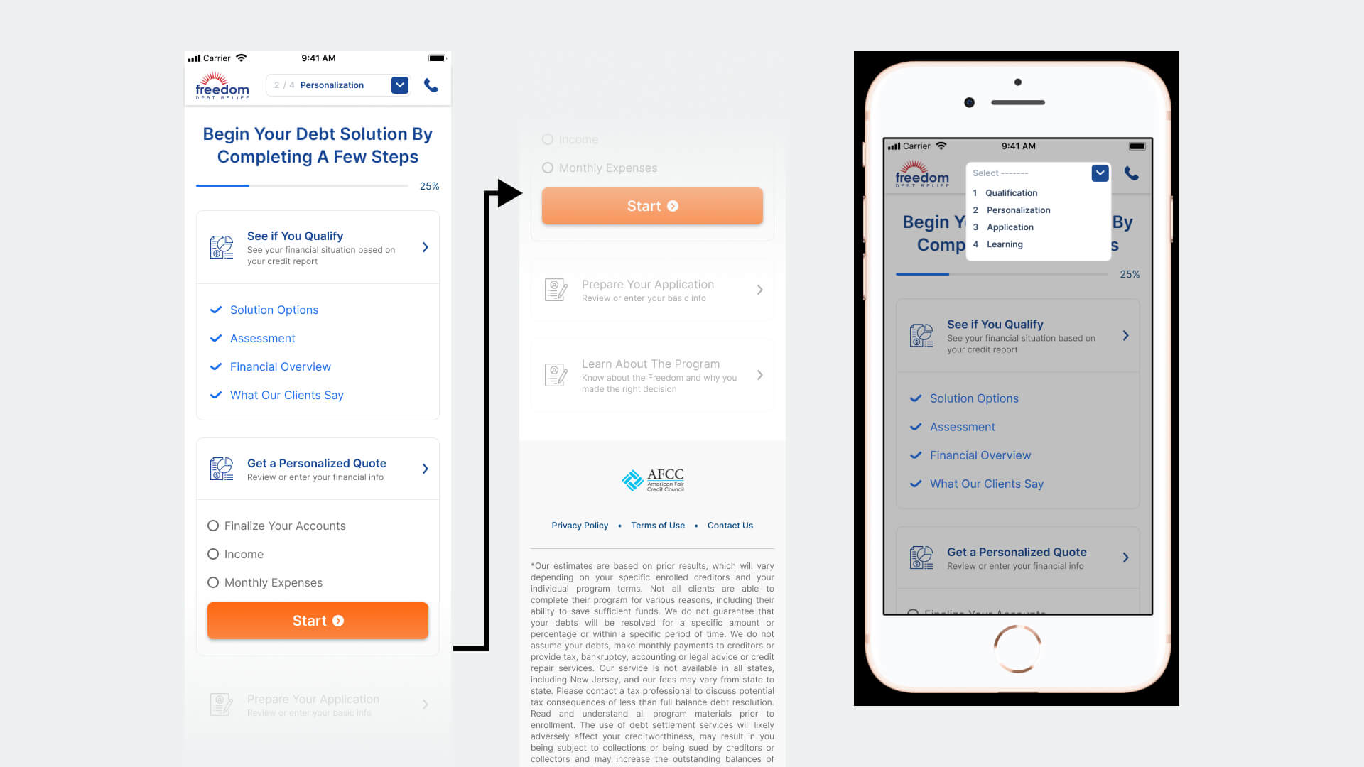
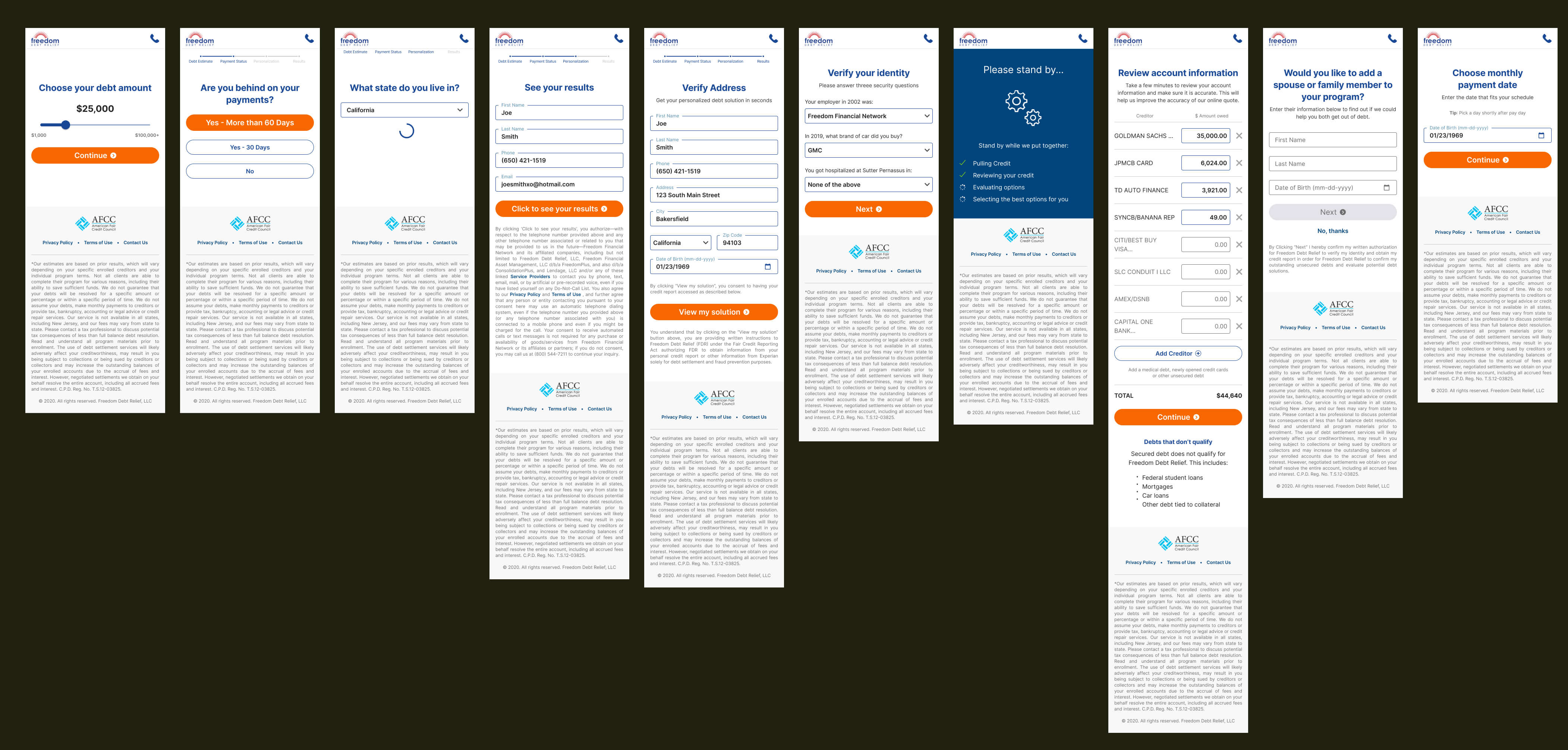
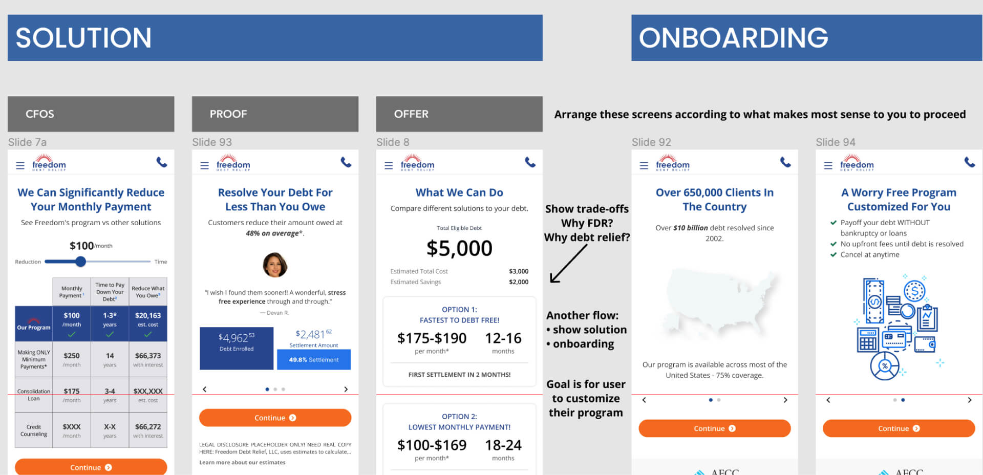
Final Flow
The final enrollment flow was structured around four sequential phases: qualification, personalization, application, and learning/signature. Each phase had a clear job: collect what was needed, return visible value, then create a bridge to the next step. The transition between phases was never passive — every major handoff was a deliberate trust moment.
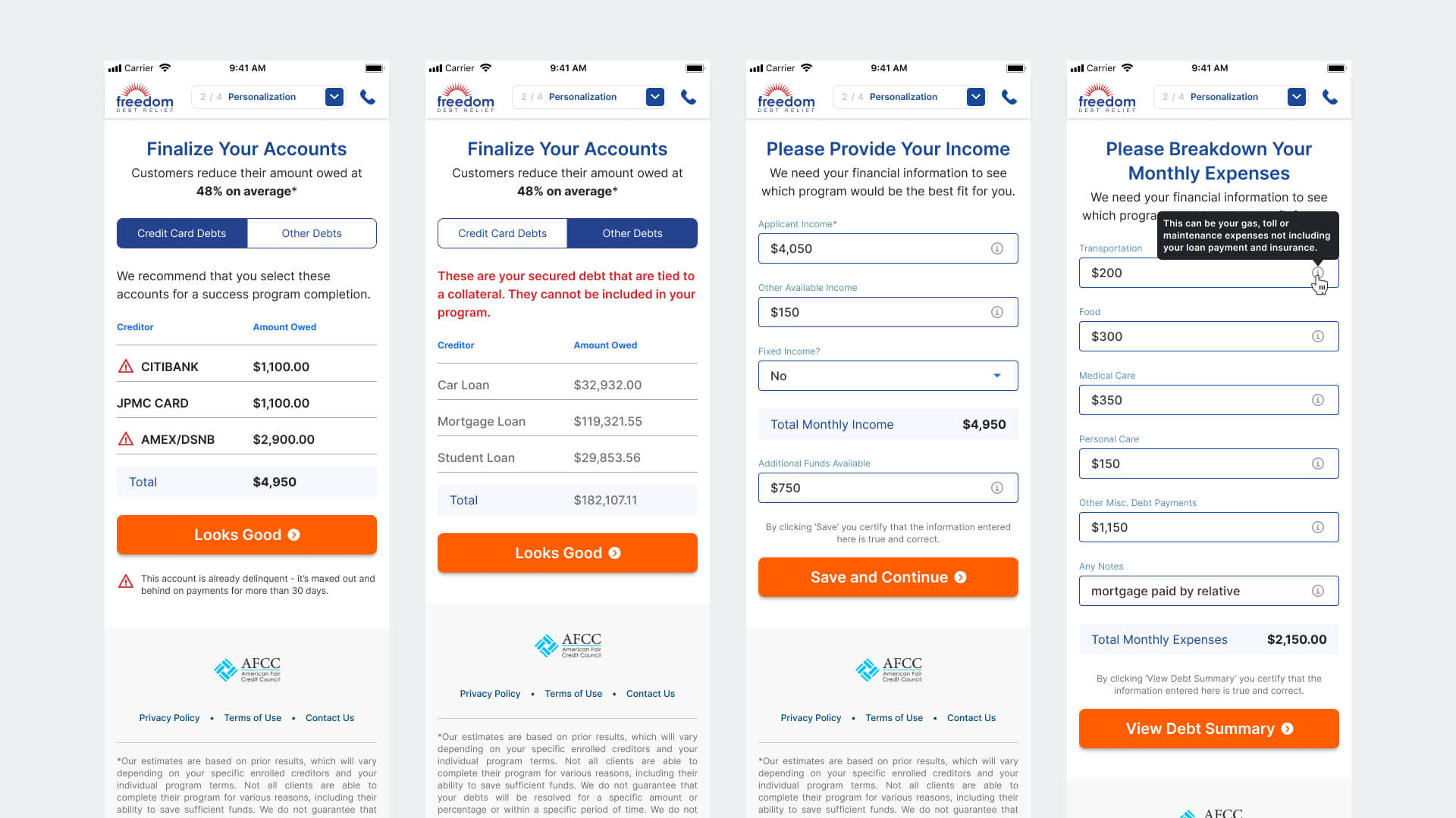
Phase 1 — Personalize the Plan
Users reviewed their pre-pulled debt data, entered income and monthly expenses, and received inline guidance for fields that most commonly caused hesitation or error — particularly SSN and bank information, where a single wrong entry could stall completion. Contextual tooltips and field-level explanations were not nice-to-haves; they were load-bearing for this user's willingness to continue.
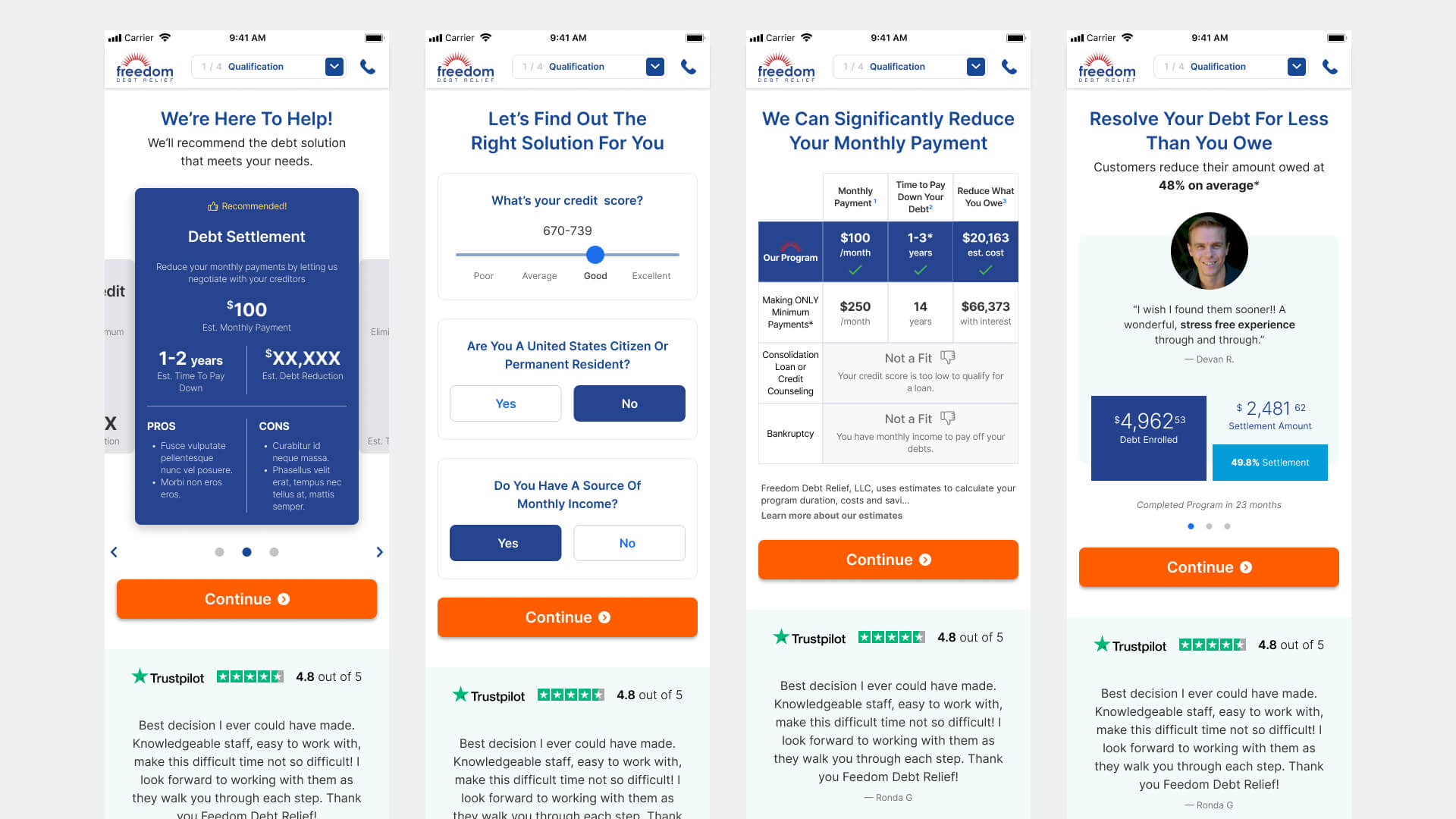
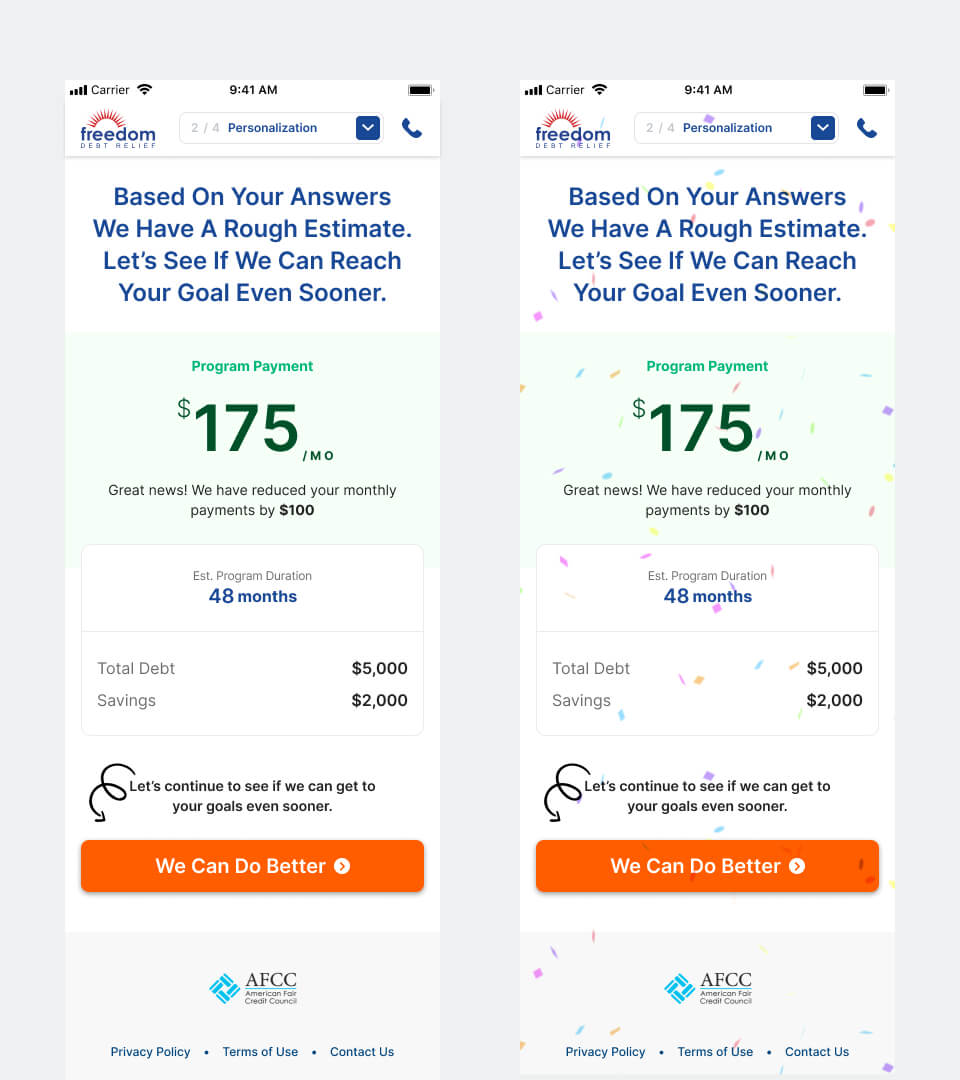
Phase 2 — Show Meaningful Rewards
After each major data-entry block, users received a reward tied directly to what they'd submitted. Entering income produced a lower estimated monthly payment. Completing the full profile surfaced the first two credit card accounts that could potentially be resolved through the program. These weren't generic marketing moments — they were personalized outcomes made possible by the user's own input, visible in real time.
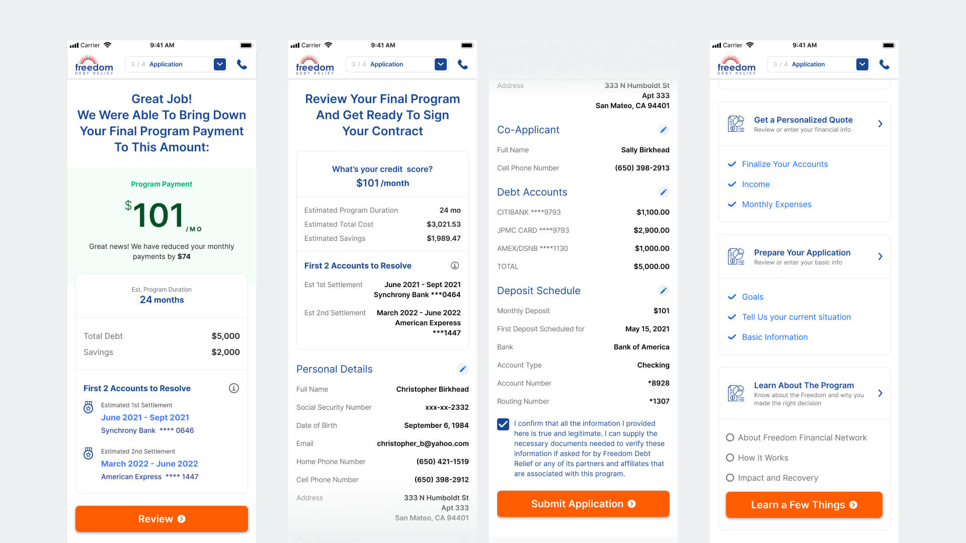
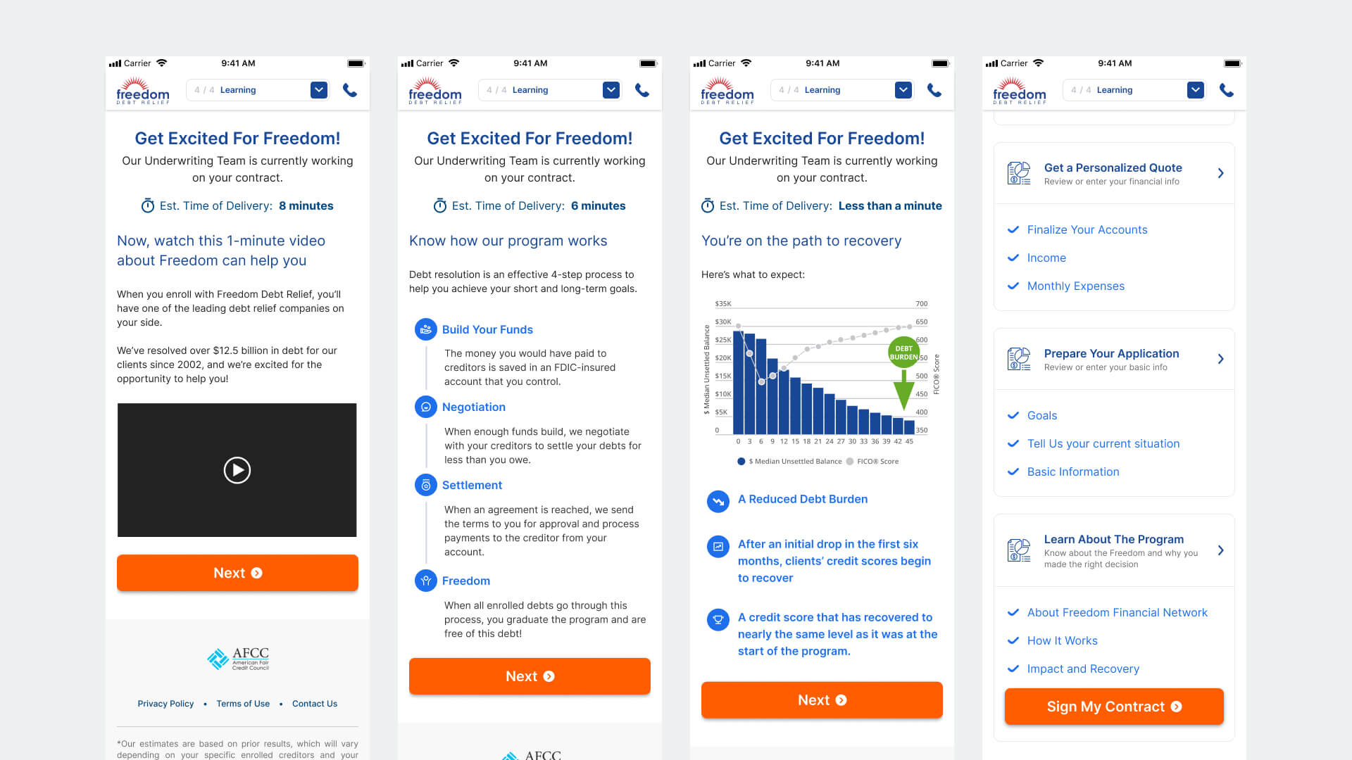
Phase 3 — Use Wait States to Build Trust
Contract generation introduced an unavoidable delay — a dead zone that many flows handle with a generic loader. We treated it as a productive design moment instead. While the contract was being prepared, users moved through a lightweight education sequence covering how the program works, what to expect in the first 90 days, and a live countdown of their estimated delivery time. By the time the contract was ready, users had a clearer mental model of what they were signing — which meaningfully reduced the cognitive load at the most sensitive step.
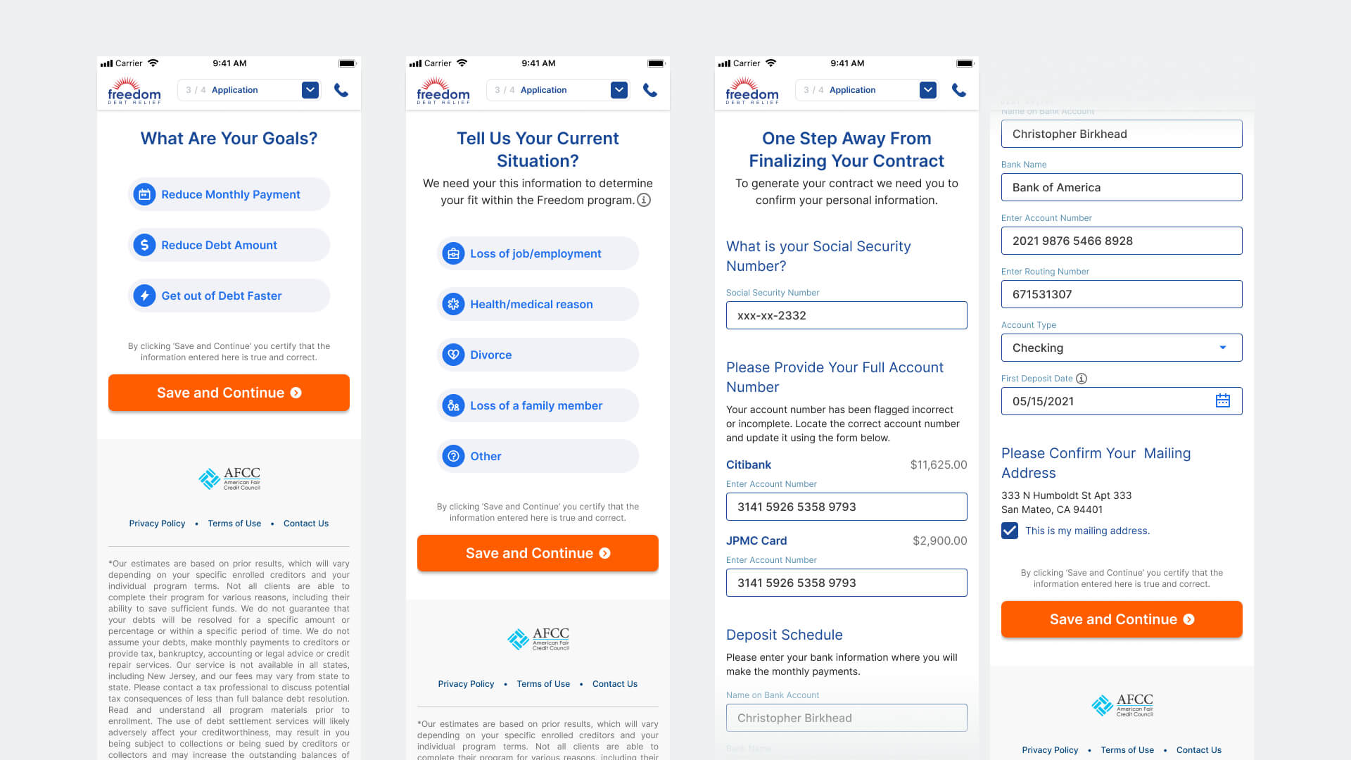
Phase 4 — Complete Enrollment
The final phase guided users through contract review, electronic signature, and confirmation. The confirmation state was designed with deliberate care: this was the first moment the user had formally enrolled in the program, and it needed to feel like a meaningful transition — not just a success screen. Clear next steps, a summary of what was submitted, and explicit guidance on what would happen within the next 24 hours gave users confidence they hadn't just pressed a button into the unknown.

Prototype & Validation
We built a high-fidelity mobile prototype for usability testing before committing to engineering. The primary hypothesis under test was whether the progressive rewards model would generate sufficient motivation for users to complete the full enrollment flow — specifically through the two highest-drop moments: the SSN/bank data entry block and the contract review step.
Secondary validation focused on whether the dashboard's visible progress model reduced anxiety during the longer mid-flow sections, and whether the wait-state education sequence improved comprehension scores at the contract stage.
Results & Learnings
The product shipped after I left Freedom. I stayed in contact with the team and tracked the first-release data closely. The results were mixed in a specific and instructive way: the interaction model performed; the structural assumption it was built on did not.
What the data actually said
- The 84% CTR on the second reward page validated the core interaction bet: progressive value reveal kept engaged users moving. Users who got that far were not dropping — they were motivated by the reward pattern and wanted to continue.
- The 78% return-via-email-link rate was the most significant signal in the dataset. It didn't mean 78% of users needed more time to think. It meant the enrollment was too cognitively demanding to complete in a single mobile session — and users were treating the email link as an explicit save mechanism. We designed for single-session completion; users needed multi-session support.
- The 2.8% completion rate — well below the 10% target — was a direct consequence of that mismatch. Users who left without an account had no reliable path back. The cookie-based progress preservation wasn't sufficient. Every session break was a potential permanent abandonment.
What this meant for the next iteration
- Account creation needed to move earlier in the flow — not at the end as a confirmation mechanism, but at the point users demonstrate intent to return. It's the only way to make multi-session completion viable at scale.
- The flow architecture assumed single-session behavior because V1 constraints prevented account creation. That constraint was reasonable to accept for a first release — but it should have been framed explicitly as a known risk in the success criteria, not discovered in the data.
- A complex financial enrollment on mobile is a multi-session product by user behavior, regardless of how we design it. The right design question was never "how do we make users finish in one session" — it was "how do we make returning as frictionless as starting."
The first release reached statistical significance within one month and established the design foundation for a second iteration focused on persistent accounts, saved progress, and a multi-session completion model.