Case Study · 04
Building a 0→1 social product
from thesis to App Store
Co-Founder & Lead Designer · Ripple Goals · iOS · 2017–2019
Most goal-setting products are built around private tracking. Ripple was a bet on a different model: that accountability, community, and visible progress were the actual mechanics of follow-through — not better to-do lists.
As co-founder and lead designer, I owned the full product design lifecycle — from the original concept and business thesis through personas, user flows, a lightweight design system, prototype testing, and four iOS release iterations. There was no existing product to inherit and no design team to delegate to. Every strategic and craft decision was mine to make and defend.
The product shipped publicly, ran for two years, and ultimately didn't achieve the retention needed to sustain it. What it produced was a precise understanding of where the thesis held, where it broke, and what I would do differently — the kind of clarity you only get from owning something end-to-end and watching it perform in the real world.
Origin & Thesis
Ripple didn't start with a consumer product idea. It started with an observation. I'd built a private web-based personal development platform for a sales and operations team, and after it launched, something unexpected happened: employees began organically gravitating toward goals that overlapped with their colleagues'. They weren't prompted to. The visibility itself created accountability — and that accountability was generating real follow-through.
That behavior was the seed of the product. If social visibility was doing motivational work that private tracking tools couldn't, it was worth testing whether that dynamic could scale beyond a single team into a consumer product.
Product thesis: the gap between intention and follow-through isn't a willpower problem — it's a structural one. People don't lack motivation; they lack visibility, accountability, and the social reinforcement that makes progress feel worth sustaining.

The Problem Space
The goal-setting app category in 2017 was saturated with private productivity trackers — apps optimized for logging, streaks, and reminders. The dominant assumption was that the right interface for goal progress was a checklist or a calendar. We believed that framing missed the actual behavioral problem.
Private tracking doesn't create accountability
An app that only you can see creates no external commitment. Without accountability to someone or something outside yourself, the cost of abandoning a goal stays near zero. The friction of starting isn't the problem — the friction of continuing is. Most goal apps were solving for the first day, not for day 30.
The design challenge was emotional, not functional
The harder problem wasn't building a goal-tracking interface. It was designing a social experience that made sharing progress feel low-pressure and genuinely motivating — not performative, not judgmental, not another place to feel behind. The wrong social mechanics could make the problem worse. Public failure in a goal app carries real emotional cost, and that cost would prevent users from posting progress at all.
The core design question
How do you design a social product around personal goals in a way that generates accountability and momentum without replicating the judgment and comparison dynamics that make public social media feel exhausting?
Success signals we designed toward
- Activation: onboarding completion rate and percentage of users who joined or created a goal in their first session
- Engagement: goals joined, Moments posted, Motivate actions taken, and repeat session rate
- Completion: goals marked achieved, and the rate at which users started a new goal after completing one — the strongest signal of genuine value
Discovery
Before moving into design, I ran a fast discovery sprint to pressure-test the thesis and establish a shared model for who we were building for. With a two-person founding team and no research budget, the methods had to be fast and high-signal: persona development from behavioral archetypes, user flow mapping to scope the first release, and qualitative conversations to surface what motivated each user type.
Four motivation archetypes
The personas weren't demographic profiles — they were motivation models. Each one represented a different answer to the question of why someone would share a personal goal publicly, which directly informed the design decisions around visibility controls, social mechanics, and the language of the product itself.


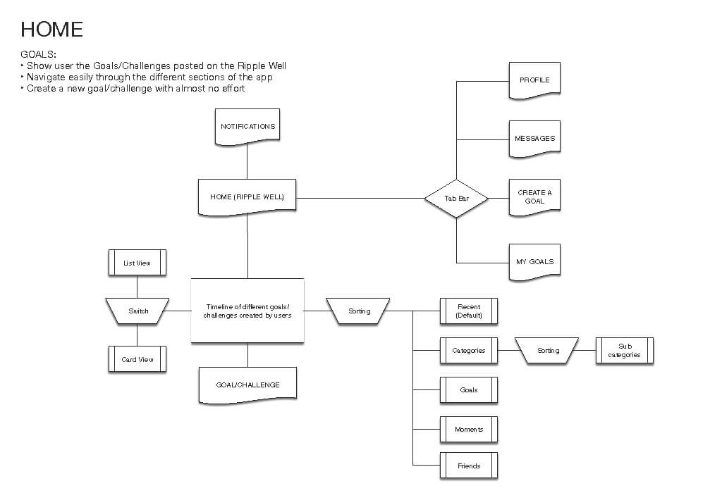
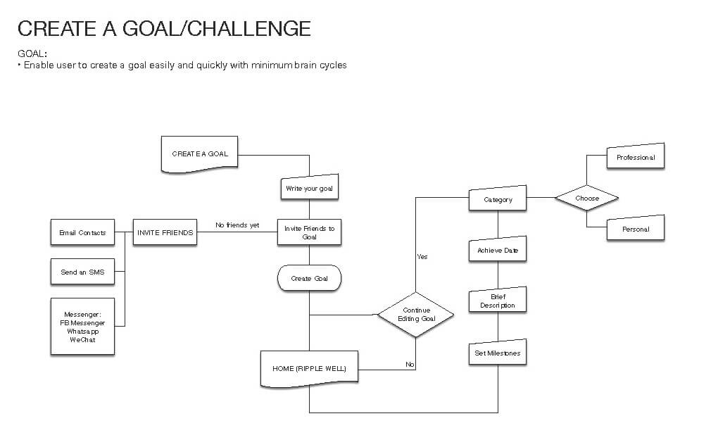
User flows as a scoping tool
With limited engineering capacity, flow mapping served two purposes simultaneously: it was a design artifact and a scope negotiation. By mapping the full surface area of onboarding, goal discovery, creation, profile management, and friends, I could identify which flows were load-bearing for the core loop and which could be deferred. This gave engineering a prioritized scope before any high-fidelity work began, which avoided the most common 0→1 trap: building everything and shipping nothing.


Research & Validation
Before committing to engineering, I ran two rounds of validation: remote concept tests via UsabilityHub to measure comprehension and preference on navigation and key interaction patterns, followed by moderated in-person usability sessions to surface the qualitative signal the quantitative tests couldn't capture.
What the research surfaced
Three findings shaped the product direction in ways that wouldn't have been visible from flow diagrams alone.
Social sharing mapped quickly to existing behavior. Users understood Moments — photo-based progress posts — almost immediately because the mental model was close enough to Instagram Stories that no new concept needed to be taught. That familiarity was strategically important: it meant the social layer had low onboarding cost, which was critical for a product where the network effect was still thin at launch.
"Goals" carried more perceived weight than we intended. For younger users especially, the word "goal" invoked seriousness and long-term commitment — a barrier to starting. Testing surfaced this as a real friction point: users were hesitant to create a goal not because the interface was confusing, but because the framing felt like a contract. We leaned toward lighter language and shorter time horizons to lower that threshold, but the finding pointed to a deeper positioning question we hadn't fully resolved.
Progress had to feel casual to happen at all. Users explicitly said they wouldn't post a "Moment" if it felt like a formal update. The interaction had to read as lightweight — something you did in passing, not something you produced. This drove the decision to anchor Moments on photos and the minimal "Motivate" action, and to deliberately avoid the comment-thread dynamic that would have made posting feel high-stakes.

Product Strategy
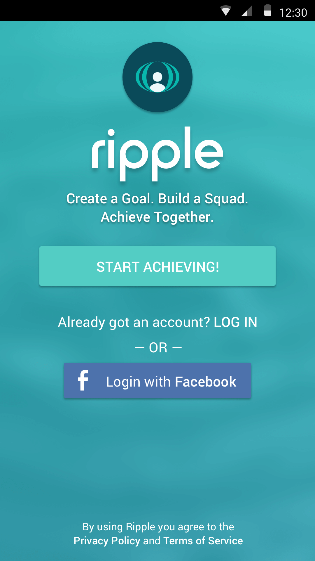
We initially built an Android prototype using Material Design — the right call given our engineering strengths and the speed it enabled. After investor feedback and a sharper assessment of our U.S. launch market, we pivoted to iOS. That decision cost us time but aligned the product with the platform where our target audience and behavioral research were most concentrated.
Four interaction principles that shaped every design decision
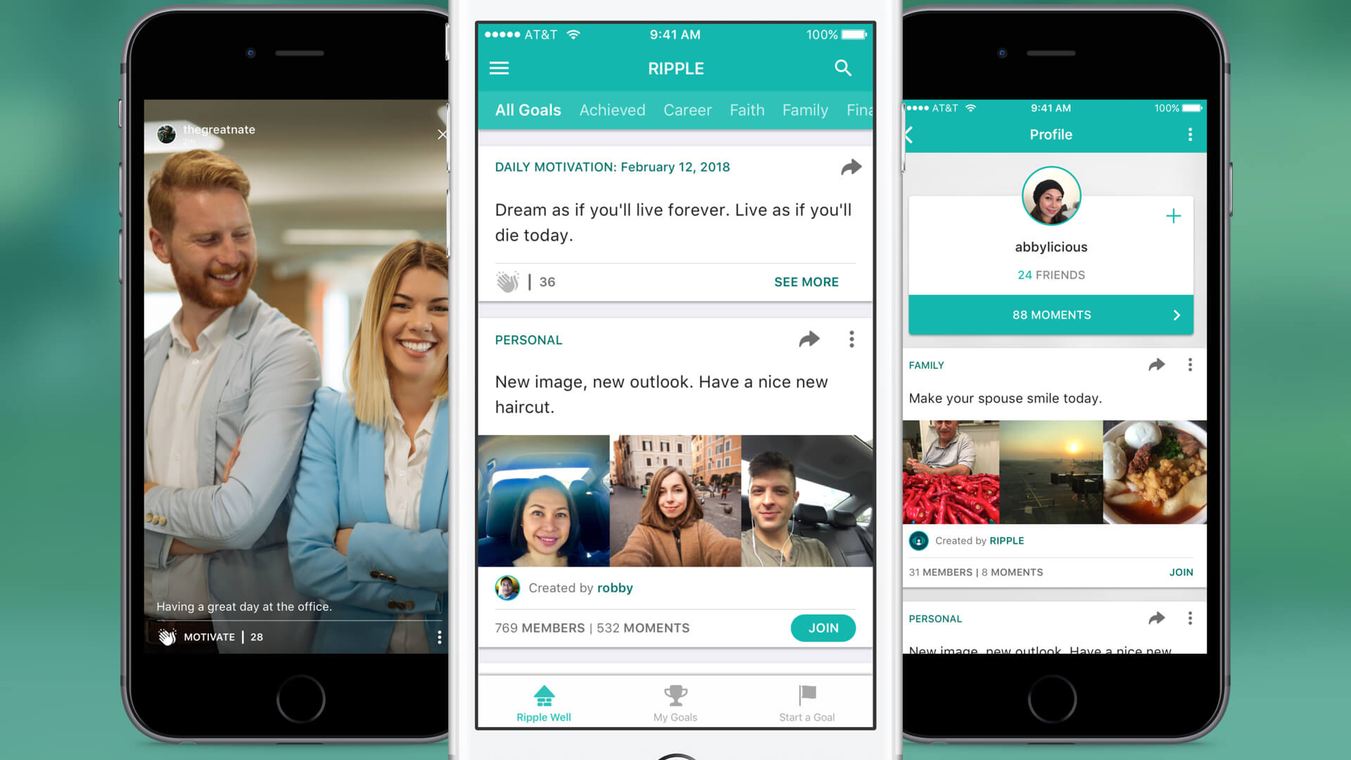
Lead with discovery, not creation. Asking a new user to create a goal before they've seen what the product is sets the wrong expectation. We made the Ripple Well — a browsable feed of public goals — the entry point. Users could explore, understand the product's social texture, and join an existing goal before they ever had to create one. This reduced the cold-start problem and lowered activation friction in a single architectural decision.
Make joining feel reversible. Commitment anxiety was a validated barrier from research. The join interaction was designed to be a single tap — no setup flow, no confirmation requirements, no public announcement. Users could join privately, observe how the product worked from the inside, and decide later whether to post. Reversibility wasn't just a UX nicety; it was the mechanism that reduced the activation cost enough to get users into their first goal.
Anchor engagement on micro-actions. Moments and the Motivate action were designed to be the smallest meaningful unit of progress. A Moment was a photo with an optional caption — the bar was deliberately low. Motivate was a single positive signal — no like/dislike polarity, no public comment thread. The goal was to build a habit of small, frequent progress posts rather than occasional high-effort updates, which research showed users were unwilling to sustain.
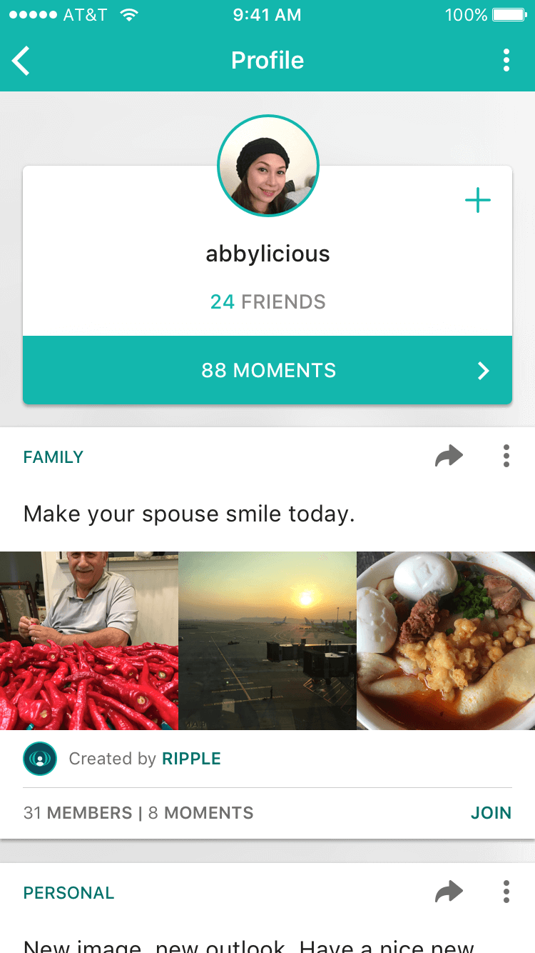
Protect private accountability as a first-class path. Not everyone who wanted accountability wanted a public audience. Private goals — visible only to invited friends — gave users the social reinforcement of the product without requiring public exposure. This was especially important for health and finance goals, where sharing publicly carried real personal stakes.
Design System
With a small engineering team and rapid release cycles, the design system had to solve for two problems simultaneously: it needed to enforce enough consistency that the product felt polished, and it needed to be lean enough that a two-person team could actually maintain it between releases. Complexity in the design system was a direct tax on shipping velocity.
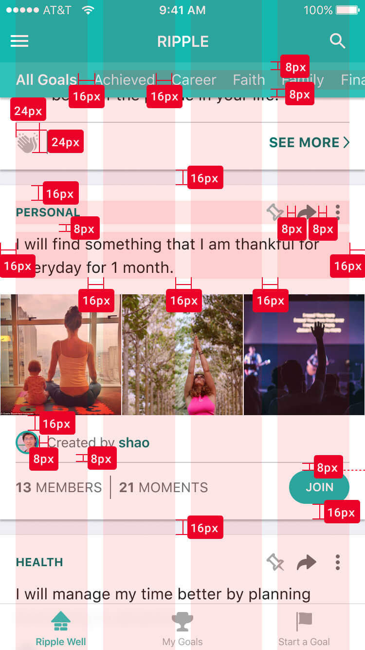
I built around a 4-column content area with 8-point spacing, a small set of reusable card components with explicit state definitions, and a tab bar + category sub-nav combination that kept discovery fast without burying it under navigation depth.
The components that did the most work
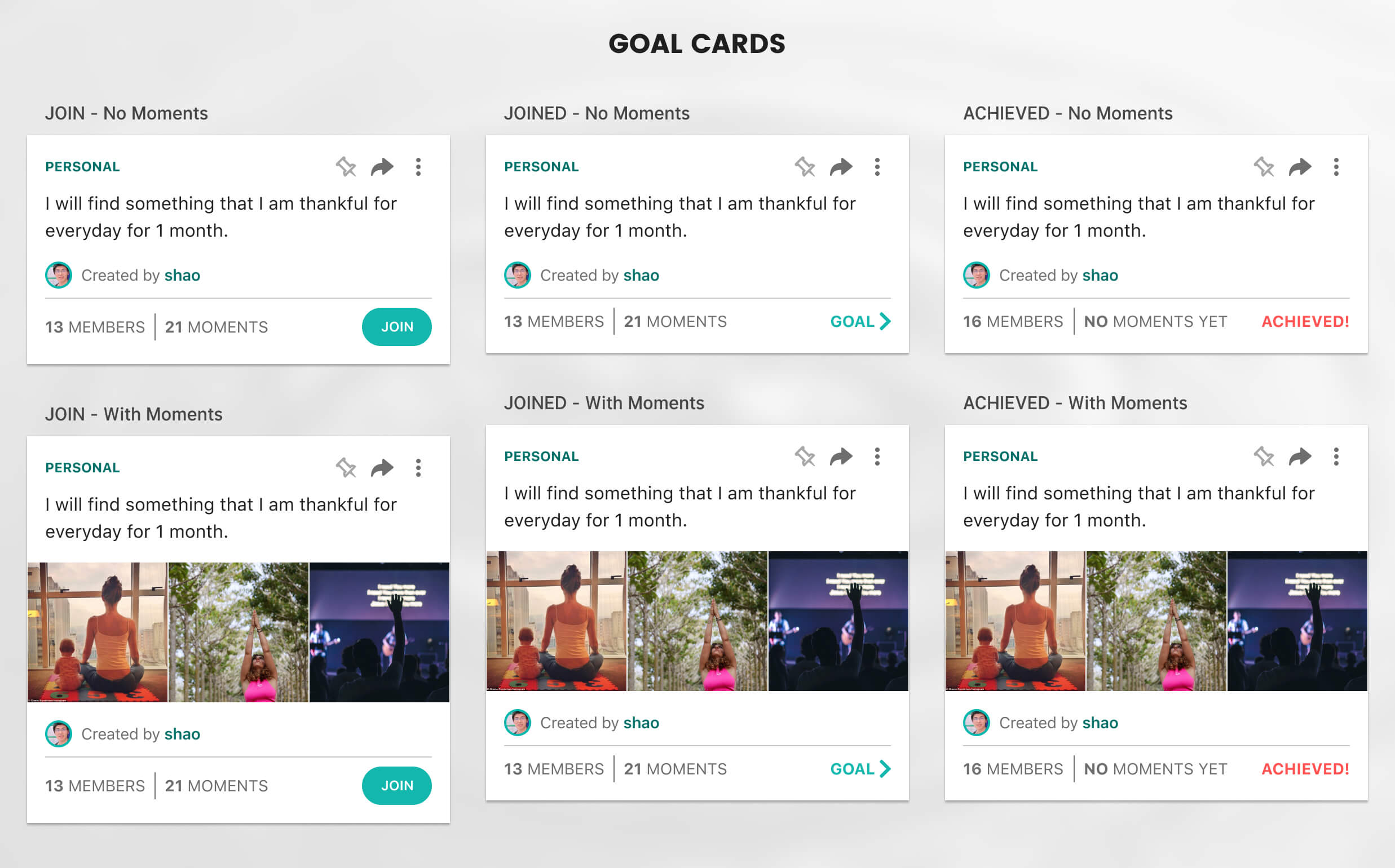
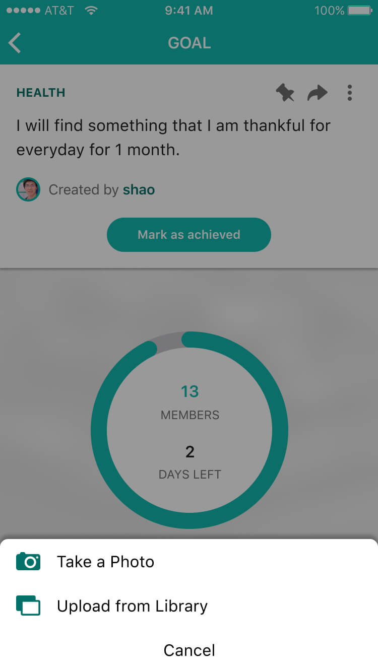
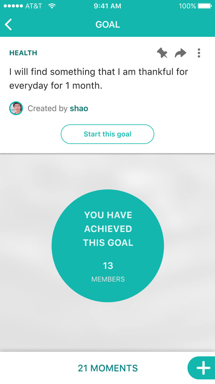
- Goal cards — the core reusable unit of the product, with explicit visual states for Join, Joined, and Achieved. Getting these states right was critical: the card had to communicate participation status at a glance, without requiring the user to open the goal detail to understand where they stood.
- Category sub-navigation — placed beneath the tab bar, it enabled fast scanning across goal types without requiring a dedicated discovery tab. This kept the navigation flat while still supporting content filtering at the feed level.
- The Motivate action — a deliberate departure from the like/dislike binary. A single positive signal, no negative counterpart. The design choice was intentional: in a product built around personal goals, the only appropriate reaction to someone's progress is encouragement. A dislike would have made posting feel risky.
- Moments — full-screen photo/video progress posts optimized to preserve original aspect ratio. The layout handled landscape, portrait, and square images without cropping or distortion, because forcing a specific ratio would have added friction to the most important action in the product.

The iOS Product
The iOS release was built around a single intended behavior loop: discover a goal → join or create it → post a Moment → receive encouragement → mark it achieved → start again. Every surface decision was evaluated against whether it reinforced or interrupted that loop. We shipped v1 through v1.3 across a distributed team, using each release to tighten the loop based on session data and qualitative feedback.
Core surfaces
- Ripple Well — the public goal discovery feed with category navigation and a daily featured goal. The entry point for new users and the primary re-engagement surface for returning ones.
- Start a Goal — a focused creation flow: title, description, duration, category, and privacy. Nothing else. Every additional field we considered adding during development was removed after asking whether a user would abandon the flow if it weren't there.
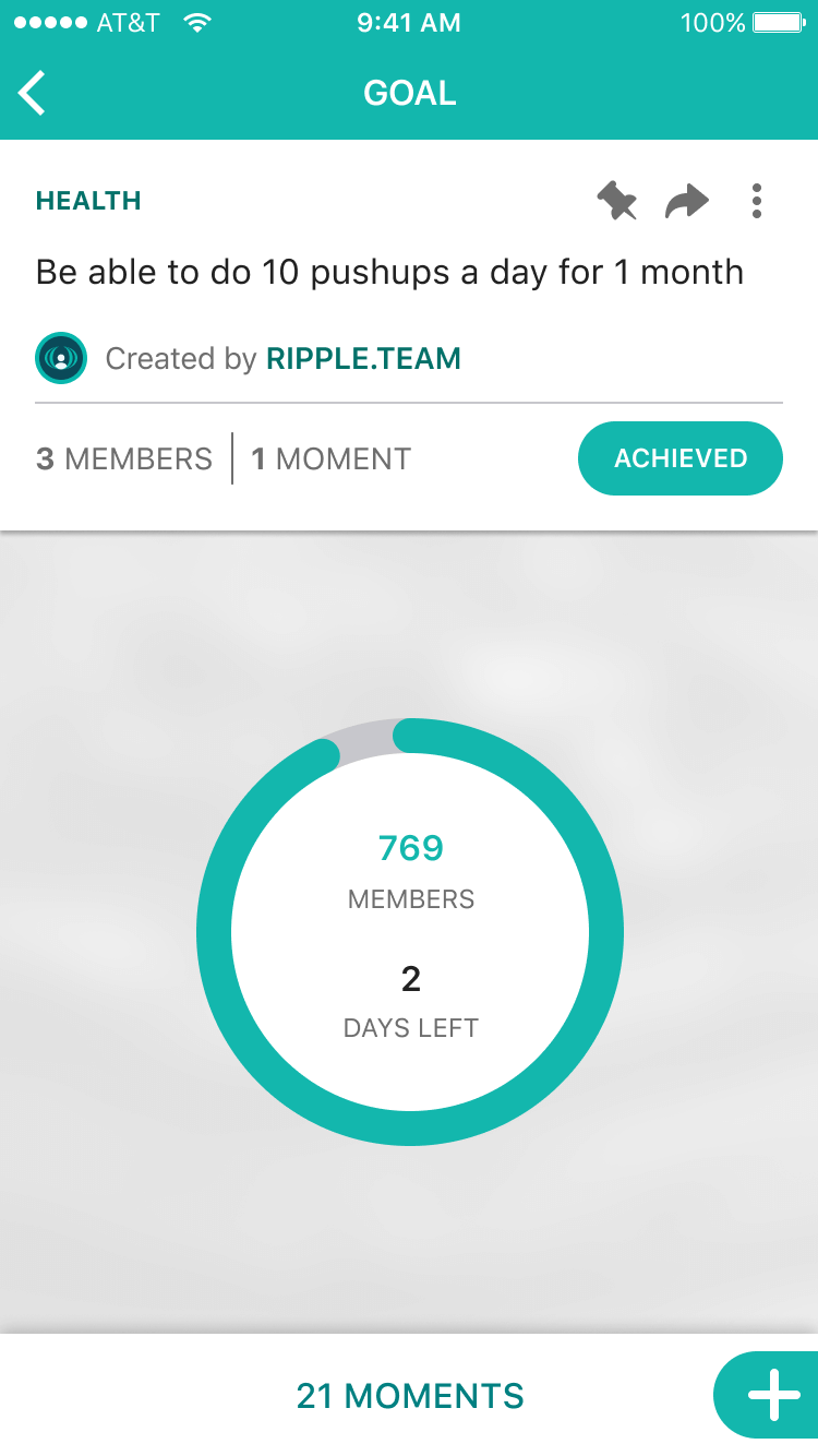
- Goal Detail — progress percentage, active members, days remaining, and achievement state in a single focused view. The surface that made the social layer visible: you could see who else was working on the same goal and what they were posting.
- Moments — the progress posting surface. Full-screen photo and video, aspect-ratio-preserving layout, and a single Motivate action. No comments. No public reaction counts displayed on the feed card.


Interaction Design
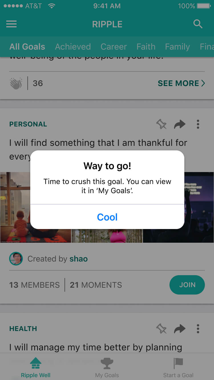
The micro-interactions weren't decorative — each one was solving a specific behavioral problem. The join confirmation reduced post-join uncertainty. The achievement state needed to feel earned, not just functional. The Motivate action had to be expressive enough to feel meaningful without triggering the anxiety of a public engagement counter.
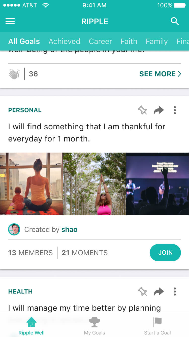
Moments — designing for every photo type
Progress documentation doesn't come in one format. A workout is landscape. A book spine is portrait. A meal is square. The Moments viewer was designed to preserve each photo's original aspect ratio rather than forcing a crop, because cropping would have changed the meaning of what users were trying to show. This was a small decision with real behavioral consequences: it removed a category of friction that would have made posting feel like production work.

Outcome & Learnings
Ripple shipped publicly on iOS, ran for two years with minimal marketing, and was removed from the App Store in March 2019. With no paid acquisition, the product reached 186 registered users, averaged 11 monthly active users, and averaged approximately 5 minutes per session — a session length that suggested genuine engagement from users who found the product, even if we didn't find enough of them.
The product didn't achieve the retention needed to sustain it. That outcome is worth being direct about — not because it invalidates the work, but because the post-mortem is where the most transferable learning lives.
What the product got right
- The session length was a real signal. Users who engaged were genuinely engaged — not passive scrollers. The experience was sticky for the people it resonated with. The challenge was acquisition and positioning, not the core interaction loop.
- The interaction model — casual posting, a single positive action, no comment threads, no public failure states — held up in usage. Users didn't abandon the social layer because it felt wrong; they didn't return because the overall habit loop wasn't strong enough to sustain frequency.
Where the thesis broke — and what I'd do differently
- Validate positioning before building the full product. The word "goals" was doing damage we didn't fully appreciate until too late. Research surfaced the friction, but we framed it as a language problem rather than a product positioning problem. "Challenges," "habits," or "progress moments" as a primary frame — rather than a feature name — might have changed who the product attracted and how they thought about participating.
- Narrow the audience before going broad. A social product's early value is proportional to the density of its network in a specific context. Launching to a general goal-tracking audience meant thin networks across every category. Launching specifically to running communities, or book clubs, or 30-day fitness challenges would have created denser accountability relationships in a smaller space — which is where the behavioral loop actually works.
- Instrument the retention funnel from day one. We had session data and registration counts, but we didn't have cohort analysis, activation event tracking, or a clear model of what "activated" looked like versus "registered." Without that, it was difficult to separate users who loved the product but stopped posting from users who never understood it at all. Those are different problems with different solutions.
- Sequence the core loop before expanding the feature set. Discovery, joining, Moments, and achievement were all present at launch. In retrospect, I should have shipped discovery and joining only — understood who activated and why — and then layered Moments and achievement once I had behavioral evidence that the first two steps were working. We built a complete product and launched it into a market we hadn't sufficiently validated. A leaner MVP would have given us more useful signal faster.
Ripple is the project that most directly shaped how I approach 0→1 product design now: with a tighter thesis, a smaller initial surface area, deeper instrumentation, and a clearer definition of what "working" looks like before expanding scope.