Case Study · 03
Scaling a social platform
without breaking what made it safe
Lead Product Designer · Shots App · iOS & Android · 2015–2016
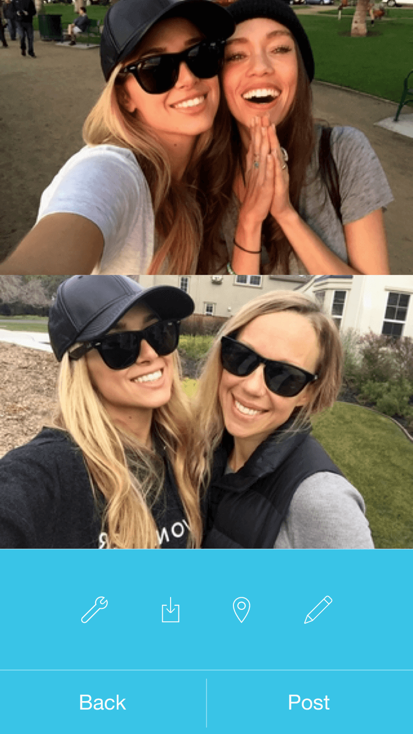
Shots was a mobile social platform built on a single, deliberate design decision: no public comments. That choice was the product's competitive identity — a lower-pressure social environment for teens and millennials in a market dominated by Instagram, Snapchat, and Vine.
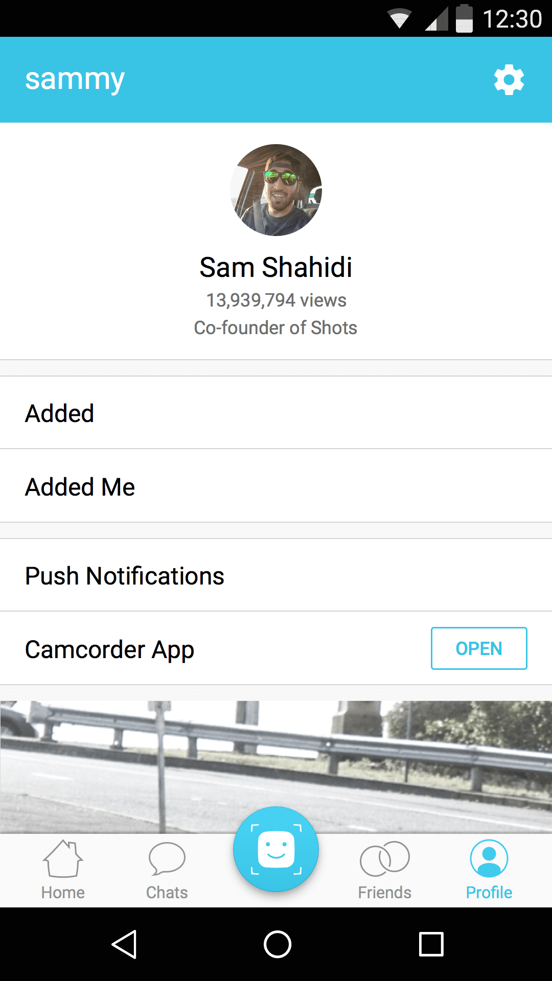
As Lead Product Designer, I owned the end-to-end design of four major release cycles — from discovery and wireframing through native execution on iOS and Android. My mandate was to grow the product's depth and utility while protecting the core experience that 6M+ monthly active users had come to trust.
The central design tension: every new feature was a potential threat to the simplicity that made the app feel different. Getting that balance right required clear design principles, rapid experimentation, and the judgment to reverse course when data and behavior told us we'd gotten it wrong.

Context
In 2015, consumer social was a winner-take-most category. Instagram had the feed. Snapchat owned disappearing content. Vine had short video. Every new entrant needed a differentiated reason to exist — and Shots had one: a social experience with no public comments, by design.
The thesis was grounded in a real user problem. Public comment sections were exposing younger audiences to harassment, social comparison, and public judgment. Shots removed that vector entirely, positioning the app as the platform where sharing felt lighter, safer, and more authentic.
At its peak during my tenure, Shots had grown to over 6 million monthly active users across iOS and Android — a meaningful audience that validated the core product bet. The design challenge was to evolve the platform quickly enough to build retention and utility, without introducing the same social pressure mechanics the product was built to escape.
The Problem Space
Shots had a compelling product identity but faced a structural growth challenge: the same constraint that made the app feel safe — no comments, selfie-first, limited surfaces — also limited retention, session depth, and creator incentives.
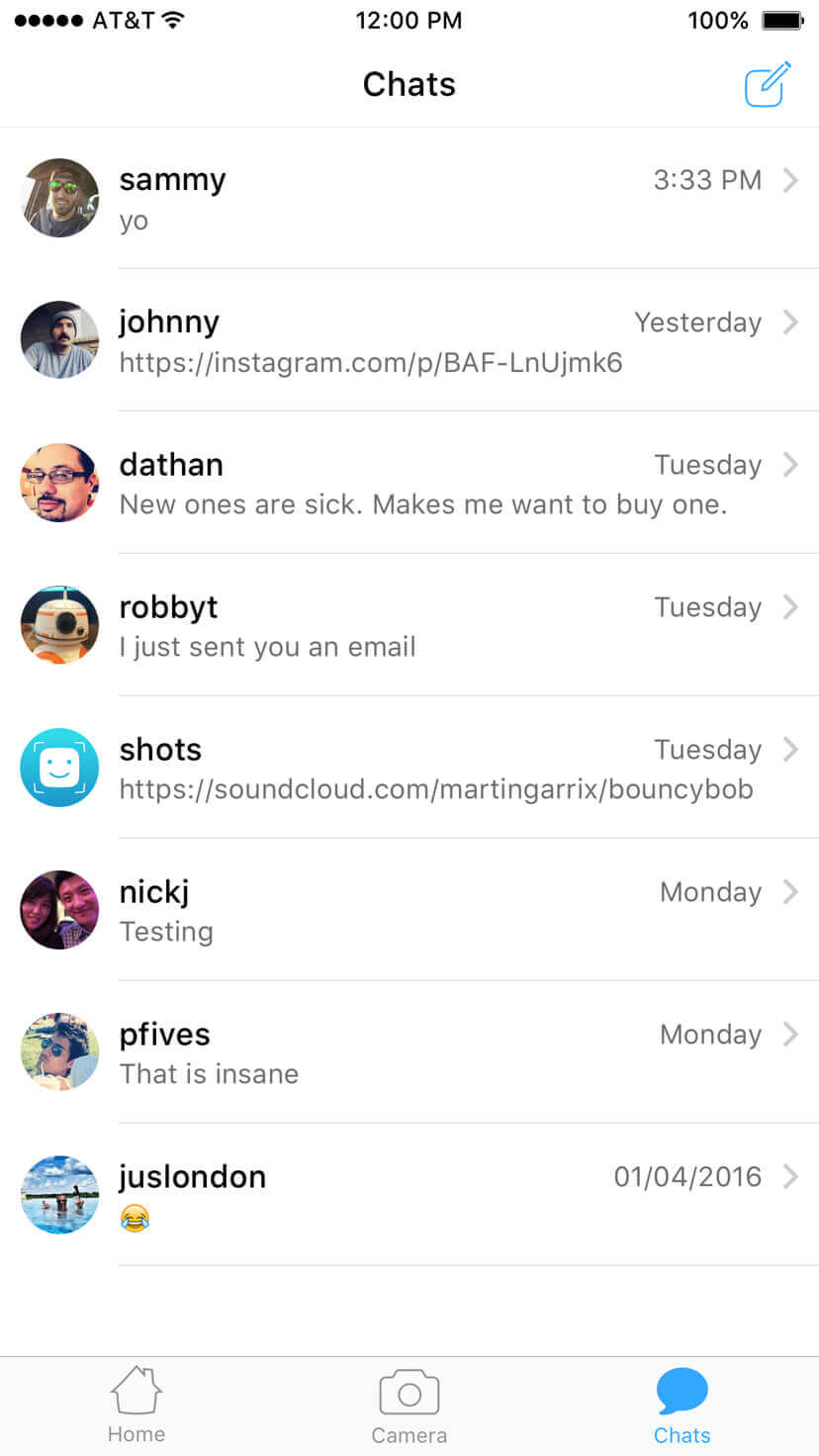
No comments meant no conventional engagement loop
Traditional social products drive return visits through notification-generating interactions: comments, replies, mentions, likes. Shots had stripped most of those mechanisms. We needed to design alternative engagement loops that created genuine connection without reintroducing social pressure. That's a harder design problem than it sounds — novelty isn't the same as utility.
The selfie-first model had a ceiling
The original experience was optimized for one action: take a selfie, post it, move on. As users matured — and as creators joined the platform — the need for video, discovery, richer messaging, and content sharing became clear. Expanding the product's vocabulary without fragmenting its mental model was the core design constraint I worked against for two years.
Consumer social moves in cycles, not roadmaps
Feature decisions in this space had short shelf lives. What worked in one quarter could create friction in the next as user behavior evolved and competitive dynamics shifted. Our design process had to be built around fast validation, not long planning cycles.
The design mandate: expand the product's depth and utility without importing the social pressure mechanics Shots was built to avoid. Every feature decision was evaluated against that standard.
Design Principles
With a fast-moving team and no formal design system in place when I joined, I established three working principles to create alignment across releases. These weren't aspirational values — they were practical filters for evaluating tradeoffs at the feature and interaction level.
Protect the core behavior loop
Every version of Shots worked because a single gesture chain was fast and satisfying: open → scroll → shoot → share. New features had to enhance that loop or exist cleanly alongside it. Any feature that interrupted the browsing or posting experience required a higher bar for justification. When Journals failed this test, we reverted. More on that below.
Design for connection, not validation
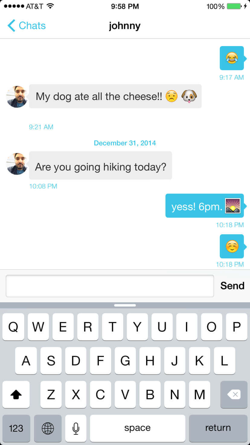
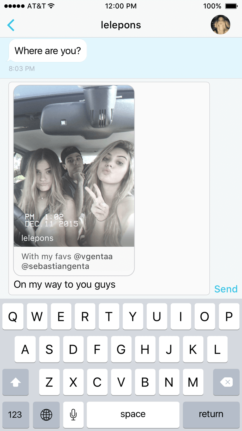
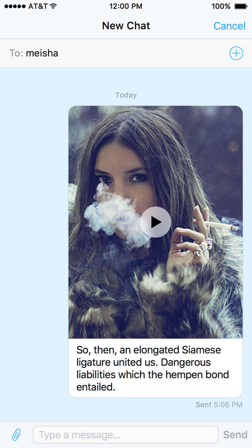
Without public comments, the product couldn't rely on social validation mechanics to drive engagement. I pushed the team toward interaction patterns that created genuine connection: direct shot sharing, private messaging, emoji reactions, and activity between friends. These weren't just safer alternatives — they were often more meaningful ones.
Treat every significant change as a hypothesis
In consumer social, a feature that looks right in a mockup can fail completely in production. We treated major design changes as experiments, moved fast to launch, and moved just as fast to reverse when behavior signals were negative. Speed of reversal was as strategically important as speed of launch.
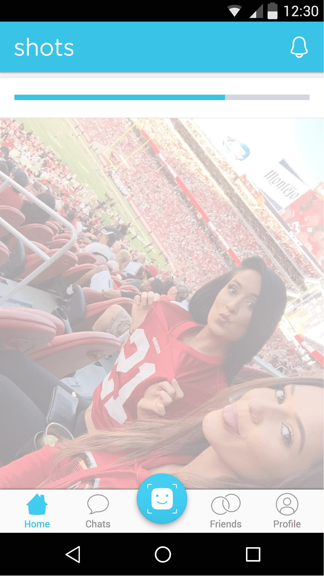
Version 3 — The Foundation
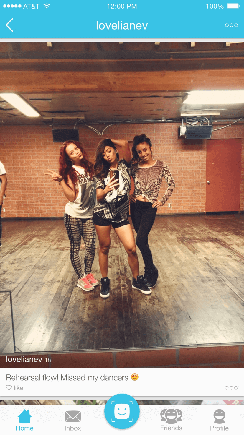
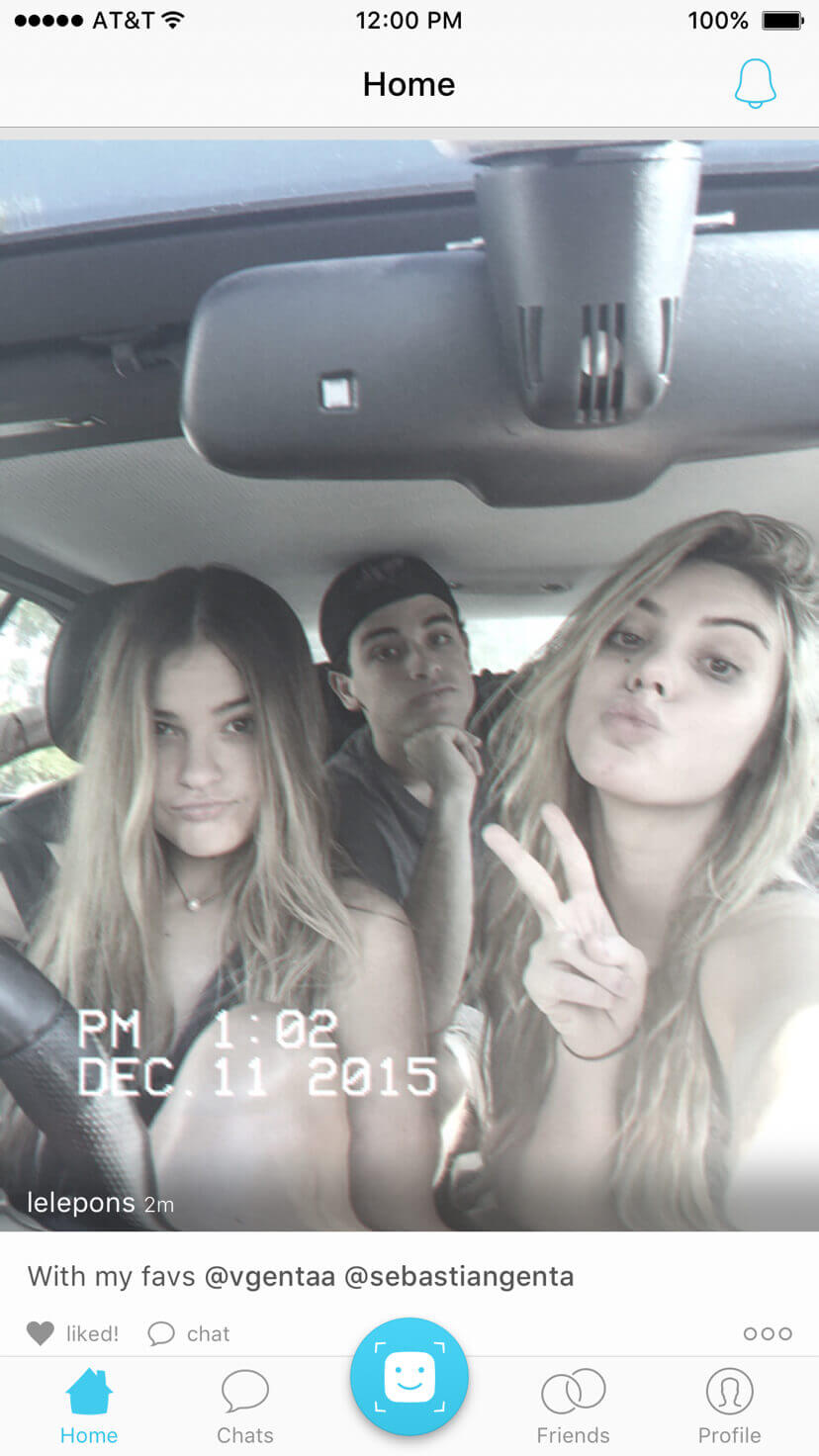
I joined shortly after V3 launched. The core experience was already in place: a full-width photo feed, a fast camera, a preview mode, and direct messaging. My initial work focused on stabilizing and optimizing these four surfaces before the next major release cycle began.
V3's success came from its simplicity. The mental model was a single sentence: open, scroll, shoot, share, chat. Every design decision I inherited had been made in service of that model. The work ahead was to expand on it without eroding it.


Design readout
The strongest design choice in V3 was restraint. The experience asked nothing of users that wasn't immediately useful. That simplicity established the benchmark every future release had to be measured against — and, in one case, failed to clear.
Version 4 — Expanding the Surface Area
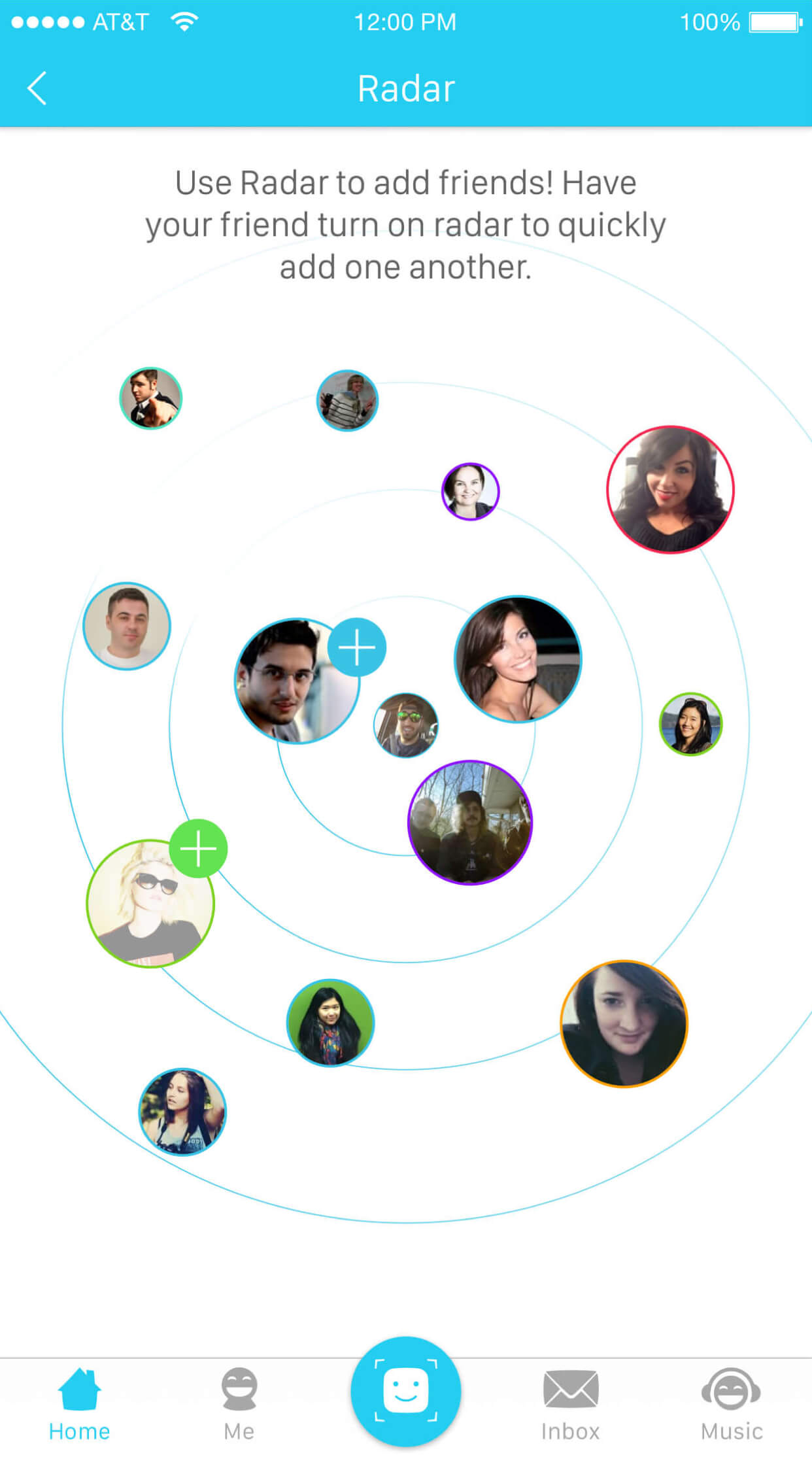
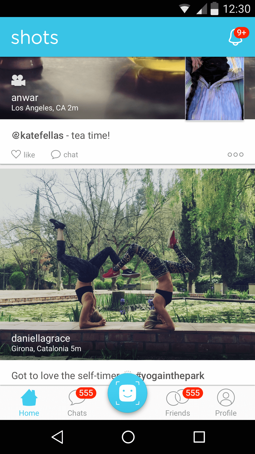
V4 was the most ambitious release I led during my time on the product. We pushed into four new directions simultaneously: location-based discovery (Radar), grouped content browsing (Journals/Albums), video capture, and a unified Connect surface for social graph management. It was also where we learned the sharpest lesson about complexity in consumer social.
Radar and Journals
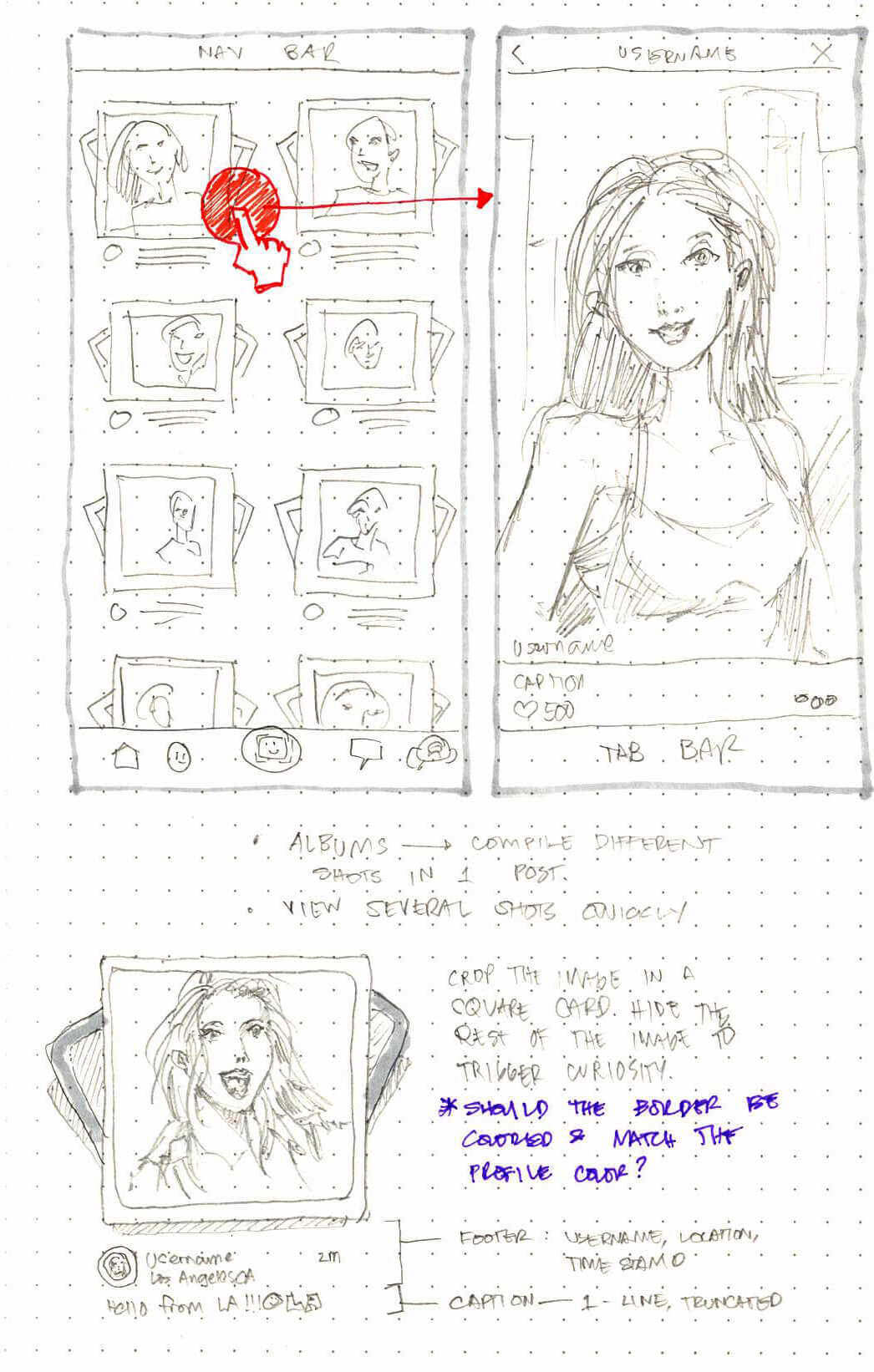
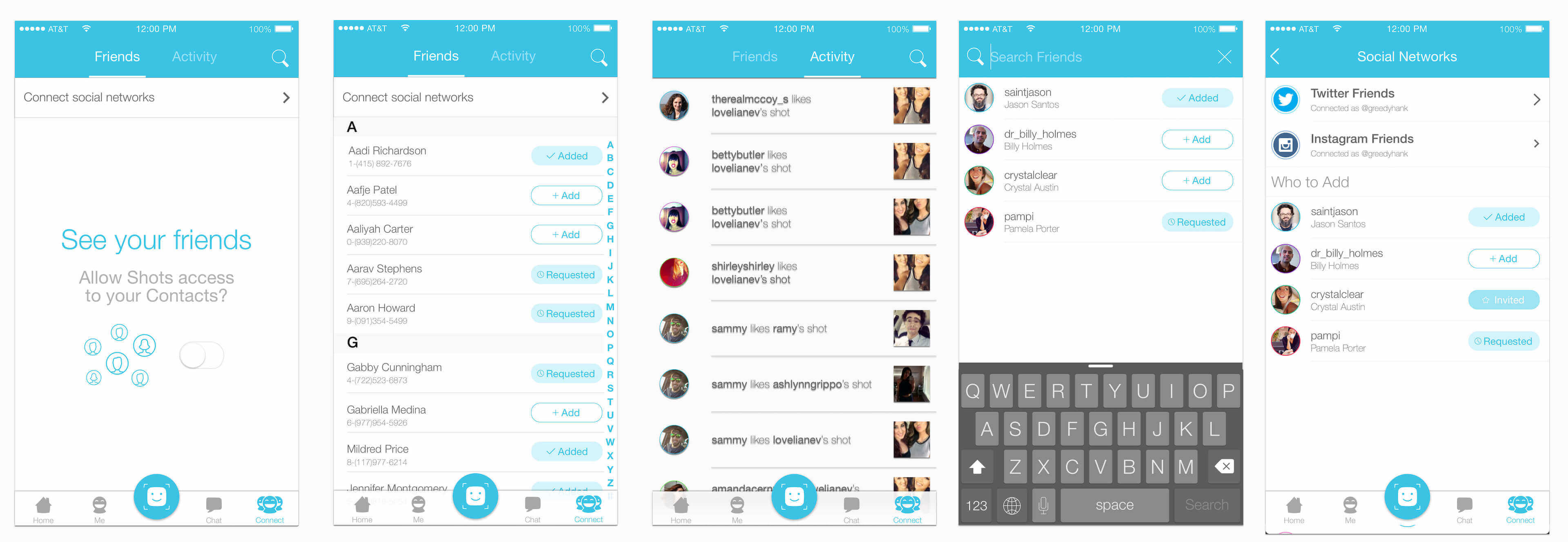
Radar was a location-based discovery feature designed to help users find nearby friends within a low-pressure, map-like interaction model. The goal was to expand the social graph without requiring aggressive contact-import flows. Journals emerged from a content question: how do you let creators post more without flooding a follower's feed? Grouping multiple posts into a single browsable album object seemed like a clean solution.


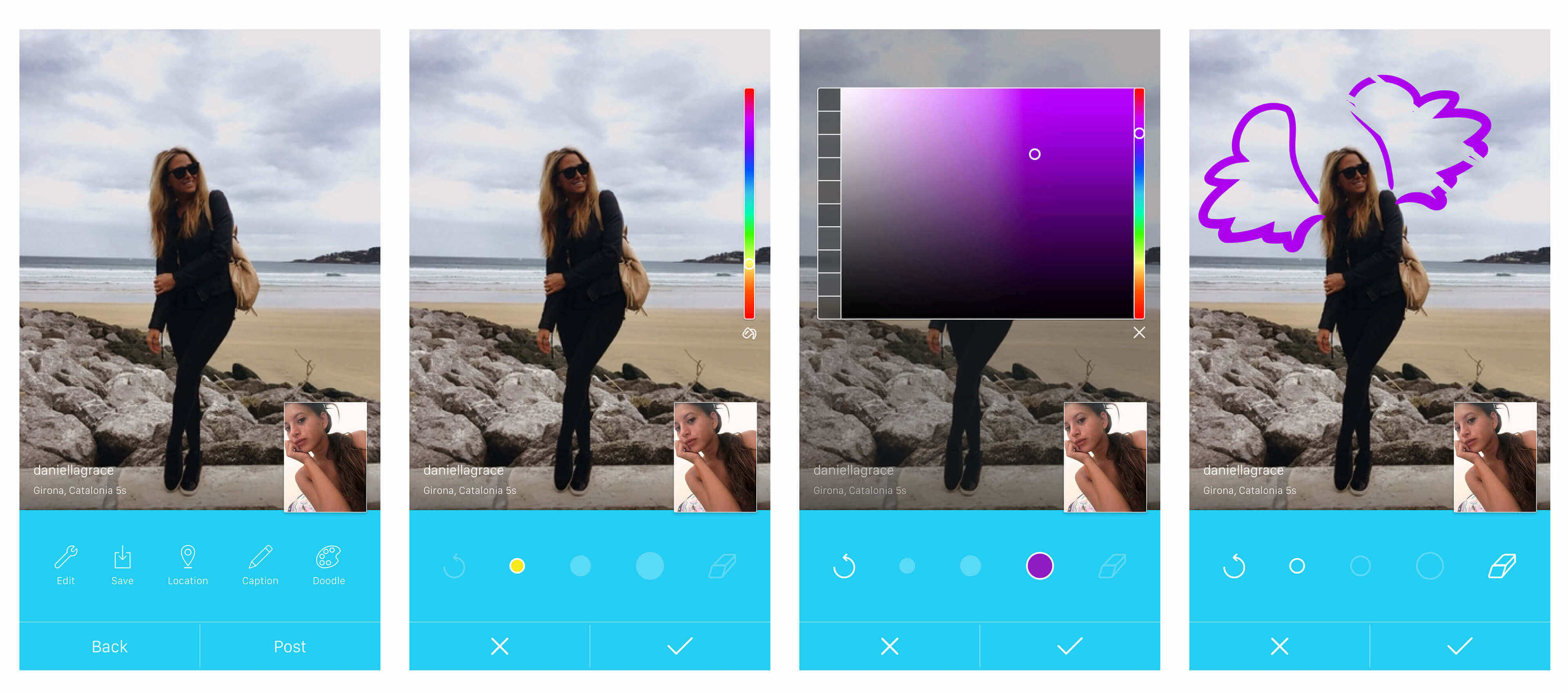
Video, Connect, and Doodle
Alongside Radar and Journals, we introduced short video capture, consolidated social graph management and search into a single Connect surface, and explored Doodle — a lightweight drawing tool for annotating photos before posting. Each addressed a real user or creator need identified through behavioral data and direct feedback.

The Journals reversal — and what it taught us
Journals failed in production. The grouped-post format introduced an extra tap before users could see full-width content — a small friction that broke the fast-scan behavior that made the feed compelling. Users and creators pushed back quickly. The album metaphor made sense as a design object; it didn't hold up as a feed behavior.
We reverted to full-width posts within a few weeks. The decision restored scroll velocity and reinforced a principle that now shapes how I approach feed design: in social products, continuity of motion is a product feature. Adding structure to a feed competes directly with the reason people open it.
Version 4.X — System Refinement
After the Journals experiment, we returned to the full-width feed and used V4.X to tighten the visual system, expand video support, and ship a cleaner, more mature design language. This phase was also where we addressed Android parity — a critical gap given the platform's share of our audience.


4.3.2 — A leaner visual system
For 4.3.2, I pushed a more disciplined visual direction. We stripped excess color from navigation and tab chrome, moved to a single blue accent applied consistently across interactive elements, and introduced the ability to initiate a private chat directly from a post. The goal was a UI that receded behind content rather than competing with it.
This release also established the visual baseline I would carry into the Android version — a deliberate choice to avoid designing the platforms in isolation.
Android — native, not ported
The Android release was designed from the Shots visual system outward, not ported from iOS screens. I adapted navigation patterns, layout density, and system affordances to match Android user expectations — a decision that mattered for feel even when the differences weren't obvious at the component level.

Version 5.X — Platform Expansion
V5.X marked a deliberate strategic shift: Shots was becoming less of a camera app and more of a lightweight entertainment and communication platform. We introduced link sharing, emoji reactions, sticker packs, richer chat media, and a Funny surface for trending content — each designed to expand the audience while preserving the product's no-judgment identity.
From selfies to shareable media
Link sharing opened the feed to a broader content vocabulary. Users could now share articles, videos, and external media alongside their own posts. The design challenge was keeping the feed visually consistent and interaction-consistent as the content type mix became more varied.
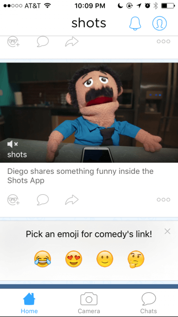
Emoji reactions were the most deliberate addition in this release. They served a precise function: giving users a way to respond to content without reopening the comment thread problem. The reaction set was informed by actual usage patterns — we updated emoji options based on which reactions users reached for most.

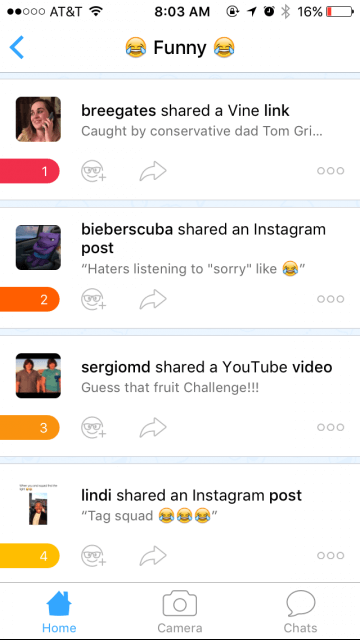
Stickers, sharing, and the Funny surface
Sticker packs and expanded sharing options leaned into the product's entertainment DNA. The Funny section surfaced trending and highly-reacted posts, creating a lightweight discovery destination for content that was resonating across the network — without requiring an algorithmic feed rebuild.

Key Learnings
Two years on a fast-moving consumer social product in a competitive market compressed a lot of design learning into a short time. The work that held up best wasn't the most innovative — it was the work that made the product more itself: faster, clearer, and truer to the user need that made Shots worth building in the first place.
The work that failed — Journals — failed for a specific, diagnosable reason: it optimized for a content management problem instead of a user behavior. Understanding that distinction earlier would have saved a release cycle. I carry that lesson forward.
Takeaways
- A strong product principle — in this case, no public comments — is only valuable if every design decision is rigorously evaluated against it. It can't be a tagline; it has to be a real filter.
- In social feeds, continuity of motion is a feature. Journals added structure; users wanted speed. That's not a UX failure — it's a signal about what the product actually is.
- Alternative feedback loops (reactions, direct sharing, private messaging) can replace comments functionally if they're designed with equal intentionality — not as afterthoughts.
- The speed at which you reverse a bad experiment is as strategically important as the speed at which you ship it. Building a culture that rewards fast reversals is a design leadership problem, not just an execution one.
The product later transitioned into Shots Studios, a media company focused on creator-led original entertainment content.