Case Study · eHealth Medicare
Helping seniors choose the right plan from their phones
Redesigning the mobile shopping experience for eHealth Medicare
Every day, 10,000 Americans turn 65 and become eligible for Medicare. A meaningful share of them land on eHealth to find a plan.
Since I joined in 2021, mobile's share of eHealth Medicare traffic had grown from 30% to 40% — yet mobile conversion sat at just 1.2%, well below desktop. I brought the opportunity to my product manager and we drove the case for a dedicated mobile redesign together, securing buy-in from leadership before the clock started ticking.
The deadline was fixed: Annual Enrollment Period — October 15 through December 7. AEP is the industry's Super Bowl. Traffic spikes, urgency peaks, and millions of seniors are actively shopping for coverage. Whatever we shipped had to be stable, validated, and ready to perform under peak load. There was no soft launch.
The Problem
Users arrive at the eHealth Medicare shopping page through two distinct channels — each with different levels of context and intent.
Two Entry Points, One Broken Experience
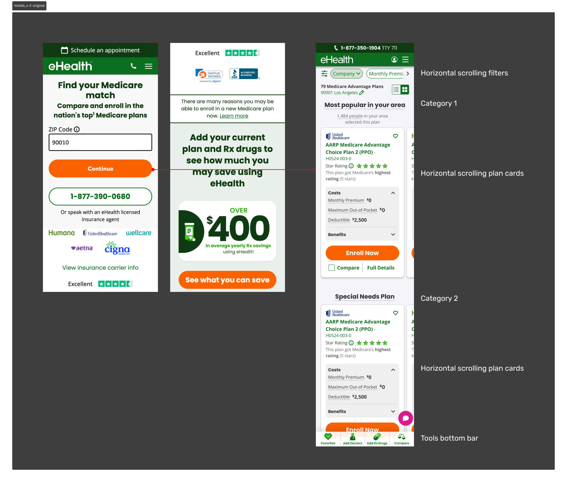
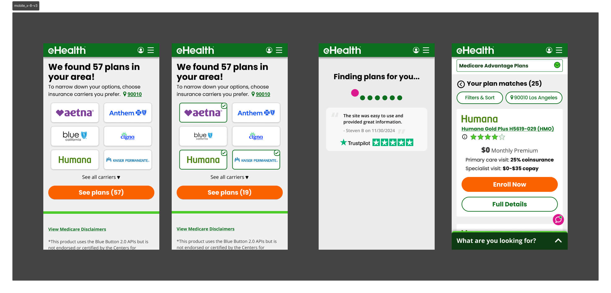
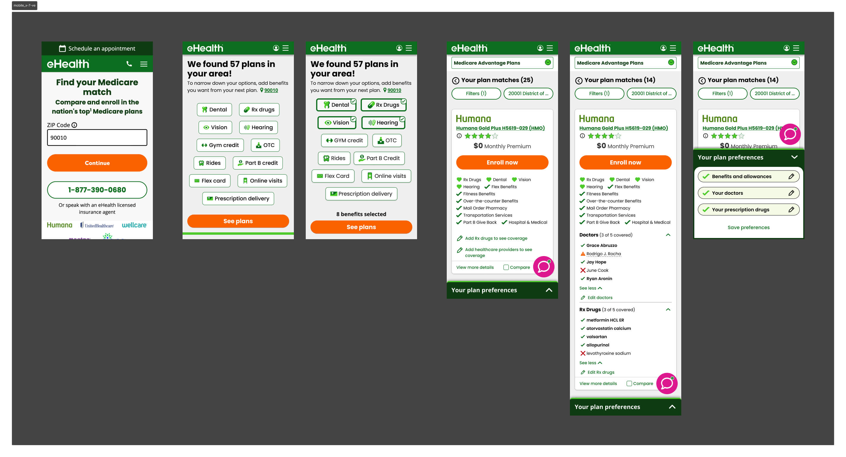
Affiliate traffic arrives pre-qualified, landing directly on the shopping page with their information already collected. Direct traffic — the focus of this work — enters through SEM or paid ads, inputs only their ZIP code, and immediately faces a full plan listing with no prior filtering or context.
For direct users on mobile, this created a wall of options. Too many plans, too much information on each card, and no clear signal for what distinguished one plan from another in the context of their personal needs.
Mobile represented 40% of monthly active users — yet conversion sat at just 1.2%. Users weren't dropping because the plans were wrong. They were dropping because the experience gave them no way to orient themselves.
The Workshop
I facilitated a cross-functional workshop with PMs, engineers, researchers, and designers to map the problem space and align on a direction. The core insight: the shopping page was being asked to do too much. It was both the filtering mechanism and the decision surface — and it was failing at both.
Opportunity
Through Hotjar session recordings and user interviews, clear patterns emerged. Users were arriving at the shopping page overwhelmed — too many plans, too much information, no clear signal for what mattered to them. The path to enrollment was losing people not because the plans were wrong, but because the experience made it too hard to find the right one.
We identified four leverage points:
- Collect more qualifying information upfront to narrow the plan set before users hit the shopping page
- Help users identify their key needs early so results felt personally relevant
- Simplify the page flow to a single vertical direction — less effort, less friction
- Reorganize the plan card to surface only what matters on a small screen
Strategy
The core hypothesis was intentionally counterintuitive: add friction early to reduce overwhelm later. If we asked users the right questions before they reached the shopping page, we could filter the plan list to only what was relevant to them — reducing cognitive load at the moment of decision rather than dumping everything at once.
This wasn't a unanimous call. Engineering and UXR pushed back — adding steps to a funnel felt like the wrong direction. But the data supported it: users weren't dropping because the funnel was too long. They were dropping because the shopping page gave them no way to orient themselves.
The redesign was built around three principles:
Reduce Cognitive Load
Give users a filtered, relevant result set before they ever see a plan card — addressing the core pain point rather than trying to manage it on the shopping page itself.
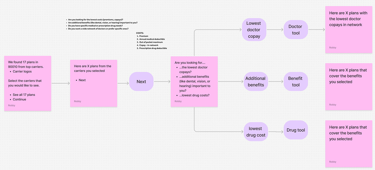
Collect Meaningful Information Upfront
Beyond ZIP code, capture what users actually care about: doctors, prescriptions, and benefit priorities. This became the basis for personalizing the plan list.
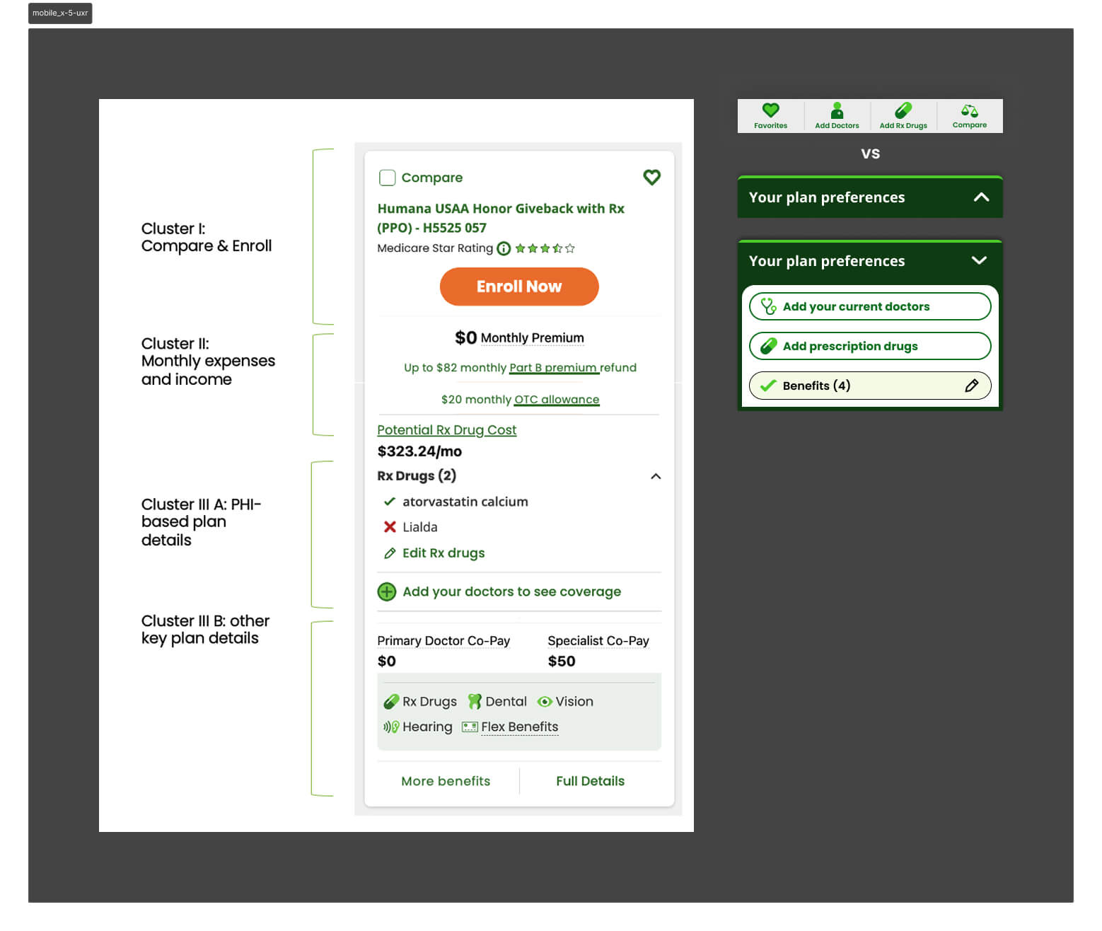
Rethink the Plan Card IA
The card was the single greatest source of overload on mobile. It needed to be rebuilt from scratch for a constrained viewport, surfacing only the benefits relevant to each user.
Iteration
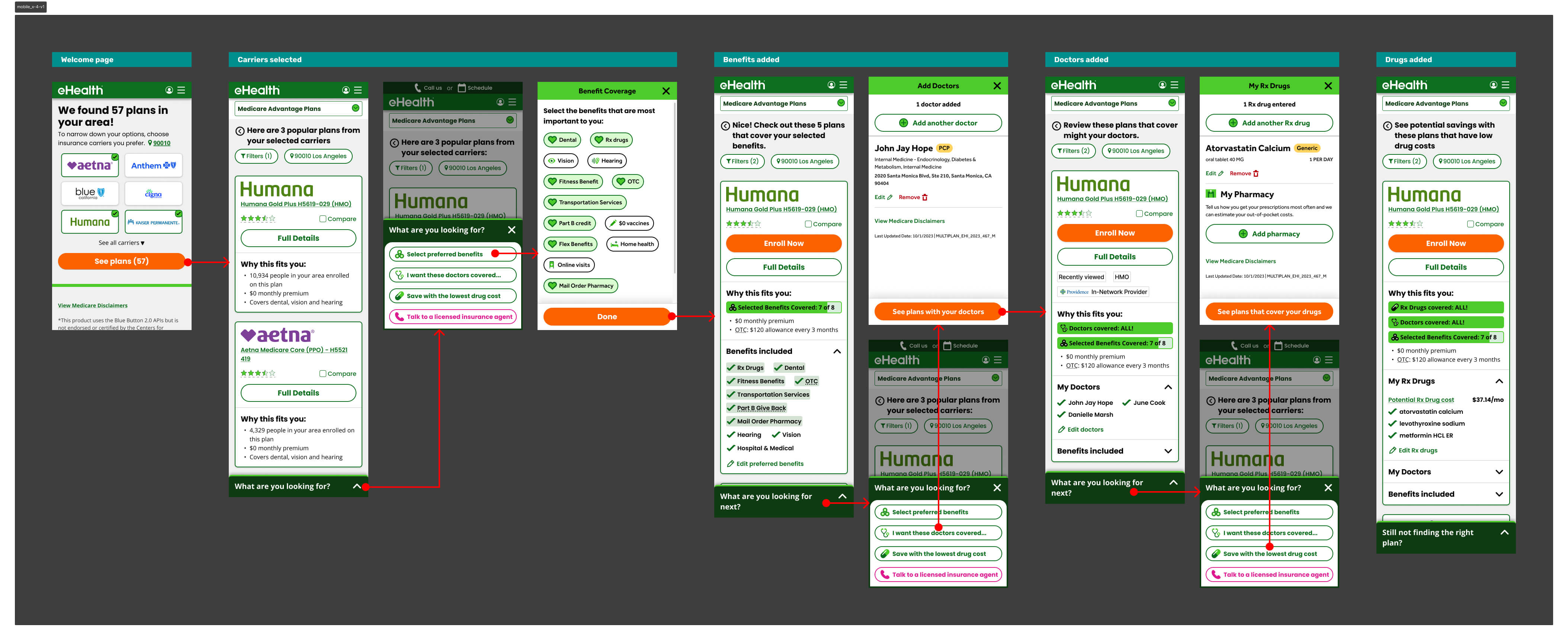
Version 1 — Progressive Disclosure
The first version tested a progressive disclosure model — surfacing different groups of plan information one at a time, letting users choose what to reveal. The intent was to give users control over information density.
It hurt conversion by an average of 5% in shop-to-enroll rate. The problem: users didn't know what information to ask for. Giving them control assumed a level of Medicare literacy most didn't have. We were solving for overwhelm by adding a different kind of friction — decision fatigue about the interface itself.
User Research — Card Sorting
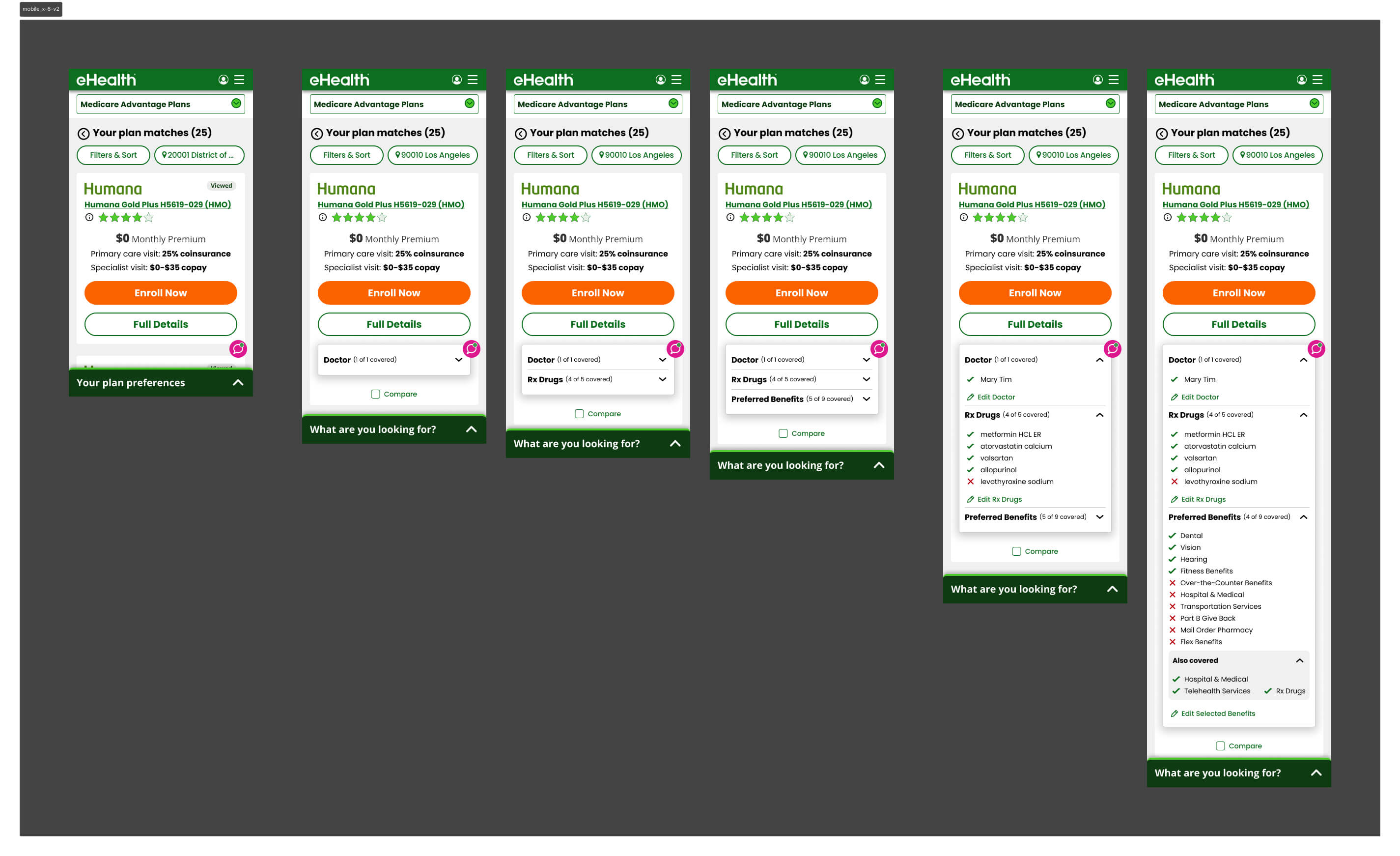
We partnered with UXR to dig deeper. I wrote the research questions alongside our UX researcher and built the prototypes used in testing. A card sorting exercise revealed how users naturally grouped plan card information — the clusters they formed became the direct foundation for how we restructured the card hierarchy in subsequent versions.
A separate finding changed our navigation approach: an expanding bottom utility bar was significantly better received than a fixed dock bar for this user base — seniors who found persistent toolbars visually cluttered and harder to parse.
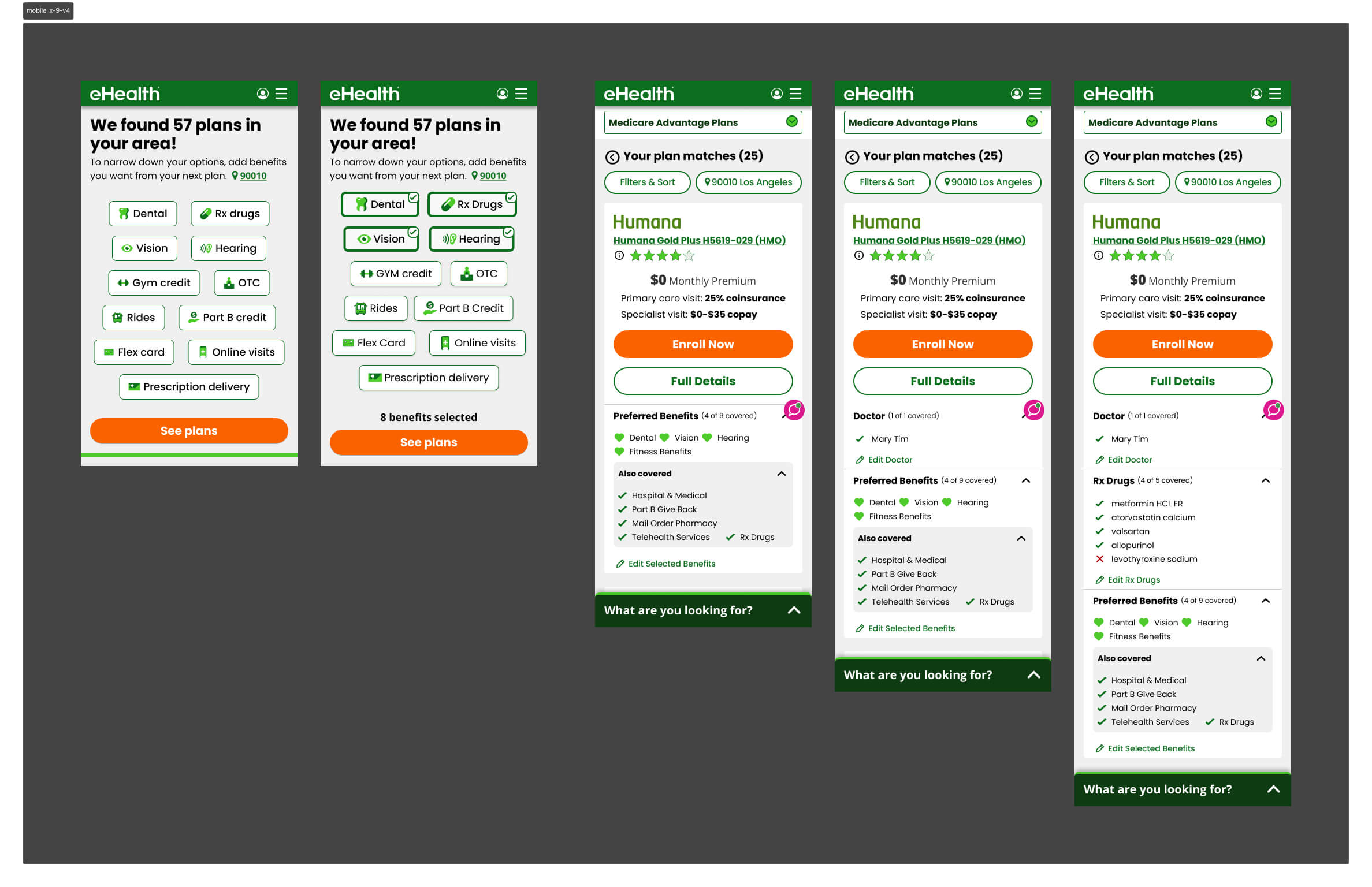
Version 2 — Card Hierarchy Rebuilt
Armed with the card sorting data, we rebuilt the plan card around the clusters users had defined themselves. A simpler hierarchy, fewer visible fields by default, and a layout optimized for vertical scrolling. It tested better — conversion improved — and confirmed we were moving in the right direction.
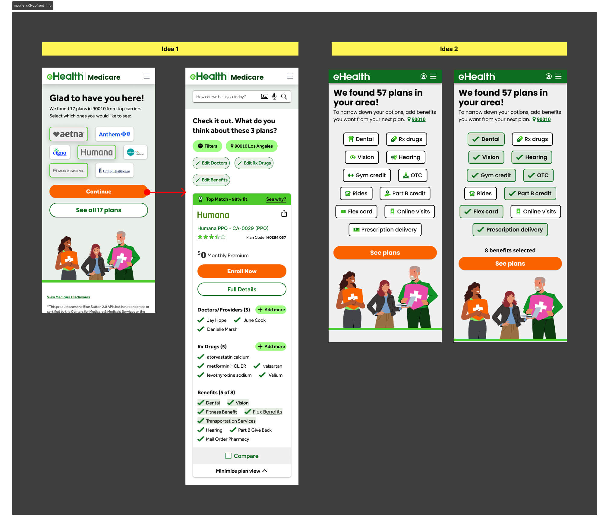
Version 3 — Carrier as the Primary Filter
V3 tested carrier selection as the primary upfront filter — the assumption being that brand names like Humana or Aetna would give users a familiar anchor before they reached the shopping page.
It failed because most markets have limited carrier inventory, so filtering by carrier first barely narrowed the plan list. The friction wasn't earning its keep — users made an extra decision upfront that produced almost no change in what they saw on the other side.
Version 4 — Benefit Selector Refined
V2 had asked users to select both carriers and benefits upfront. V4 stripped the carrier selector out entirely and led with benefits only — then surfaced only the chosen benefits on the plan card, alongside what was already included in the plan. It outperformed V3 decisively and became the direct foundation for V5.
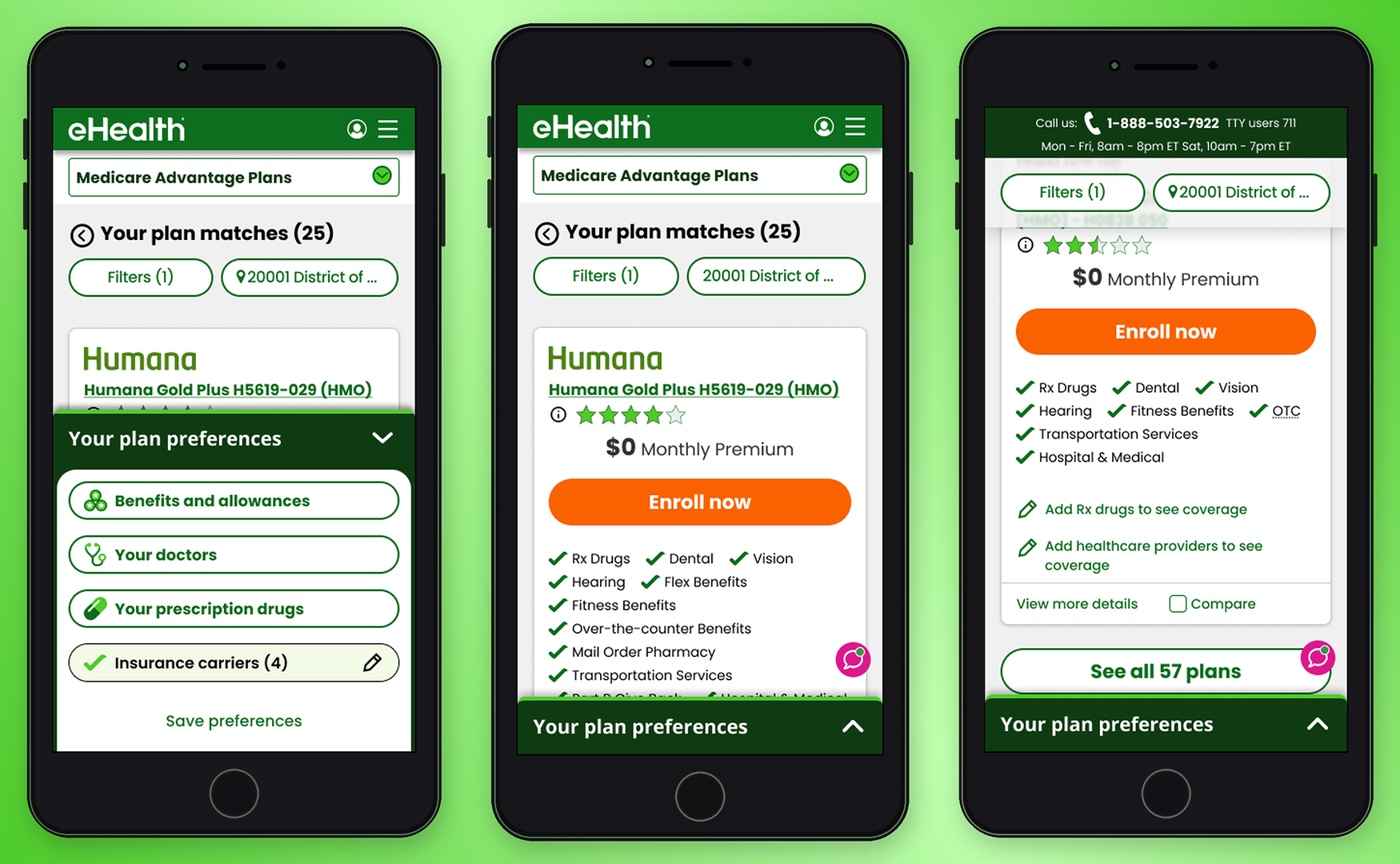
Winning Version v5
After the full A/B test sequence, Version 5 emerged as the highest-converting design — validated head-to-head against Version 4 during AEP itself.
Personalized Plan Cards
The plan card showed only the benefits the user had flagged as priorities during the upfront flow, plus additional included benefits. Doctors and drug information appeared in collapsible accordions — present for users who needed them, out of the way for those who didn't. The result was a card that felt personally relevant rather than generically overwhelming.
Contextual Bottom Utility Bar
The expanding bottom utility bar — surfaced through research — replaced the persistent dock. It collapsed when not in use, reducing visual noise for a user base already processing complex coverage decisions.
Prototype
The interactive prototype below walks through the end-to-end mobile shopping experience — from the upfront qualification flow through plan browsing and the redesigned plan card.
Key Learnings
& Results
During AEP, mobile conversion increased from 1.2% to 1.54% — a ~28% lift on the industry's highest-traffic window, where every fraction of a point carries significant revenue impact.
The more telling number came after AEP. With the full dataset, mobile conversion reached 3.2% — more than 2.6× the baseline we started from. Version 5 became the established design foundation, with subsequent tests unable to beat it.
Takeaways
- On a constrained screen, information decisions are zero-sum — too little sends users elsewhere, too much triggers drop-off. The winning version found the line: benefits first, everything else available but not foregrounded
- The counterintuitive bet paid off — adding friction upfront reduced cognitive burden at the moment that mattered most. Users who told us what they cared about arrived at a plan list that already felt curated for them
- Giving users control over information density backfired when they lacked the domain knowledge to use it — informed defaults outperformed open-ended choice for this audience
- Supply constraints can invalidate a design hypothesis regardless of UX quality — V3's carrier filter was a sound idea that the product catalog couldn't support
- The expanding bottom utility bar proved to be the right pattern for seniors — persistent chrome reads as noise for users already processing complex information
Version 5 shipped for AEP and became the unbeaten baseline — the highest-converting mobile experience in eHealth Medicare's history at that time.